.
.
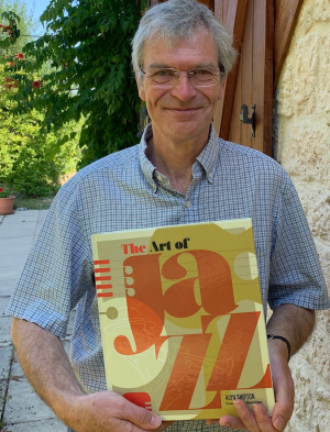
Alyn Shipton, author of The Art of Jazz
.
___
.
…..For many who venerate jazz, the way the music “looks” can often be as entertaining and engaging as how it “sounds,” but the visual importance of the culture has often been overlooked. While there have been many books on jazz photography and art, few have explored how the music’s progress has interacted with the art world.
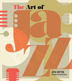
…..In The Art of Jazz, the revered British jazz biographer, music historian, radio host and musician Alyn Shipton takes readers on a concise tour of the music’s history – from its late nineteenth century beginnings to its present day diversity and eclecticism – all the while skillfully presenting the evolution of jazz imagery in all its forms, mirroring the shifting nature of the music itself.
…..In the book’s Foreward, John Edward Hasse, Curator Emeritus of American Music at the Smithsonian Institution writes; “Just as jazz has influenced poetry, fiction, dance, fashion, and vernacular language, so has the music affected the visual arts…This pioneering book links the art together in a narrative, contextualizes each element in the broader history of jazz, and names and explores some of the lesser-known illustrators, designers, and artists who shaped our perception of the music in an almost subconscious way.”
…..The Art of Jazz is a joyful, colorful education – an exploration of how jazz influenced sheet music art, album art, posters, photography, and individual works of fine art. Shipton discusses his indispensable, timeless book in a March 12, 2021 interview with Jerry Jazz Musician Editor/Publisher Joe Maita.
.
.
_____
.
.
“From the realm of jazz came some of the era’s leading creative artists, pursuing instantaneous, high-level communication and expression. The brilliance of these artists affirms some of the most admirable values of our time: originality, individuality, risk-taking, cultural diversity, creative collaboration, and innovation.
“All were basking in the freedom that jazz affords and encourages. ‘If jazz means anything,’ wrote Duke Ellington, ‘it is freedom of expression.'”
-John Edward Hasse, Curator Emeritus of American Music, Smithsonian Institution
.
.
photo by William Gottlieb/Library of Congress
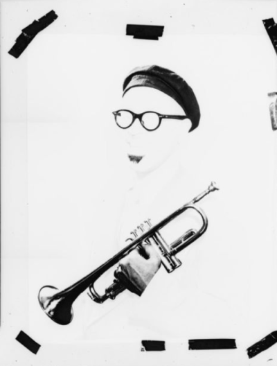
The photographer William Gottlieb’s 1947 portrait of Dizzy Gillespie removes his physical presence to focus on nothing more than what music writer Barry Ulanov called his “visual personality.” It became the template for bebop fans the world over.
.
.
Listen to the 1947 recording of Dizzy Gillespie playing “Groovin’ High,” with Charlie Parker (alto saxophone), Clyde Hart (piano), Frank Paparelli (guitar), Slam Stewart (bass), and Cozy Cole (drums)
.
.
JJM In the book’s foreword, Smithsonian Curator of American Music John Edward Hasse wrote that “Jazz appeals most directly to the ear, but also engages the eye. Yet the visual dimension of jazz is often overlooked. There are books about jazz photography, specific record labels, album cover design, and museum exhibitions, but almost nothing has been published taking on the overall picture of the music.” What inspired your interest in writing this book?
AS Well, I very nearly became an art historian. I studied English literature at Oxford and, along with two other students, was involved in writing a catalog of the rather excellent collection of pictures that my college had acquired beginning in the 17th century. This got me involved in art history, enough so that I even thought I might eventually go off and do a PhD in art at London University. So, I have always been interested in art. But, at the same time, I was playing jazz and becoming more involved in the jazz world.
My daughter is a history writer, and her editor had helped her publish a book on women during World War I. I met the editor to say thank you, bought her a cup of tea, and she told me she was looking for someone who could bring together the worlds of jazz and art, and I said that you might have just found the right person! So, it was literally a complete coincidence, and once she’d made the suggestion, then off we went.
The question I was initially posed with was: do I treat art history as the governing principle, or do I treat the story of jazz as the governing principle? I decided to use jazz because the art movements of the 20th century would have taken a lot more space to explain and show how they fit together, whereas jazz gave me a chronology to work with. So, the story of jazz became the governing principle, and that then dictated how we chose the illustrations.
JJM When we think of jazz art we tend to think of record album cover art, but before record albums there was sheet music. Using the ragtime pianist and composer Scott Joplin as an example, how did sheet music art help cement his place in the public imagination as a serious composer?
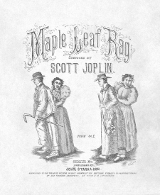
First edition cover of Scott Joplin’s 1899 composition “Maple Leaf Rag” (John Stark and Son, publisher)
.
Library of Congress, Music Division
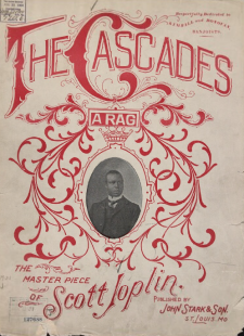
Sheet music from Joplin’s 1904 composition “The Cascades” (John Stark and Son, publisher)
.
Library of Congress, Music Division
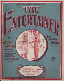
Sheet music from Joplin’s 1902 composition “The Entertainer” (John Stark and Son, publisher)
.
Library of Congress, Music Division
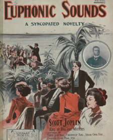
Sheet music from Joplin’s 1908 composition “Euphonic Sounds” (Seminary Music, publisher)
.
Library of Congress, Music Division
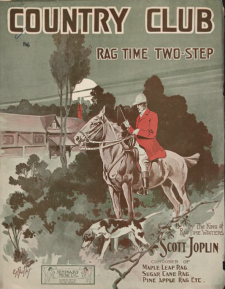
Sheet music from Joplin’s 1909 composition “Country Club” (Seminary Music, publisher)
.
Library of Congress, Music Division
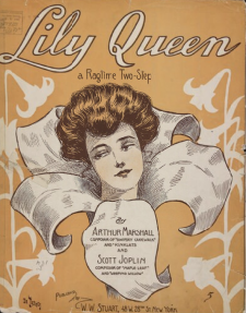
Sheet music from Joplin’s 1907 composition “Lily Queen” (W.W. Stuart, publisher)
AS It’s an interesting story. He was first published in 1899 with his composition “Original Rags,” and the publisher put a white arranger on the sheet music and copyrighted it in the name of that arranger rather than Joplin. When he began being published by John Stark and Son of St. Louis, from the very beginning with “Maple Leaf Rag,” Stark paid Joplin a royalty, which was much more like classical deals than those in the popular music world. So, that was an interesting departure.
The other thing that you see happening is that Stark began portraying Joplin as “The King of RagTime Writers” on the sheet music. These covers would feature an illustration, but you’d also see a little vignette of Joplin’s portrait on some of them, and it’s quite significant that he’s putting an African American composer on the sheet music cover, irrespective of who he’s selling the music to. And what we have to remember about the ragtime music craze is that it was selling to everyone – not just to African Americans – and during a time when the piano industry was selling 250,000 pianos a year. That is a staggering number of pianos, and it meant that, in one way or another, virtually everyone had access to one. It’s a bit like in the late 1920s, most people had access to a phonograph, but that revolution took place over 20 years.
JJM So, the sheet music art was marketed to everyone. It isn’t as if one piece of art was created for a white consumer and another for a Black consumer…
AS Yes, the sheet music art was the same, but it is very interesting to look at early examples of the art and who it was marketed to. One of the earliest songs, “The Cascades,” has a photograph of Joplin in the middle of the art itself, while two others, “The Entertainer” and “The Ragtime Dance,” feature very stereotypical African American figures. Then, as Joplin’s career moves on and he becomes more popular, you’ll notice on his piece “Euphonic Sounds,” published by Seminary Music, that all of the people in the painting with the exception of the conductor are white. In another example, “Country Club – A Ragtime Two Step,” we’re seeing an image of a huntsman in a setting that could be New England or even Britain. It is a very “un-African American” image. On other covers, like “Lily Queen” and “Sugar Cane,” the publisher uses a white female model to sell the product. So, this is a really big shift. As he gets more popular the designs focus more on the affluent white sheet music buyers than the early rags did.
JJM And it was also a way to communicate that ragtime was a “legitimate” music…
AS Yes, and a very difficult music as well. If you sit down and sight-read some of those Joplin rags, it would test your abilities even if you’re a very competent pianist. I know quite accomplished jazz pianists who have to work very hard to play those Joplin rags efficiently because they’re not easy.
JJM You wrote; “The subjects that first inspired a visual reaction to jazz were ragtime; the dance craze inspired by the Castles and James Reese Europe; the African American clubs where white patrons dance to jazz; and the whole risqué atmosphere conjured up by the word ‘jazz’ itself.” How did this new music show up in art?
AS We see it coming in several different ways. It starts with photography and posters, and I use examples of the cakewalk era and then the early photographs of people like James Reese Europe and the way he is depicted on sheet music covers. Also, Vernon and Irene Castle are fascinating – he is an Englishman and she is a white American, and they are popularizing dance to the American public while almost always accompanied by an African American band. So, the racial stereotypes break down very early with the Castles because Europe is a cult figure in New York, particularly, but if you look at his sheet music cover, it is marketed “as danced by Vernon and Irene Castle.” Their effect on the popularity of dance was important. William Howland Kenney writes in his book Chicago Jazz that since there were mixed audiences at the time, the city fathers found it easier to encourage dance than it was to keep the populace separate. It was an interesting period. I wouldn’t say that that was the case in many other cities, and Kenney does make the case that Chicago was exceptional, but social dance was a massive craze, and it leads to the “dime-a-dance” halls, the Savoy Ballroom, and other things later on. There aren’t many, but there are examples of posters that reflect this “dime-a-dance” culture, which carried on into the 1920s and 1930s.
JJM Is there any knowledge about whether the Castles had influence over how they were depicted?
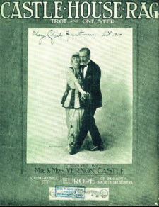
George Moffett’s photograph of Irene and Vernon Castle on Castle House Rag (Jos. W. Stern & Co.)
AS Well, I think we start with “Castle House Rag,” which was a piece named after them and recorded by James Reese Europe’s band in 1913. They are very keen on the way that their image is portrayed on the sheet music, and also in the photographs that you see in the press. They were thinking hard about their image, but also jazz dance as an object of study in its own right. The musicologist Marshall Stearns looked at that years ago, but jazz dance is a good place to look to see how jazz is visually represented in movement, and then in drawings and photography of that movement. For instance, in the book we show a 1920s photograph of a “flapper” dancing, which is also interesting because it is an early example of multiple exposure photography – the dancer is in several different poses in a single shot, which must have taken somebody a long time in the darkroom to make it work. This is picking up on imagery that goes right back to the Castles, and even before that when we see “Clorindy and the Origin of the Cakewalk”, and the pictures showing Bert Williams and George Walker with their respective partners.
JJM Who were some of the artists inspired by early jazz?
AS You can look at the fine art world, and you can also look at the jazz world itself. In the fine art world my favorite line drawing in the book is Picasso’s cover for Stravinsky’s Ragtime, which is a single pencil line showing two musicians wearing hats, one playing a guitar and one playing a banjo. They are immensely detailed but it’s actually like a jazz improvisation – there is just one line going right through these two figures. That’s a good example of an artist who gets jazz right at the beginning. Stravinsky doesn’t get it as much as Picasso does.

Piet Mondrian referred to his 1942/43 painting “Broadway Boogie Woogie” as “dynamic rhythm,” and catches the grid pattern of Manhattan. He created this after his escape from Nazi Germany.
Then we move on into the 1920s and 1930s, and I pick up some examples from fine art. There are many others that could have been discussed, but the ones I’m most interested in representing are Theo Van Doesburg’s Composition in Grey and Piet Mondrain’s Broadway Boogie Woogie. Both of these artists were part of the Dutch movement in Europe that looked at art in rectangular terms. And then the other side of it is represented by the German realist painter Otto Dix, but it could just as easily have been George Grosz, an expressionist painter who was painting that decadent society in Berlin that we read about in Herman Hesse or which is depicted by Christopher Isherwood.
JJM Grosz was influential on the American collage artist Romare Bearden…
AS Yes. He came to America just before World War II and made his money creating those little “column breaker” drawings in the New Yorker magazine. I love that idea that (in his paintings) he can’t quite let go of Berlin, and he was able to show that pre-World War II world in very good detail.
Another artist I write about and show examples of his work is Norman Lewis, an African American artist who moves from a very realistic portrayal of Harlem, and the lifestyle there, to much more abstract painting. You have to look at the way that the artistic movements dip in and out of jazz history, and he is a classic example of that. I am very glad that we have one of his great mid-period post-expressionist paintings of saxophonists in the book – it shows tremendous originality, and he is yet another influence on the Romare Bearden generation and on Bearden himself.
JJM Early on, Paul Whiteman personified this new music…
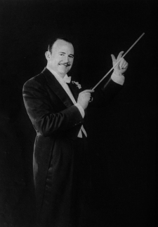
Paul Whiteman, in an uncredited photo that appeared on the cover of Radio Stars, 1934
AS Whiteman early on believed in self-caricature, and his picture with his bald head became his trademark very early on, and we see that stamped on a sheet music cover in the book. The importance of Whiteman is interesting. Prior to Whiteman, the way in which you organized a large band hadn’t been worked out. If you listen to W.C. Handy’s big band recordings in 1918 or so, you hear chaos. Then, listen to Whiteman’s early recordings from just two or three years later and you hear organized chaos. He’s thought very carefully about how the sections are going to work, and he also has a very talented composer and arranger in Ferde Grofé working for him. But this is no surprise since he grew up around music – his father Wilberforce Whiteman was the supervisor of music for the Denver public schools, and many African American musicians I’ve talked to over the years have said that they owed their early apprenticeship to Whiteman’s father; Doc Cheatham being one of them. So, Wilberforce ensured that a good music education in Denver was available to everyone, irrespective of race.
Paul Whiteman had the money, and the publishing background, to make sure that pictures on his sheet music were well-commissioned, and that the art looked attractive. He’s the classic case of someone who bridged the time when songs were sold through sheet music and then via records. We also see him early in the movies – we all remember the famous scene of the numerous pianists playing “Rhapsody in Blue” on that giant piano.
Now, that brings me on to something else, which is that movies and movie design are integral elements in the development of the relationship between art and jazz – the more we can see the music being played, the more opportunities to depict it visually, particularly on posters and other ways in which the films were advertised.
JJM You devote a chapter in the book to the women in early jazz, particularly Bessie Smith, Ma Rainey and Josephine Baker, and how they were depicted artistically. Josephine Baker stimulated graphic art, and her move to France inspired artists. Talk a little about how artists depicted her, and how that influenced the way consumers viewed jazz music?
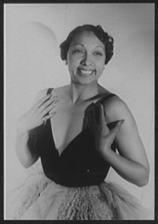
Josephine Baker, October, 1949
.
photo by Carl Van Vechten/Library of Congress Prints and Photographs Division
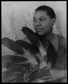
Bessie Smith, February, 1936
AS Josephine is a really interesting figure, and it has been interesting for me to talk to the older generation of musicians, and how they viewed her. For example, I remember talking to Doc Cheatham about how African American musicians viewed her and her success. The fact that Josephine became a huge star in Europe was seen as fantastically important for, using the term of the time, “the race,” as a way of showing that artistic and material success was possible. Florence Mills might well have had a similar career had she not died prematurely, and it is interesting that both of them – and to some extent Adelaide Hall as well – became really huge stars in Europe.
So, what was it about Josephine? Well, of the three of them she was the most exotic dancer. She was actually expelled from Austria for wearing an “edible costume” made of bananas. The bananas become interesting because in my book you see an advertisement for a Paris nightclub that features an African American dancer wearing bananas. It wasn’t even necessary for the artist to say who it is, because it was perfectly obvious to the viewer it was Josephine. There is also the very risqué portrait of her topless for the Moulin Rouge, and that again points out that she is an exotic dancer. Then we see Paul Colin’s lithograph of her, which is one of a whole series of his lithographs of Le Revue Negre in Paris. So, she’s the first female musician who inspired graphic art in this way.
You mentioned Bessie Smith, and in the book I trace the way she influenced photographers like Edward Elcha and Carl Van Vechten, and Dudley Murphy’s film St. Louis Blues. She absolutely captivates photographers and filmmakers in the same way she does the listener on record. With Josephine – who is not a great singer, she is more about telling stories in song – her stage presence leads to artistic depiction.
JJM Another key musician of the era was Duke Ellington, of whom you wrote; “Ellington was the first Black bandleader whose commercial success was at least partly achieved through skillful manipulation of his visual image.” What was his and his manager Irving Mills’ strategy for presenting Ellington to the public artistically?
AS Mills is a very interesting character. I am going to sidetrack and then come back to the answer. When I was writing my book on Cab Calloway, I found in the Cab Calloway Collection, in Boston University, the huge book that Irving Mills sent out everywhere that the Calloway band was going to appear to show promoters how to present the band. The book included absolutely finite instructions about how to promote Calloway in every piece of publicity you could imagine – there were templates for newspaper advertisements and posters that went up outside the theater, and there were also drawings and photographs in reproduction quality, all in an effort to control the way Calloway appeared artistically. When my friend Harvey Cohen was writing his book Duke Ellington’s America, I was able to see from his research that exactly the same thing had been done a few years before by Irving Mills for the Ellington band.
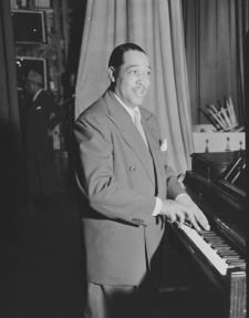
Duke Ellington, ca. 1946
Mills was learning how to use new media through the 1920s. He’s the first music publisher to get broadcasting. He’s the first music publisher to get the idea that you should own your own publishing company, and that you should own your own record company, so he sets up what would eventually become Columbia Records. He also famously owned percentages of the Ellington orchestra and the Calloway band and Lucky Millinder’s and various other orchestras, as well as naming himself “co-composer” on almost everything he published. Irving Mills is a musical entrepreneur – he’s profiting as a publisher, receiving a songwriter’s royalty and a record company’s mechanical royalties, and he’s getting a share of the band itself.
So, how does he make Ellington look different? The answer is there in those posters in the book that show Ellington as an artist. If you see the 1929 film Black and Tan, Ellington is shown working on a song that Freddie Washington will dance to, and then an African American version of a Laurel and Hardy team show up to take away his piano, but they are both bought off with gin. So, what that’s saying to us is that even though Ellington is a poverty-stricken artist, he can buy off the lower-class African Americans. It’s the Williams and Walker thing all over again – George Walker, the suited, well-to-do guy, and Bert Williams, the working man who’s always slightly tricked by the partner – it’s that trope all over again. But at the end of the film, you see Ellington give this magnificent performance with his entire band and choir that somehow fits into his tiny apartment.
I picture the poster from Black and Tan in the book because it shows Ellington (in white tie and tails) as an orchestra conductor, which is in great contrast to the way someone like Jelly Roll Morton appears. While it’s true that Morton looks very artistic on the cover of some of his albums and posters, for the most part he is portrayed as somebody who rolls up his sleeves, sits at the piano and gets on with playing with his band. It shows up when he is sitting at the piano with the Red Hot Peppers, sort of wagging his finger at them all, and the idea is that he’s in the middle of the music-making process. In contrast, Ellington stands back a bit, waving his baton, either conducting the band or thinking pensively while seated at the piano, and on some of those covers he is presented to us as if he were a matinee idol. It’s a really interesting demonstration of Irving Mills’ control over Ellington’s artistic image.
JJM Mills connected the word “genius” to Ellington as well…
AS Yes, and very successfully. The Calloway examples in the book include a poster for the film The Big Broadcast, and another poster of the musical comedy Hi-De-Ho, and this art was just as carefully controlled as Ellington’s. The whole idea, which was very clever, was to promote Cab to a national radio and phonograph audience as someone who sings these funny songs about his girlfriend Minnie the Moocher. Only a certain percentage of the population – largely an African American audience – were going to understand the references to “kicking the gong around,” or “Smokey Joe, he was cokey,” and all of the other drug culture stuff that’s in those songs. Those passed by the majority of the white listeners at that stage, but they spoke directly to the African American audience, much in the way that other songs about “vipers” did. I wanted to catch something of that in the book to show that this image of Cab is just as carefully controlled as Ellington’s, but it’s targeting a slightly different sector of the market, and just as effectively.
JJM Calloway had a huge impact on fashion, too. He and Dizzy Gillespie were the two pillars of hipster fashion for that period…
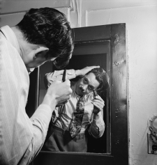
Cab Calloway, Columbia Studio, New York, N.Y., ca. 1947
.
photo by William Gottlieb/Library of Congress
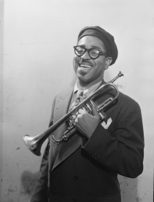
Dizzy Gillespie, New York, N.Y., ca. May, 1947
AS Yes, especially during the 1940s when we see the zoot suit, particularly in the film Stormy Weather, during a great dance sequence with the Nicholas Brothers. His fashion influenced the Zazou resistance movement in France, and a picture in the book shows a Parisian Zazou hipster who is smartly dressed and posed in a gesture of defiance as well. What would the Nazis do with someone dressed like that?
I also go into the zoot suit riots in Los Angeles, which is an occasion where jazz garments actually stimulated a big public reaction in a major city during the war. Dizzy’s beret and spectacles and beard didn’t produce the same reaction, but he was influential, and I show a photo of three young female Dizzy fans wearing their berets and eyeglasses and false beards as an example, because it tells you something about how he has broken through to a different public. I wrote a biography of Dizzy, and during my work on it, time and again it came back to his image being so very important to him.
In the book I make the point that his upturned trumpet was probably stimulated by a visit he made to Manchester in the UK in 1937 with Teddy Hill’s band. One of the trumpeters there was near-sighted and had the bell of the trumpet bent up so he could lean forward to read the music on the band stand. Dizzy saw this and thought it was great. I asked Jon Faddis what he thought of it, and said; “Well, it’s a phallic symbol – Dizzy is going to have audiences falling at his feet!” And when you look at that picture of him with the young ladies, you see that he is very carefully projecting a visual image that might be at odds with the musical image. He might be playing very complex music but he makes it seem accessible because of how he projects it.
JJM Image was so important, and the photographers helped set the tone for how the music was represented artistically. You had William Gottlieb cataloguing the New York scene…
AS Yes, and if we go back just a little before that and look at an example of Glenn Miller’s image, there is a famous photograph of Miller looking quite stern and forbidding, but a beautiful oil painting interpretation of the photo makes him look like your friend. Then, when Chesterfield started sponsoring him and he is re-photographed, he mimics the smile in the photograph while holding a cigarette. Miller’s label RCA often commissioned these lithographic color portraits because in those days color photography was in its infancy, but color lithography wasn’t.
JJM How were swing era musicians generally portrayed?
AS I stray again into the business of movies here, particularly because of the way in which movies began to be made just after World War II. As the swing era itself is going into decline you find that all the methods for how musicians were presented during the era itself are kind of distilled into the poster art for those films. So, we see the Miller band in Orchestra Wives and other films that were being made during the war, and we see the Goodman and Artie Shaw representations as they are on their record sleeves, and that brings me to other important points.
One is Jim Flora, who starts designing record albums, which at the time were these great big books of 78s that had a color cover, and we see his early work starting to come through with a brilliant picture of Goodman’s sextet. Why did they use Jim Flora? Because his art – for example the cover of Goodman’s album – is racially neutral. Although Goodman’s band was integrated at the time, when you look at Flora’s cover anyone could be in the band. So, RCA is selling those records to everyone. He is not on a race label, he is on the main RCA label, and that is how those records are sold.
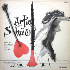
David Stone Martin’s design of Artie Shaw’s 1955 recording with his small group, the Gramercy Five
With Artie Shaw, the picture that I have in the book is the David Stone Martin cover of a Gramercy Five record, which lets us know that Shaw is a man with a colorful personal life who has been married loads of times, but more importantly the cover subtly suggests that Shaw’s true love was the clarinet. This is where Stone Martin is such a genius. Later on he defined the way Norman Granz’s recordings look, because of his incredible ability to take a whole complicated idea and reduce it down to one record cover or one poster. For this reason, Stone Martin is a hugely important figure. So, there you have two completely different portrayals of swing era musicians who are being sold without the controversies associated with them.
JJM When people think of the emergence of the bebop era in the early 1940s, I think they associate that era with William Gottlieb’s photographs in the clubs on 52nd Street. How did that music show up in other art? Did it influence painting or design?
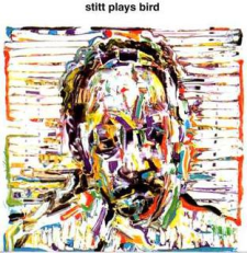
Sonny Stitt’s 1963 recording Stitt Plays Bird, designed by painter and Atlantic Records art director Marvin Israel
.
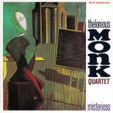
Designer Paul Bacon’s reproduction of Giorgio de Chirico’s 1915 painting The Seer is the cover of Thelonious Monk’s 1958 Riverside recording Misterioso, featuring a one-eyed figure, architectural forms, and a chalkboard
.
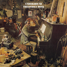
Thelonious Monk’s Underground – his seventh for Columbia Records – was recorded in 1967, and shot by the photographers Steve Horn and Norm Griner
AS It’s an interesting one. You start seeing painters like Norman Lewis picking up ideas from bebop and it shows up in his abstract works like “Jazz Club.” I also portray a couple of record covers that are quite troubling – one of Bud Powell and another of Sonny Stitt where the image itself is fragmenting in the way that some critics thought the music itself was going. But equally I’ve tried to show how photographers in particular took the idea of bebop and represented the music in a slightly more intellectual way. An example of that is a Franz Hofmann photograph of the Modern Jazz Quartet onstage, where you can see a reflection of John Lewis in the piano lid and a smaller image of Milt Jackson over his shoulder. The photo says “concert hall,” and communicates that the music has moved into a new venue.
The other area that I find interesting are the ways in which Thelonious Monk is depicted, because he is such a hard sell. Bob Weinstock of Prestige once told me he couldn’t sell Monk “for love or money,” and Alfred Lion had the same experience at Blue Note, but he went on recording him. Orrin Keepnews at Riverside stuck with Monk and finally their albums went somewhere. So, initially, Monk was a terribly tough sell, and what I wanted to do in the book is show ways in which different record companies tried to portray his difficult music. In one example – the cover to the Columbia album Underground – you see Monk in a set-up photograph where he is wearing a machine gun and surrounded by explosives and hand grenades. Another is the cover to his Riverside album Misterioso, a painting by Giorgio de Chirico who tries to connect the ideas of surrealism in Monk’s music to the art. Neither of these probably sold any more records, but they are a great guide to how people used different approaches to market Monk’s charismatic, difficult product. I wouldn’t have said that about him being a hard sell if I hadn’t heard that from the record companies themselves.
JJM Yes, he was a tough sell. There is the famous story about how Max Gordon hired Monk to play at the Village Vanguard early on in his career but nobody showed up. So, he was “out there” for his time, and it is interesting to hear of the artistic challenges record companies had in creating a bridge to consumer acceptance…
AS Yes, they were all trying to do that, and of course when he gets to Columbia it all changes, and those albums did sell. The label’s George Avakian got very good at selling so called “difficult music,” and they had a budget to do so.
JJM Columbia was also challenged by how to market Miles Davis. Because of the publicity surrounding his drug use they wanted to portray him in a positive way, and early images of him on the label portray prosperity and relaxation…
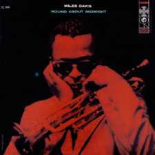
The album cover to Miles Davis’ Columbia album ‘Round About Midnight, his first for the label (recorded in 1955 and 1956, released in 1957)
.
___
.
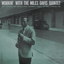
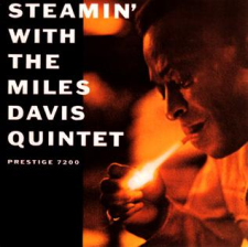
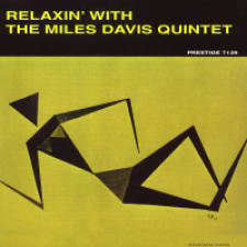
Two 1956 recording sessions resulted in four Miles Davis albums released by Prestige, Workin’, Steamin’, Relaxin’, and Cookin’
.
.
.
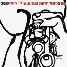
AS Absolutely. I interviewed George Avakian at length about this, and he told me that after he heard Miles with Monk and Gerry Mulligan play “Round Midnight” at the 1955 Newport Jazz Festival, he signed him almost immediately. But Miles hadn’t finished his Prestige contract and he owed them four albums, which became his albums Cookin’, Steamin’, Relaxin’ and Workin’, and I go into their album design in some detail in the book. Bob Weinstock at Prestige knew that it was to his benefit that Columbia signed Miles and he brought those albums out progressively after the first Columbia album appeared. They sold far better than the previous Miles albums because of Columbia’s marketing budget spent on their own Miles albums. And when you look particularly at the way they involved Reid Miles and some of the other designers on these four albums, you can see that Prestige was spending on them in a way they may not have previously done.
There are other Prestige albums pictured in the book that didn’t have that kind of budget behind them, but Weinstock knew that he could sell these Miles Davis ones better because of Columbia’s dollar. George Avakian had a big problem persuading Columbia to sign Miles for the reasons you bring up, and he had to prove that he was clean and that he was going to work, and he did, of course, and for the next five or six years that relationship really burgeoned. He worked with George for a while until Teo Macero came into the picture.
I also devote a chapter in the book to looking at the changing image of Miles and how his record companies sought to portray his image over the coming years. I can’t think of any artist in the history of jazz who has moved on stylistically so frequently and so successfully as Miles, and the book tries to pick that up in terms of the related imagery.
JJM He was the epitome of cool, and I guess he was always that way, wasn’t he? Even in some of those early Gottlieb photos…
AS I was able to spend an evening with Bill Gottlieb once, talking to him about his work, and he said what you have to remember is that he was doing the entire music scene, photographing Willie “The Lion” Smith one night, and Pete Brown the next night, and then the next night it would be the beboppers. It is just that history has looked perhaps more at his photography of this era’s musicians because of the American Federation of Musicians recording ban – he was taking pictures of the moments we can’t hear.
JJM The designer Reid Miles was such a critical contributor to the art of jazz. Maybe you could talk a little bit about his influence?
AS Many of the histories of Blue Note focus on Alfred Lion, and that’s obviously the place to go if you are thinking about the way that label moved musically. Francis Wolff did produce some recordings but he tended to like music that was slightly off-beat, or conversely very popular. At the time Alfred was recording Monk, Francis was doing Jimmy Smith. They had different interests and those are reflected in some ways in the sessions that they took charge of. Francis Wolff was in Stockholm for the Golden Circle concerts by Ornette Coleman, for example, so it is his photograph that we see of the trio on the snow outside the club in Stockholm.
A sampling of Reid Miles designs for Blue Note Records
___
.
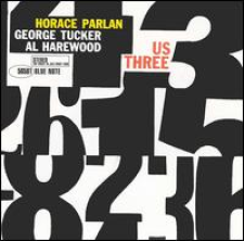
Horace Parlan’s 1960 recording Us Three is an example of Miles’ purely typographic covers
.
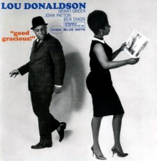
Lou Donaldson’s 1963 recording Good Gracious!
.
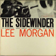
Lee Morgan’s 1964 recording The Sidewinder was a best-selling Blue Note album that featured the merging of Francis Wolff’s photography with Miles’ design
So, these two partners have set up a label and they have slightly different but complementary views about what the musical policy should be. You have Francis with his extraordinary photographer’s eye capturing the sessions that both of them are producing, and that is the starting point. What Reid Miles did was two-fold; he of course commissioned some great graphic art from himself and other artists, and there some good examples of that in the book. But he also was the first designer, I think, to recognize that the marriage of typography and photography was an art form in itself.
With David Stone Martin you have the marriage of beautiful line illustration and typography, but with Reid Miles you’ve got a man who is a typographer who also knows how to design and use line drawings, along with Francis Wolff’s brilliant session photographs, plus the Harlem photographers who were taking pictures of female personalities there, which showed up on the covers of records by people like Lou Donaldson. Those elements come together in Reid Miles’ work as in no other designer up until the work of ECM some years later. During the time of the 1950s and 1960s, when Reid Miles is really creating the look of Blue Note, he is right in there at the beginning of the LP and at initial stages of the creative use of type face, and he is right there in imagining how to use photography in new and innovative ways. And he is blessed with a photographer like Francis Wolff who shares that.
JJM As a consumer I remember walking into a record store and you could spot a Blue Note album cover from a mile away, and the beauty about it is that it wasn’t as if there was a “line look” where every album was orange or blue or pink, it was just that the aesthetic fit all the albums. ECM is the same – you know it’s an ECM album, but it can feel more contrived…
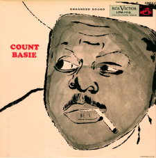
Andy Warhol’s design of Count Basie’s 1955 RCA Victor recording reveals a second facial image when turned upside down
.
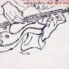
The cover of Kenny Burrell’s 1956 self-titled 1956 Blue Note album, featuring the art of Andy Warhol and Reid Miles’ design
AS There is a subtle point about this in the book, in the section on Andy Warhol. I think you can see quite clearly where the partnership with Reid Miles brings the elements together in a more satisfactory way than the two covers I show for the other labels he did. I love the visual joke that he did with the Count Basie album where you turn it upside down and see a second facial image…
JJM Yes, I never noticed that before!
AS That is great Warhol, just having a joke, and I’m sure at the time the record company didn’t even notice. But I love where Reid Miles takes the designs – particularly the guitar on the Kenny Burrell albums – where he is focusing on the hands of the guitar, and then again on a Johnny Griffin album that he focuses on the shirt and the tenor. You know who the artist is as soon as you see it, and you know it’s a Blue Note album, even though Warhol was designing for other labels. It is that marriage of Reid Miles and his graphic work that tells you it’s a Blue Note.
JJM You write a chapter called “Changing Landscape” that focuses on three artists – Ornette Coleman, Charles Mingus and John Coltrane – whose work became associated with musical freedom. How did artists and designers depict this new freedom and this new sound artistically?
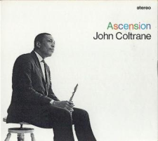
John Coltrane’s 1965 Ascension (Impulse!)
.
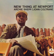
Archie Shepp’s 1965 live album New Thing at Newport (Impulse!)
..

Albert Ayler’s 1964 album Spiritual Unity (ESP-Disk)
AS With Coltrane, with very few exceptions, his labels chose to market him as a respectable, outstanding citizen dressed in a suit, playing a saxophone, and you see that right up even to Ascension, the music of which contains no relation to this musician who is looking very immaculate on the cover. In some ways Atlantic chose exactly the same strategy with Ornette, and his move to Blue Note shows him in a different and more creative way, particularly on his albums Love Call and At the Golden Circle Stockholm. In the book I also go on a little further into his later work and show how as his music develops, so too do the images that were used to sell it. In another example, on the cover of New Thing at Newport we see Archie Shepp looking like a guy spending his day off on the golf course, which again doesn’t bear a lot of relationship to the music. This is how it is until we get to a different element of freedom, and we start looking at artists like Albert Ayler and The Art Ensemble of Chicago, and suddenly we find graphic art and photography picturing a very different element – there is the face painting with the Art Ensemble, with Albert Ayler we see the graphics that are connected to his album Spiritual Unity. These attempts are to somehow depict the music in graphic terms, which is exactly the opposite of what Atlantic and Impulse chose to do with Ornette and Coltrane.
JJM You point out in the book that during the mid-1960s the most innovative album cover design came out of the United Kingdom…
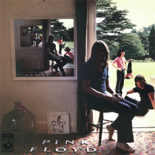
Pink Floyd’s 1969 album Ummagumma
.
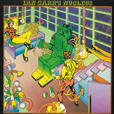
The Keith Davis design of fusion band Ian Carr’s Nucleus 1973 album Roots (Polydor)
.
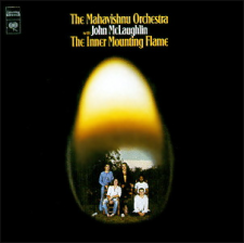
Ron Coro’s design of Mahavishnu Orchestra’s 1971 album The Inner Mounting Flame (Columbia)
.
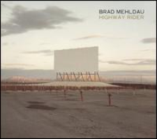
Richard Misrach’s photograph of a vast drive-in movie is the cover to Brad Mehldau’s 2010 album Highway Rider (Nonesuch)
AS Yes. What I was trying to say is that because of the British Invasion and the development of rock and roll, it had its influential graphic artists. I focus on the Pink Floyd album cover Ummagumma, which was designed by the UK partnership Hipgnosis in 1969. I then look at the designer Keith Davis, whose art appeared on albums by the fusion band, Ian Carr’s Nucleus, and also Ron Coro’s design of John McLaughlin’s album Inner Mounting Flame.
What I was trying to say there is that rock music leap-frogged what was going on in jazz design, and we subsequently find all those ideas coming into jazz. It is wonderful to see them in Miles Davis’ work and the work of Gary Burton and Carla Bley – the ideas are all there but they are pioneered on my side of the Atlantic with bands like Pink Floyd, who are looking for new ways of representing their music graphically.
I also make the very clear connection between Pink Floyd’s Ummagumma and the work of Brad Mehldau. Brad is very up on European art in all sorts of ways, not just musical art, but visual arts, architecture, and novels as well. In conversation with him you find yourself left behind – the breadth of his knowledge is just extraordinary – so it is no surprise that he is at the cutting edge of what is going on in album design, as demonstrated on his albums like Modern Music, Highway Rider, and Largo.
JJM You can’t have a conversation about jazz album cover art without spending some time on ECM. You write about ECM artwork in the book, and quote the musicologist Barry Kernfield as saying that ECM music is “strongly oriented toward the jazz avant-garde but…with an overriding sense of politeness, delicacy, and spaciousness.” How has this house design look of ECM’s impacted the music?
AS Looking at the way that ECM has gone about creating its aesthetic requires thinking of the whole package, on both the macro and micro level. Manfred Eicher is someone with a vision, who tries to see that through in everything the label has done. There are fantastic books on the art of ECM and how it all fits together, but what I was trying to show here was that, in just the same way that David Stone Martin for Verve and Reid Miles for Blue Note created a style, Barbara Wojirsch did this for ECM.
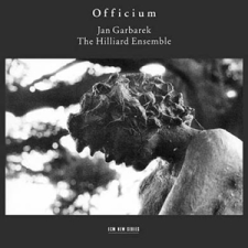
Roberto Masott’s photograph on the cover of Jan Garbarek’s 1994 ECM recording Officium
.
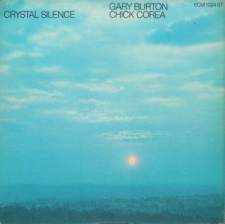
A 1973 photograph by Hans Paysan is the cover of Gary Burton and Chick Corea’s ECM album Crystal Silence
.
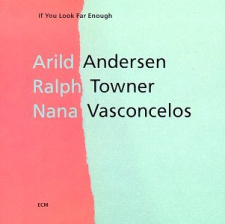
ECM designer Barbara Wojirsch’s cover of the 1993 ECM album If You Look Far Enough, by Arild Andersen, Ralph Towner and Nana Vasconcelos
On one page in the book I point out the three particular areas in which she has triumphed. One is to find completely unrelated photographs that somehow mirror the aesthetic of the music on the album. As an example, I’ve shown the Jan Garbarek album Officium, (with the Hilliard Ensemble), which pictures a crumbling statue in a churchyard that could be anywhere, but somehow it takes us back in time to the music that the Hilliard sing, yet there is a modernity in the typeface that represents Garbarek’s contribution to that music.
Another example is the Gary Burton/Chick Corea album Crystal Silence, which is a classic use of color photography to set a mood. There is something about the reflective nature of that duo – which is particularly poignant at this moment with Chick having just passed. I heard them in concert here in London and it had the same effect on me as when I saw Garbarek with the Hilliards at St. Paul’s Cathedral in London. Somehow the music that you hear live and then on record is reflected by Barbara’s artistic vision for it in the album cover.
Finally, on that same page in the book I show some of her typographic design, because just as Reid Miles was on top of the typography of the 1960s, Barbara Wojirsch was on top of the typography for the 70s, 80s and 90s in a very creative way.
JJM ECM’s design look and artistic concepts can be brilliant, but I do wonder if artists at times create music to fit this aesthetic and possibly hamper their own creativity…
AS I might have thought that too, but in my other career as a publisher I had the experience of being the commissioning editor for the English edition of Wolfgang Sander’s biography of Keith Jarrett which came out just before Christmas 2020, and was translated by Jarrett’s brother Chris. Sander explains the dynamic between Jarrett and Manfred Eicher in such tremendous detail that it is very easy to see that theirs is a symbiotic relationship. It goes both ways. Because Jarrett had a record company/manager who encouraged him to do what he wanted to do, he was able to address projects that he would not have done with George Avakian at Columbia. So, you see the American quartet pursuing one discrete objective, and you see a much wider, more adventurous spirit at work in the relationship with ECM.
Litania is a 1997 ECM album by Tomasz Stanko, featuring the photography of Sascha Kleis, whose landscapes would become an integral part of ECM design imagery
Since working on that Jarrett book I have looked at some of the other ECM collaborations, and a good one is Tomasz Stanko. Stanko had a fantastic career already, recording for labels that you couldn’t very readily get in the west. When he signed to ECM he worked for a while with the house rhythm section, Tony Oxley on drums rather than Jon Christensen, but fundamentally that is the band he is working with, and he records things that are absolutely his kind of music. The one album that Christensen does play is Litania, which is the sextet playing the music of Krzysztof Komeda. I heard them play that live in London and broadcast it on the BBC, and it is hard to imagine any label other than ECM taking it on. It is difficult music, and Tomasz plays it brilliantly.
.
So, yes, there is an ECM aesthetic, but it certainly cuts both ways. The artist wants to make a certain kind of record, and usually Manfred Eicher won’t stand in their way. My good friend John Surman records for ECM, and a particularly good album of his is Proverbs and Songs, which is choral music with organ, baritone sax and choir. What other label is going to take that on? I was in Salisbury Cathedral for that recording, and it was absolutely stunning because the building itself is part of the music. John wrote it knowing that this amazing cathedral would create the resonance that he needed, and the time delay of the organ and the choir were all built into the thinking behind the music. Again, what other label would do that?
Kamasi Washington’s 2015 recording The Epic (Brainfeeder)
.
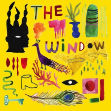
The cover to Cecile McLorin Salvant’s 2018 album The Window (Mack Avenue) features her own artwork
JJM How is jazz music influencing today’s art world?
AS I think what you see in today’s art world is control. The artists I chose to focus on, in the final segment of the book, are musicians who care very much about the way their work is presented. Kamasi Washington is an obvious example. On his two great albums, The Epic and Heaven and Earth, he’s looking after the art direction as much as he is looking after the musical direction, and they are visually very striking. In a talk that I did about his work I showed that the inside cover of The Epic is related to a huge piece of street art in Los Angeles. It looks like he is standing in front of a planet, but it is actually an enormous street mural on Crenshaw Boulevard, by Patrick Henry Johnson. It is part of his bigger relationship with the art world than we see just on the album.
The other musician that I like to single out because she is a graphic artist in her own right is Cecile McLorin Salvant. She thinks about everything in a very similar way and has actually drawn the cover for more than one of her albums. In the book I show how she has taken her own very carefully contrived visual image – which is an image that is thought about in the same way as Dizzy Gillespie’s or Duke Ellington’s was – and characterized it through her art. We see it, for example, in the spectacle trope that appears on her album designs. She is an extraordinary artist, and a classic case of somebody who has complete visual control of her work.
The other person I think of in the same way, because she controls everything about her output, is Maria Schneider. Since she started recording with ArtistShare she has controlled every aspect of her work. She thinks very powerfully about how her image is projected. Her album The Thompson Fields makes the point perfectly – the landscape that she is in could be the landscape of Virgil Thompson or Aaron Copland. There was a Virgil Thompson ballet called Filling Station which is about a Midwest filling station, and connects the urban world to the country world, which is something that shows up in Copland as well. Maria has both an eye and an ear on those connections to other aspects of American music as well, and is a great example of someone with the ability to bring art and jazz together.
.
___
.
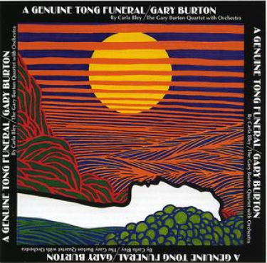
Jim Fasso’s linear drawing for Gary Burton’s A Genuine Tong Funeral (RCA, 1967), is one of the covers that marks the turning point of jazz album design, where influences shared with the rock world became the norm for jazz-rock fusion.
.
.
Listen to “Morning, Pt. 1” from Gary Burton’s Genuine Tong Funeral, with Burton (vibes), Carla Bley (piano and composer), Steve Swallow (bass), Lonesome Dragon (drums), Larry Coryell (guitar), Steve Lacy (soprano sax), Leandro Barbieri (tenor sax), Jimmy Knepper (trombone), Michael Mantler (trumpet), and Howard Johnson (tuba)
.
.
___
.
.
by Alyn Shipton
.
Praise for The Art of Jazz
Musician Shipton gathers over 300 colorful images of jazz paintings, studio photos, record covers, and posters in this vibrant illustrated history. John Edward Hasse, a curator at the Smithsonian Institution Museum of American History, writes in the introduction: “Jazz appears most directly to the ear but also engages the eye. Yet the visual dimension of jazz is often overlooked.” A detailed summary of early jazz follows—from the brass bands of New Orleans and Louis Armstrong to Duke Ellington, Bessie Smith, and Jelly Roll Morton—supported by a collection of eye-popping photos (a soft-focus head shot of Peggy Lee in 1947; Count Basie’s orchestra squeezed together onstage at New York City’s Famous Door jazz club in 1938) and artwork (such as Street Musicians, by Harlem-born abstract expressionist painter Norman Lewis). Meanwhile, noted illustrators, designers, and graphic artists such as Andy Warhol (who designed the cover of RCA’s 1955 album Count Basie), Verve Records’ David Stone Martin, and Blue Note’s Reid Miles provided album cover designs for bebop and modern jazz records. Other album cover images include those of the ever-evolving Miles Davis, Ornette Coleman, and 21st-century jazz musicians, Kamasi Washington among them. This indispensable work of the genre’s art is perfect for jazz aficionados.
.
.
Shipton, music historian and jazz radio host with the BBC, offers a fascinating survey of how jazz influenced the art world. As he states in his introduction, “the wider ramifications of jazz . . . as syncopated music . . . rapidly transferred itself into the visual and graphic arts.” The text follows this process by combining a survey of jazz history with a parallel look at artists who illustrated jazz sheet music, posters, and, especially, album covers, and who also incorporated jazz influences into their own paintings and drawings. Modern jazz forms, from bebop through free jazz and fusion, offered the most synchronicity for visual artists, with Picasso, Warhol, Romare Bearden, and Jean-Michel Basquiat among those whose art was used in jazz illustration or who created specific work for album covers. Shipton is also strong on jazz photography, calling out the use of iconic devices like strategically placed microphones and curling cigarette smoke. Far more than a showcase for striking album covers, this is a remarkably insightful analysis of both art and jazz, showing vividly how one form has fed the other.
.
.
___
.
.
About Alyn Shipton
Alyn Shipton is a biographer, music historian, and a radio host for the BBC in London, having won the Willis Conover/Marian McPartland Award for Lifetime Achievement in jazz broadcasting from the Jazz Journalists’ Association in New York. He won an ASCAP Deems Taylor/Virgil Thomson Award for his biography of singer Harry Nilsson, and his monumental New History of Jazz, first published in 2001, was named Jazz Journalists’ Book of the Year. He has also received two Association of Record Sound Collections awards for excellence in music research. He is currently a Research Fellow at the Royal Academy of Music in London. He has published numerous oral histories, including the life stories of musicians as diverse as Sir George Shearing, New Orleans guitarist Danny Barker, and pop singer Billy J. Kramer. He is also an accomplished jazz bassist and currently leads the Buck Clayton Legacy Band.
.
.
___
.
.
This interview took place on March 12, 2021, and was hosted and produced by Jerry Jazz Musician Editor/Publisher Joe Maita
.
.
.





















Great article/interview.
Interesting interview. I’ve listened to Alyn Shipton’s Jazz Record Requests for many years now, and I will be seeking out this book.
S’marvelous interview with Alyn Shipton. This praise is from one who has read dozens of interviews and reviews of Alyn Shipton’s books. His extraordinary biographical books about Cab Calloway and Harry Nilsson are in my top 5 jazz/composer biographies. I listen to his BBC Jazz show for years.
Additionally your blog here is fantastic.
Chord-I-Ally,
Barbara Effros