.
.
Paul Morris is a graphic designer and writer who collects album art of the 1940’s and 1950’s. He finds his examples of influential mid-century design in the used record stores of Portland, Oregon..
In this edition, Paul writes about the classical label Westminster Records
.
.
__________
.
I’m back with more covers from the classic age of album art, 1940 to 1960. As it’s been a while since this column appeared (no catastrophes, other endeavors intervened), I’ll explain that I collect and write about album covers from the era when painters and illustrators created mini-posters mainly without using photographs.
By profession I am a graphic designer, and I have gravitated toward the covers of the leading designers of the time, such as Alex Steinweiss, Eric Nitsche, and Jim Flora. Besides good design, though, I have a taste for the odd, and as any vinyl shopper knows, the ‘50s produced a lavish amount of visual camp and shlock. I sometimes share my examples of dated and strange fashions, styles, and slogans.
The classical label Westminster is my focus this time. It was a small label founded in New York in 1949 by a group that included the owner of the Westminster Record Shop. This is one of several examples of record retailers starting small labels. The recordings acquired a reputation for superior sound among audiophiles, continuing until 1960. The brand continued under several different owners and formats, but without the classic cover designs.
.
.
_____
.
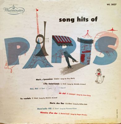
My first example is a 1954 10-inch LP, Song Hits of Paris. The design with pen-and-ink drawings is by Joe Weitz, a first-class artist and designer about whom I know nothing beyond his extant work. The “R” with crossed legs is a great idea.
.
.
_____
.
.
Beethoven’s Fourth begins with a large “4” in the 1952 cover by Sam Norkin (1917-2011). The piano image is wedged into the asymmetrical “4” to balance it. There are many covers for Beethoven’s Fifth that use an enormous “5,” which is a more satisfyingly balanced numeral.
.

.
.
_____
.
.
This Beethoven cover by Joe Weitz features dated typography and isn’t a great success. The old engraving depicts the prisoner being rescued from prison in Fidelio.
.

.
.
_____
.
.
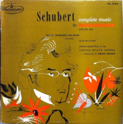
The Complete Music to Rosamunde illustration by Weitz is quite nice. It’s based on the 1825 portrait of Schubert by Wilhelm August Rieder. In the Dvorak cover the drawing by Joe Weitz is paired with tasteful type.
.
.
.

.
.
_____
.
.
The uncredited cover for the Concerto No. 1 for Piano is better still. The abstract shapes bring to mind mandolins one minute, amoebas playing trumpet fanfares the next. It uses a typeface loved by Erik Nitsche.
.

.
.
_____
.
.
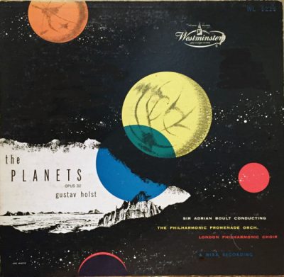
The Planets by Holst tended to inspire experimental, “spacey” designs. This 1954 album was by Joe Weitz, as was Harold in Italy with its engravings of Renaissance characters.
.
.
.

.
.
_____
.
.
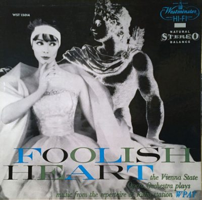
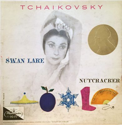
The design for Foolish Heart with the dancing couple is credited to Doris Shaw, a rare woman’s name in the “Mad Men” advertising world. Photograph by Zacharay Freyman, gown by Cotillion. The negative image of the Greek god is a partial view of the famous statue in the Vatican, the Apollo Belvedere. This image is also flipped—the actual statue raises its left arm. The Tchaikovsky album features a photo by “Baron” of Margot Fonteyn and a design that’s uncredited but that I want to think is by Joe Weitz.
.
.
.
.
.
_____
.
.
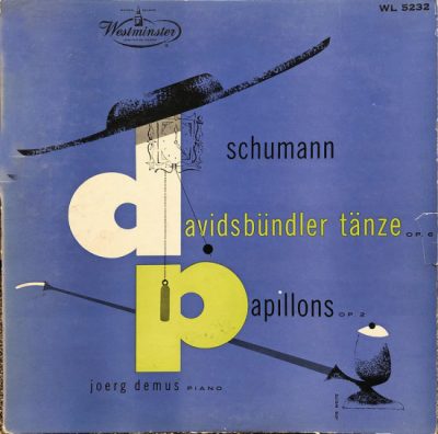
Again we have a big numeral with a piano form and too many typestyles in Joe Weitz’s cover for the. Piano Concerto No. 2. The last piece by Mr. Weitz is a delightful composition from 1953 for an album of Schumann music. I wondered if the hat, clock, and pipe referred to anything, and found that in one of the piano works a clock is heard chiming
.

.
.
.
.
_____
.
.
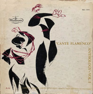
I just picked up the 1953 Cante Flamenco record this month at Everyday Music in Portland. The art is signed “Huxley” or “Husley.” The album of Mozart concertos got a Sam Norkin design with stylized clarinet and bassoon and bold spot colors.
.
.
.

.
.
_____
.
.
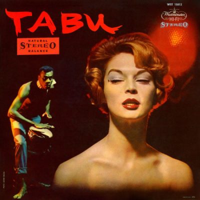
After its sale to ABC-Paramount in the early ’60’s, Westminster ventured into pop music and repackaged its inventory in trendier styles. If you run across albums like Soundblast or Tabu, you’ve left the “Mad Men” era of classic design and entered the “Mad Magazine” era of wilder styles, not normally part of this column.
.

.
.
.
.

.
.
_____
.
.
The Westminster label specialized and didn’t sell in enormous numbers, so my collection is limited in size. It shows, however, that whoever handled the art direction had a strong eye, and provided a showcase for the estimable Joe Weitz, about whom I would like to know more.
.
.
.
.
.
_____
.
.
In Volume 1 of “Cover Stories,” Paul shared his collection of covers by Alex Steinweiss, known as the father of the record album cover, and for many years in charge of Columbia Records’ art department.
Volume 2 focused on Columbia covers
Volume 3 featured jazz illustrations from the early years of the record album
Volume 4 revisited the 1950’s with images of fans holding and enjoying their albums
Volume 5 explored the work of Alex Steinweiss when he used the pseudonym “Piedra Blanca”
Volume 6 featured teenagers of the 1950’s enjoying their music
Volume 7 featured Steinweiss album covers from his prime period — the late 1940’s and early 1950’s
Volume 8 featured a “disturbing” and fascinating trend in 1950?s album art — Records on the Floor!
Volume 9 featured a selection of RCA Victor album covers from Paul’s collection
Volume 10 featured a selection of covers by Curt John Witt, the prolific illustrator for mid-century budget record labels
Volume 11 featured a selection of “glamour girl” covers
Volume 12 featured the “late Columbia” era of master designer Alex Steinweiss
Volume 13 focused on Everest Records, the last of several new labels that Alex Steinweiss helped launch
Volume 14 Paul shares some of his personal jazz record collection, concentrating on the lesser known and sometimes quirky covers that emphasize photographs
Volume 15 took a look at the art of London Records
Volume 16 Paul shared some jazz covers from the 1950’s
Volume 17 looked at the album cover art of Erik Nitsche, a pioneer of modern design
Volume 18 featured album covers picturing designer furniture
Volume 19 showcased choice examples of Decca Records
Volume 20 featured examples of vintage kitsch on several themes
Volume 21 featured samples of Alex Steinweiss album covers, created during the early 1940’s, at the beginning of his career
Volume 22 showcased album covers of Paul’s favorite pop singers of the 1950’s
.
.
.






Very cool, Paul. Thank you for sharing.
Paul,
Cool collection. Glad to see you’re still at it. I like the flamenco and clarinets. Others are cool too. I like that you bring back obscure (to me) designers. Altogether your columns create a history of album cover art design of the mid-century. Bravo.
–Al
Beautifully rendered and meticulously noted, Paul, as always. Big Feelz generatin’ off your impeccable Taste Budz.
1. Urbanological-erotic note: Those crossed legs on the “R” in Paris ain’t STAYIN’ crossed, is all I’m sayin’. On the “Clock Face” of the Standard Michelin *Poche* Plan de Paris, those legs are pointed directly at . . . the rue St. Denis–a “quartier chaud” [hot district] since the Middle Ages. Is all I’m sayin’.
2. Not-Redundant, nor marginal, nor atavistic typographical note (only because I know you would do the same for me!): “schlock” has the “c” when spelled in English, I believe, because without the “c,” the word itself is less . . . well, schlocky. Cp.: Schmaltz (lit., in Yiddish, “chicken fat.”)
And keep bringing those styles, Giles!