Paul Morris is a graphic designer and writer who collects album art of the 1940’s and 1950’s. He finds his examples of influential mid-century design in the used record stores of Portland, Oregon.
In this edition, Paul features choice selections from Decca Records
__________
It’s time for a trip back to the record racks of mid-century America. I have a selection of covers from the Decca label, most picked up because they were better than average Decca designs from the period. But I make no claim for their greatness. The company was large, with no particular house style. These covers were produced by artists who weren’t moved to incorporate Swiss Modern styles and who never received a credit.
The designs I show here, all ten-inch, are a mixed bag, with few ambitious illustrations like those featured by Columbia and RCA in these years [see my column in 2014 about RCA].
These Decca covers were part of the commercial landscape in which Alex Steinweiss at Columbia operated. His sometimes-complex and always memorable illustrations still have the power to delight. Here you can see some of his competition in the years 1946 to 1954.
_____
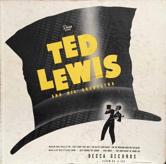
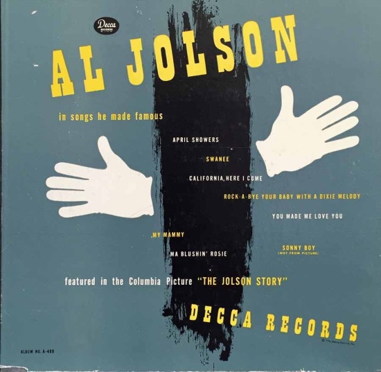
These first two are covers from 78 RPM albums released in 1946. An album of four records (eight songs) was $3.75, quite an investment when minimum wage was around forty cents. These bold, poster-like designs are akin to 1940s Steinweiss covers.
__________
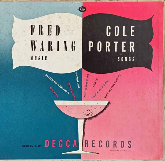
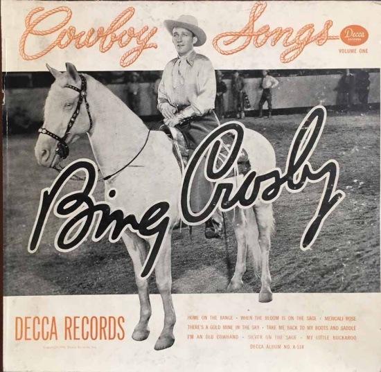
Also from the 78 era are these albums from two of the label’s biggest stars. As much as I revere Crosby’s music, I find no gems among his record covers until the late fifties, when Steinweiss started working for Decca.
__________
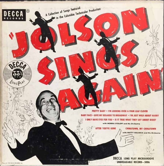
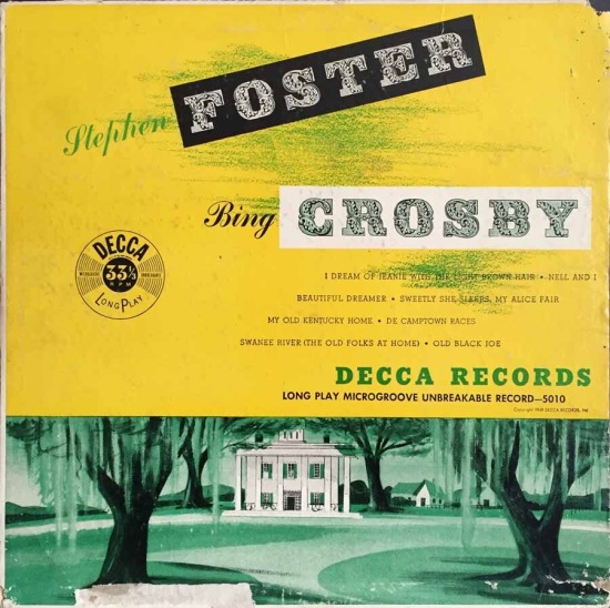
Jump to 1949 and the LP era. The Jolson cover is like a Broadway poster; the Crosby design uses the Victorian-flavored type that was available and a stereotypical view of a plantation.
__________
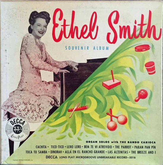
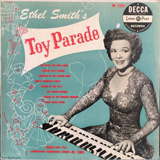
I must confess I haven’t listened to Ethel Smith, but I had to preserve these covers. The illustration of Latin percussion instruments is spirited. Ms. Smith’s hairstyle changes from the forties to the fifties in these two photos. In both of them she wears a dress with a daisy pattern; I’m not sure if it’s the same dress.
__________
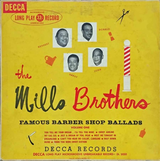
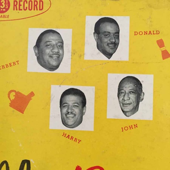
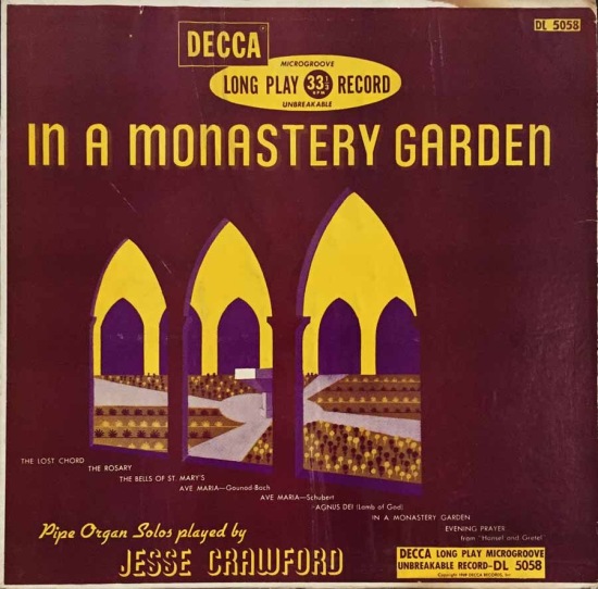
I would call this Mills Brothers cover (1949) quaint. All the graphics are barber shop items; the typography is a mess of multiple competing styles. In a Monastery Garden has a nice illustration of a cloister garden, uncredited as usual on this label. Again the type choices are random.
The Decca logo at this time grew to include “Long Play 33 1/3 RPM Record,” and this was important information: the LP had been on the market only about a year at this time. Columbia and Decca sold both ten-inch, (the same as 78s) and twelve-inch records.
__________
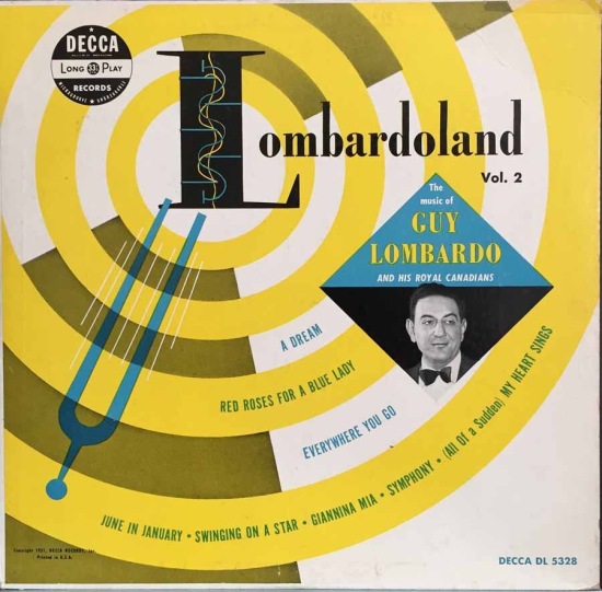
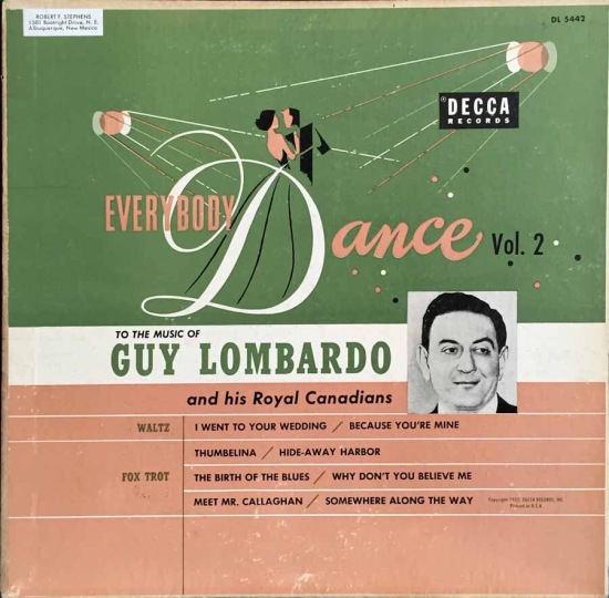
The first Guy Lombardo cover, from 1951, is a modernist effort that is made less timeless by the photo of the super-square bandleader. Following that is a 1953 design with a dancing couple.
__________
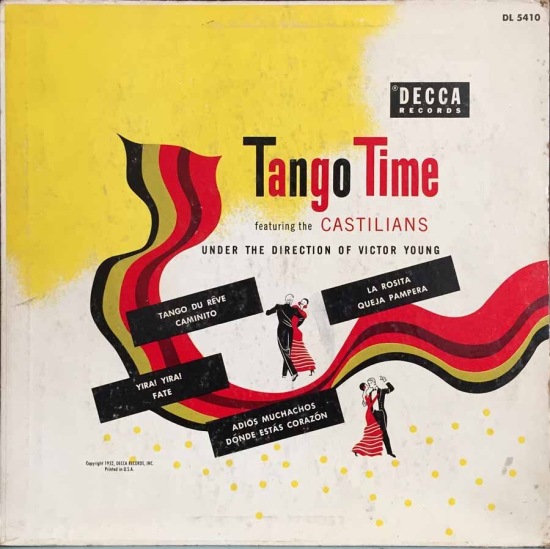
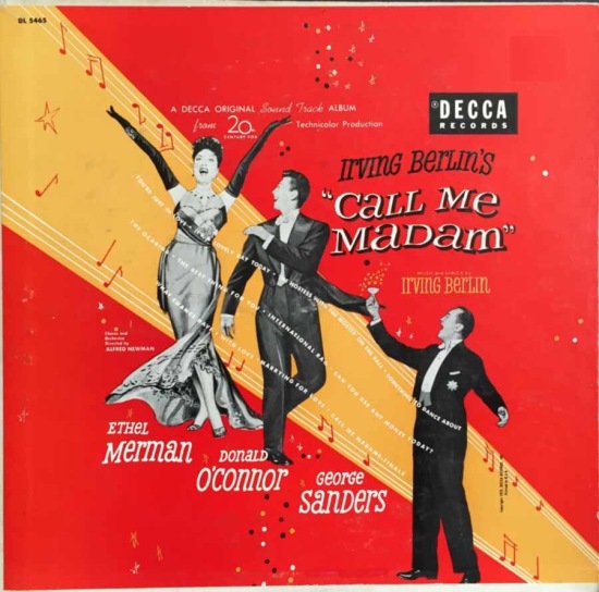
The Tango Time illustration is one of my favorites, though it could have seemed dated in 1952. Call Me Madam is one of many Broadway cast albums from these years. Decca in the U.S. was a pioneer in issuing recordings by original casts. In both these covers the designer has sprinkled in a few of the then-popular polka dots.
__________
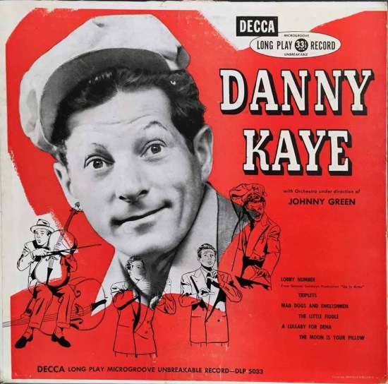
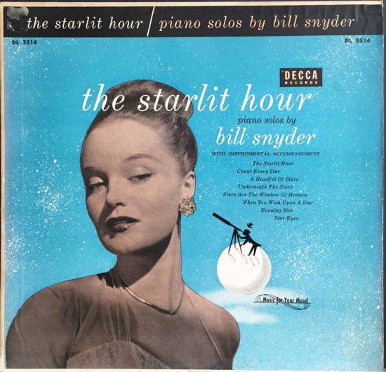
These covers mix illustrations with one large photo. The drawing of the top hatted man and a telescope is stylistically similar to Steinweiss, who began freelancing for Decca in 1954.
The Decca label was one of the big three companies in these decades, and we can thank them for giving a home to the music of Louis Armstrong, Louis Jordan, Count Basie, and Billie Holiday. The album covers carried a variety of graphic styles by a host of designers, whose work I have sampled here.
*
Next time: Paul dips into his kitsch section
__________
In Volume 1 of “Cover Stories,” Paul shared his collection of covers by Alex Steinweiss, known as the father of the record album cover, and for many years in charge of Columbia Records’ art department.
Volume 2 focused on Columbia covers
Volume 3 featured jazz illustrations from the early years of the record album
Volume 4 revisited the 1950’s with images of fans holding and enjoying their albums
Volume 5 explored the work of Alex Steinweiss when he used the pseudonym “Piedra Blanca”
Volume 6 featured teenagers of the 1950’s enjoying their music
Volume 7 featured Steinweiss album covers from his prime period — the late 1940’s and early 1950’s
Volume 8 featured a “disturbing” and fascinating trend in 1950?s album art — Records on the Floor!
Volume 9 featured a selection of RCA Victor album covers from Paul’s collection
Volume 10 featured a selection of covers by Curt John Witt, the prolific illustrator for mid-century budget record labels
Volume 11 featured a selection of “glamour girl” covers
Volume 12 featured the “late Columbia” era of master designer Alex Steinweiss
Volume 13 focused on Everest Records, the last of several new labels that Alex Steinweiss helped launch
Volume 14 Paul shares some of his personal jazz record collection, concentrating on the lesser known and sometimes quirky covers that emphasize photographs
Volume 15 took a look at the art of London Records
Volume 16 Paul shared some jazz covers from the 1950’s
Volume 17 looked at the album cover art of Erik Nitsche, a pioneer of modern design
Volume 18 featured album covers picturing designer furniture


