Paul Morris is a graphic designer and writer who collects album art of the 1940’s and 1950’s. He finds his examples of influential mid-century design in the used record stores of Portland, Oregon.
In this edition, Paul writes about album covers picturing designer furniture
__________
My selection this time is album covers with designer furniture, which happens to be the first “category” that I decided to collect. I already had a sizeable vinyl collection, but had never bought something just for the cover. It was at Bop Street Records in Seattle that I heard from an employee about the owner’s large collection. Record collectors love to brag about how many thousands they have, and this fellow had rooms full of records, with a special depth in early rock. The clerk told me the owner collected albums with covers showing people smoking.
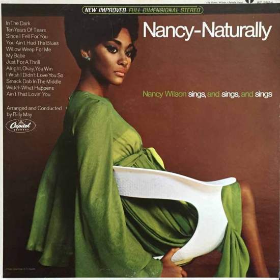
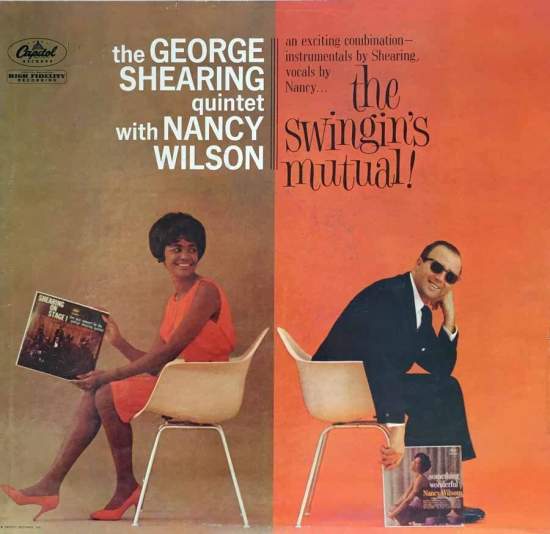
Collecting for covers was not an activity I’d thought of, but the tidbit stayed with me until one day I was looking through my Nancy Wilson albums and saw that two of them showed the singer in a modern molded plastic chair. And on The Swingin’s Mutual, where she was paired with George Shearing, the liner notes said, “Armchair on cover designed by Charles Eames. Herman Miller Inc.” These two famous names were about the extent of my knowledge of furniture designers and sellers, but I liked finding this link between the albums.
Since then I’ve found enough similar covers to see that 1950s art directors were eager to make use of current furniture design, just as they were alert to fashion and art trends. And judging from the liner credits, some furniture retailers were working to get their wares into the photo studios. This “category” is now one of a score or so in my collection, and I still don’t know much about modern furniture, but I certainly appreciate seeing a musician dressed sharply and lounging in an Eames chair.
_____
In Nancy—Naturally from 1966 the chair isn’t credited, but the photo is by fashion photographer Roger Prigent. On The Swingin’s Mutual from 1961, the Shearing photo is credited to New York photographer Maynard Frank Wolfe, along with the credit to Charles Eames and Herman Miller. By this time the Herman Miller firm had emerged as the preeminent American manufacturer of modernist furniture. Their marketing of a high-end lounge chair by Charles and Ray Eames in 1956 did much to bring cutting-edge furniture to public prominence.
__________
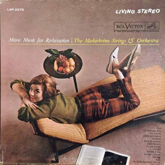
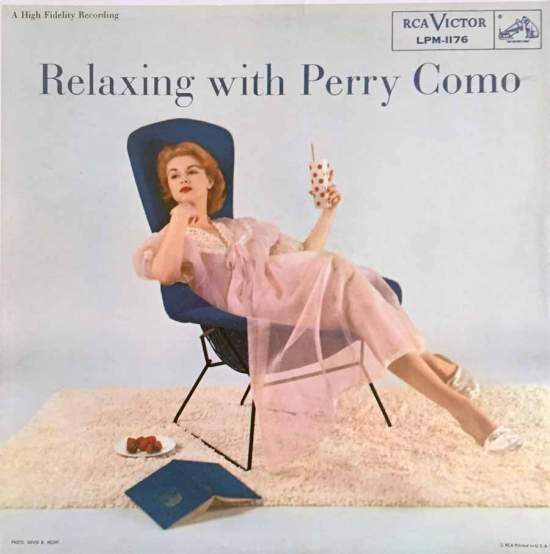
More Music for Relaxation, also 1961, comes with a model relaxing in “Clothes by Pantino, Inc.” on “Selig Furniture Courtesy of Bloomingdale’s.” The Selig company imported and manufactured Danish Modern furniture. This chair would go for thousands now, apparently. More relaxing is going on in the Perry Como cover, photo by RCA staff man David Hecht, chair designed by Harry Bertoia, Knoll Associates. I now know that Bertoia was a leading name in 1956 when Como ruled the charts, and that Knoll still sells his designs, known for achieving “sublime grace in an industrial material.”
__________
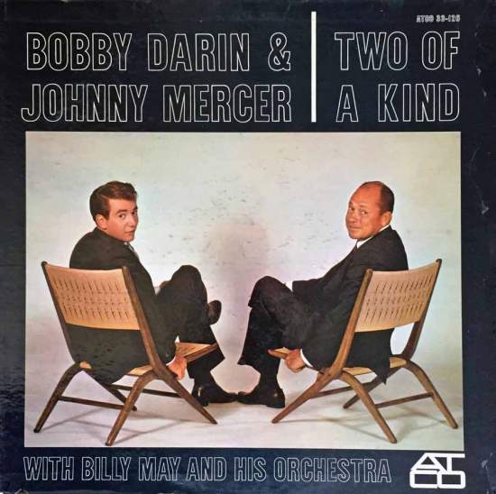
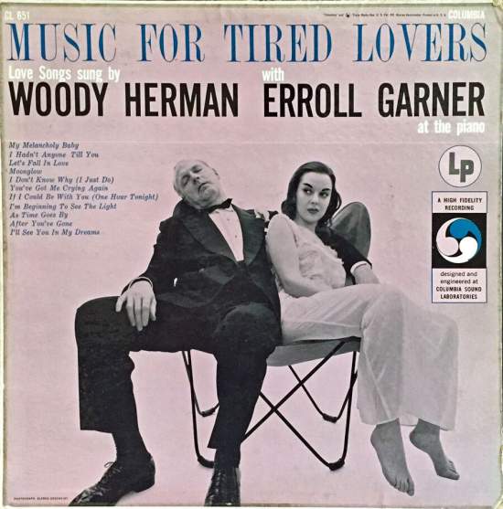
This Bobby Darin & Johnny Mercer album makes excellent listening, with Billy May arrangements. Loring Eutemey, who was once part of Push Pin Studios and worked for Atlantic, designed the cover. The chairs are uncredited, as is the butterfly chair on Woody Herman’s album. The title is “Tired Lovers,” but Woody is the tired one; his partner in the negligee looks peeved in the photo by Alfred Gescheidt.
__________
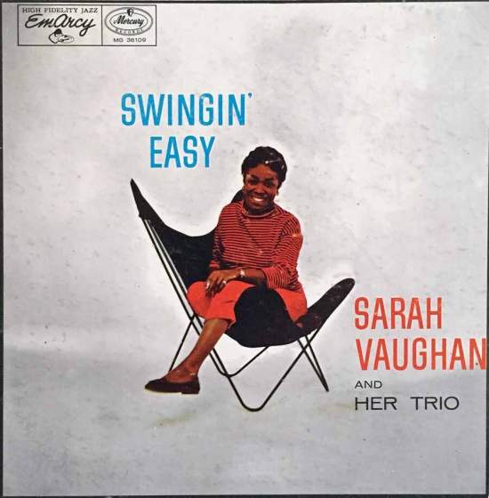
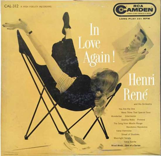
The 1954 Mercury album Swingin’ Easy first got me hooked on Sarah Vaughan, and it remains a definitive example of jazz singing and scatting, with outstanding drumming by Roy Haynes. I don’t know the photographer for this or the other butterfly chair pic on the Henri René album, but they both convey a casual mood.
__________
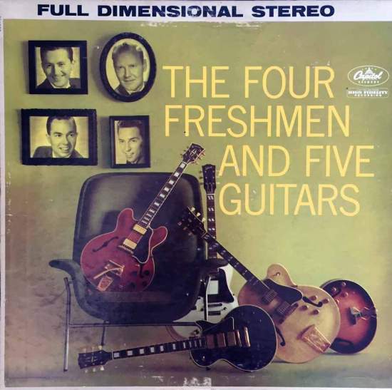
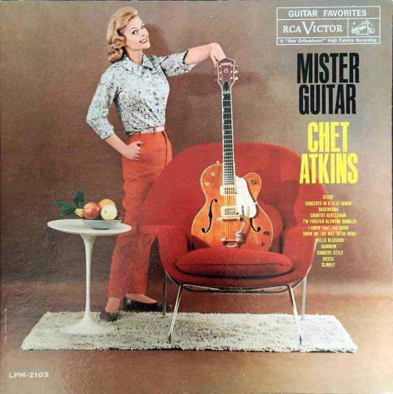
For this 1959 Four Freshmen cover, the photographer remains unknown but the chair was by George Nelson for Herman Miller. Nelson was a contemporary of Charles and Ray Eames; his chairs are still popular. The guitars are by Gibson. They don’t accurately show what the liner notes describe as four amplified guitars plus a bass guitar. A similar chair holds a Gibson in the Chet Atkins photo. The furniture, the fashions, the shag rug—they all say 1959.
__________
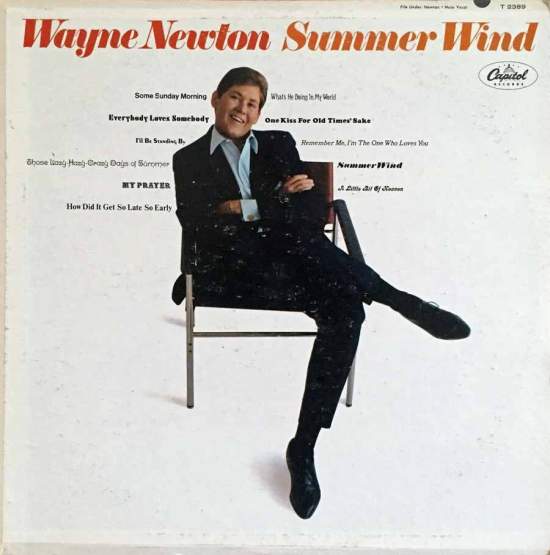
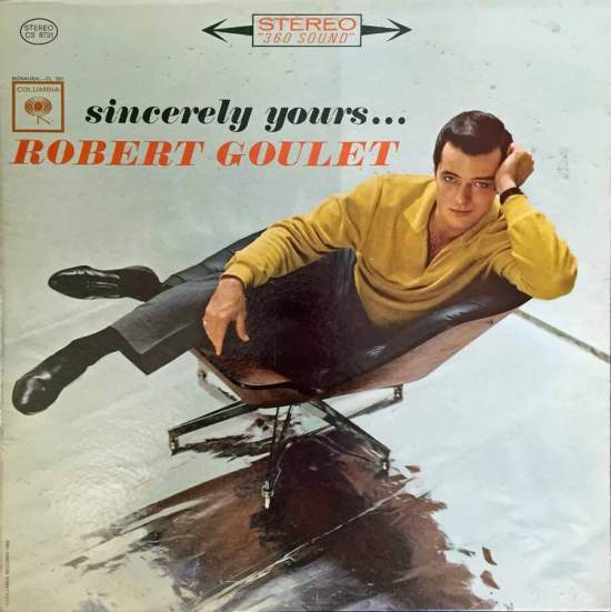
There’s only one way a Wayne Newton record is making it into my collection, and that’s if he’s sitting in a chair from Knoll Furniture in Los Angeles in 1965. Photo by Ken Veeder. Note the terrible technique of using a different font for every song title. In the case of Robert Goulet, from 1962, I’m worried he’s going to fall over.
__________
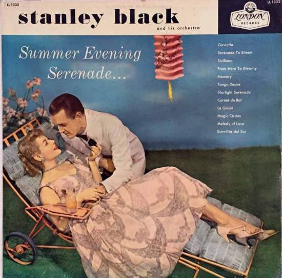
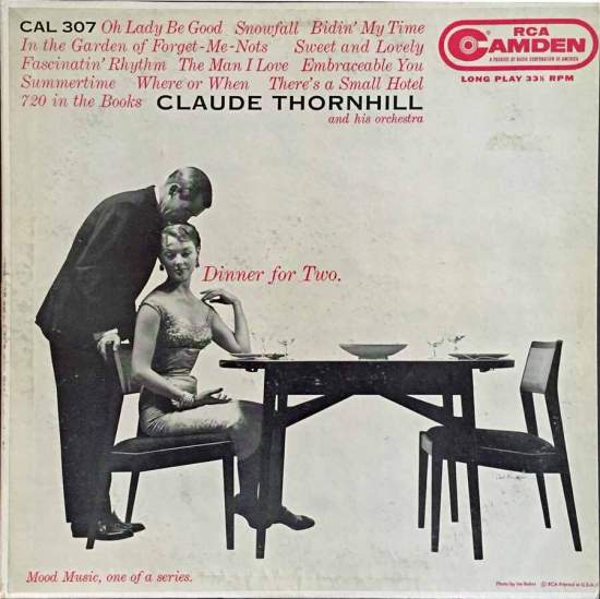
As they say on the radio, if you’ve already squandered a good five minutes looking at album covers of chairs, you might as well keep going. How about this garden chaise by Salterini on the Stanley Black cover? If you could find one of these Italian numbers in good condition, eBay would be your friend. The gown is by Ficol, “a high-end label carried by the likes of Bergdorf Goodman,” according to a source. Nice shoes, too. For the Claude Thornhill album, a similar classy couple gets intimate with a dining set by Nikos Zographos. The credit at the lower right reads, “Photo by Irv Bahrt,” but puzzlingly, the signature of noted lensman Carl Fischer appears under the chair on the right.
__________
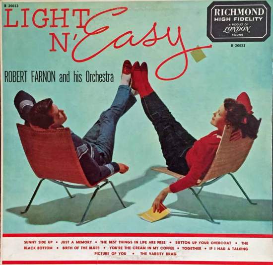
For a last example of this narrow but rich category, here are two 1953 teenagers in two sleek wicker chairs that, like other examples here, don’t look too comfortable. The boy’s shoes have taken on a red tinge. I’m sure there are more chair covers in basements somewhere out there—bring them in to your local record shop!
*
Next time: choice selections from Decca Records.
__________
In Volume 1 of “Cover Stories,” Paul shared his collection of covers by Alex Steinweiss, known as the father of the record album cover, and for many years in charge of Columbia Records’ art department.
Volume 2 focused on Columbia covers
Volume 3 featured jazz illustrations from the early years of the record album
Volume 4 revisited the 1950’s with images of fans holding and enjoying their albums
Volume 5 explored the work of Alex Steinweiss when he used the pseudonym “Piedra Blanca”
Volume 6 featured teenagers of the 1950’s enjoying their music
Volume 7 featured Steinweiss album covers from his prime period — the late 1940’s and early 1950’s
Volume 8 featured a “disturbing” and fascinating trend in 1950?s album art — Records on the Floor!
Volume 9 featured a selection of RCA Victor album covers from Paul’s collection
Volume 10 featured a selection of covers by Curt John Witt, the prolific illustrator for mid-century budget record labels
Volume 11 featured a selection of “glamour girl” covers
Volume 12 featured the “late Columbia” era of master designer Alex Steinweiss
Volume 13 focused on Everest Records, the last of several new labels that Alex Steinweiss helped launch
Volume 14 Paul shares some of his personal jazz record collection, concentrating on the lesser known and sometimes quirky covers that emphasize photographs
Volume 15 took a look at the art of London Records
Volume 16 Paul shared some jazz covers from the 1950’s
Volume 17 looked at the album cover art of Erik Nitsche, a pioneer of modern design


