Paul Morris is a graphic designer and writer who collects album art of the 1940’s and 1950’s. He finds his examples of influential mid-century design in the used record stores of Portland, Oregon.
In this edition, Paul shares some of his personal jazz record collection, concentrating on the lesser known and sometimes quirky covers that emphasize photographs
__________
In this column I have a personal selection of 1950s jazz covers that emphasize photographs. This is a large field, documented by numerous coffee table books. Most of my selections are not the iconic Blue Notes by Coltrane and Rollins that are in any jazz collection. These are lesser known and sometimes quirky.
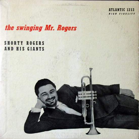
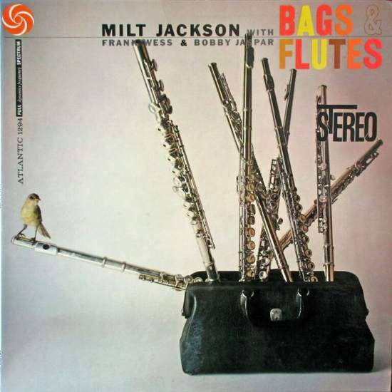
Below is trumpeter Shorty Rogers shot by William Claxton, one of the deans of jazz photography. Another Atlantic release was Bags & Flutes, with Milt Jackson (Bags) playing with Frank Wess and Bobby Jaspars on flute. Putting the flutes in the satchel isn’t the cleverest visual pun, but at least they put a bird on it. Photo by Elbert Budin, design by Marvin Israel.
__________
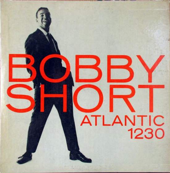
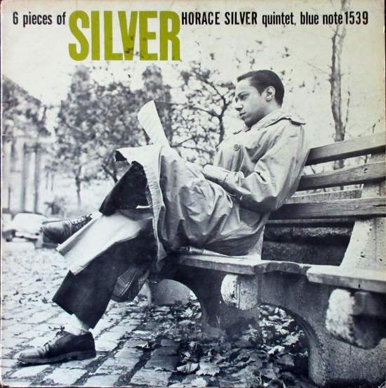
Here are two portraits of photogenic jazzmen. For the 1957 Bobby Short album, photo by William Helburn, the designer Robert Guidi uses no background. For Horace Silver’s 1956 album, Francis Wolff’s photo, shot from a low angle, places the serious young man in a busy urban setting. The designer was Reid Miles, Blue Note’s mainstay.
__________
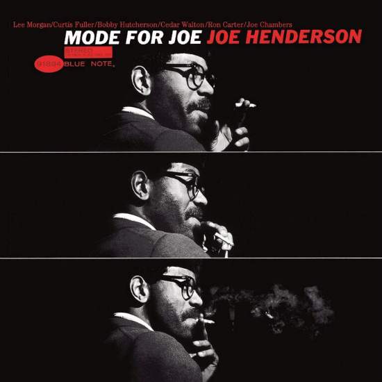
This has been called the definitive Joe Henderson album. He’s backed by Lee Morgan, trumpet, Curtis Fuller, trombone, Bobby Hutcherson, vibes, Cedar Walton, piano, Ron Carter, bass, and Joe Chambers on drums. The 1966 Reid Miles design lets the photos by Wolff do the talking, with unobtrusive typography and a plain black background. The swirl of smoke was a common detail in jazz photos during that window in cultural history when smoking was cool.
Interestingly, Reid Miles was not a jazz fan. When Blue Note gave him free copies of records he’d worked on, he traded them for classical disks. Sometimes his designs emphasized type used in inventive arrangements, with less prominent photos. Click here for examples:
__________
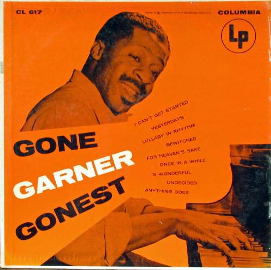
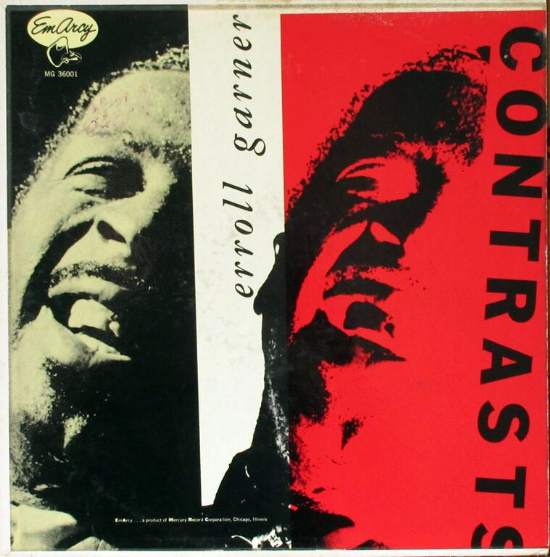
In the 1950s pianist Errol Garner recorded frequently for Columbia. This orange cover (1956) is typical of the style they used. The album Contrasts, from 1954, uses a negative image and a typically cheerful Garner photo.
__________
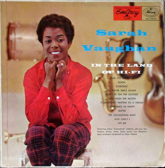
Mercury had a series of albums named “in the Land of Hi-Fi” to tune into the newest audio innovation. The music companies were trying to persuade customers to replace their old LPs with the latest technology, high fidelity. It had been just a few years since listeners had moved on from 78s, and in about five years they would be urged again to buy new albums in the stereo format. On this 1955 album a young Cannonball Adderley accompanied Sarah Vaughan.
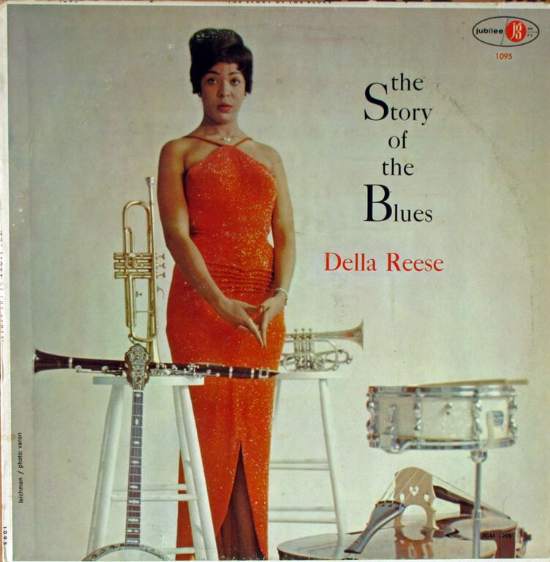
Next is a rare 1958 release by Della Reese before she became a star on the night club circuit. It includes narration of the history of the blues written by Mort Goode. Reese looks uncertain about the pose she is asked to assume. I’m uncertain why they used a banjo instead of a guitar to illustrate the blues. Design by Sy Leichman, photo by Charles Varon. Stamped on the back is the name of the retailer, House of Sound, a record store on North Williams Avenue in Portland where the African-American music scene thrived in years past.
__________
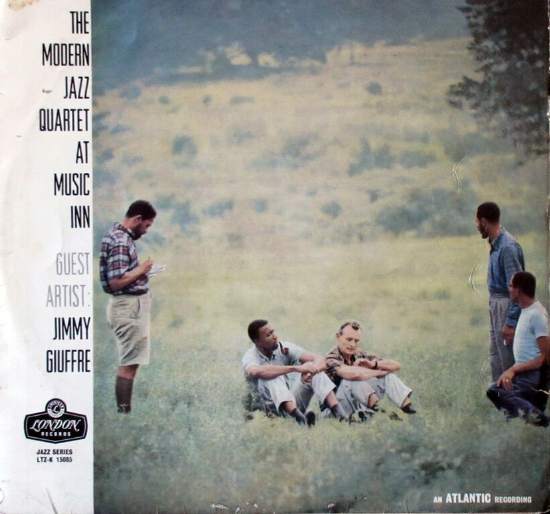
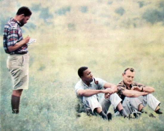
Clarinetist Jimmy Giuffre joined the Modern Jazz Quartet for a 1956 recording. This cover is from the British release on London. It uses the same Jay Maisel photo as on the U.S. Atlantic pressing, but with a different design. Music Inn was a resort in the Berkshires that sponsored seminars and concerts in the summers. I like seeing these jazz guys posed in a meadow. In the close-up I believe that’s John Lewis in the shorts taking notes, Connie Kay smoking his pipe, and Giuffre checking his watch. Design by Marvin Israel.
__________
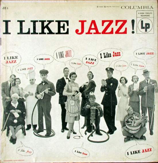
Here are two attempts to market jazz to the uninitiated. The Columbia compilation shows jazz fans in all walks of life (though not all ethnicities). Notice that the uncredited designer used typefaces associated with the occupations: the secretary has American Typewriter, the greengrocer has a stencil font that might be on a crate of vegetables. The grandma uses a Victorian script font and the rich woman has a typeface used in Broadway advertising. The photo is by Alfred Gescheidt.
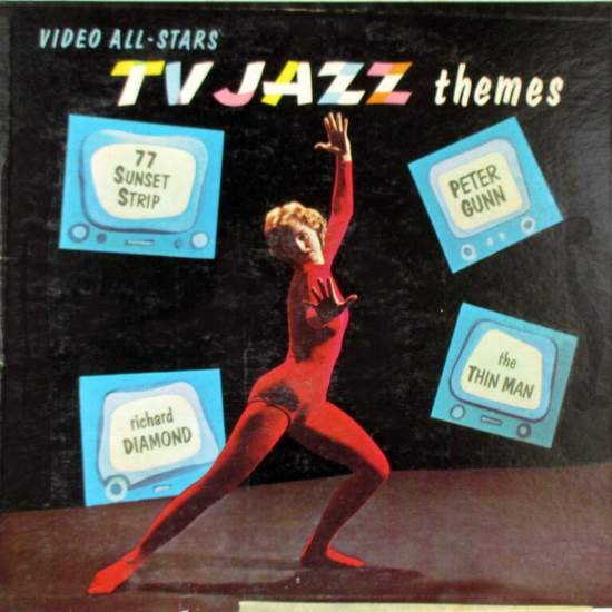
“TV Jazz Themes” tried to interest TV viewers in jazz, with music from several current shows that used jazzy scores. The cheesy design by George Pico portrays a woman who I assume is doing jazz dance.
__________
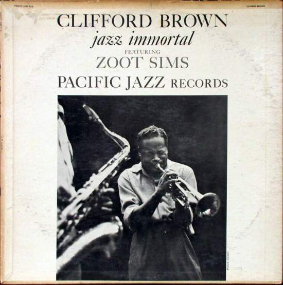
William Claxton’s Clifford Brown portrait is well known. On this 1954 recording (released 1960) he was backed by some Los Angeles players.
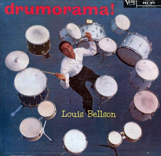
The Louis Bellson album (1957) features a fun photo by Phil Stern, shot from overhead. Stern worked for Look magazine and was known for his portraits of Hollywood stars.
__________
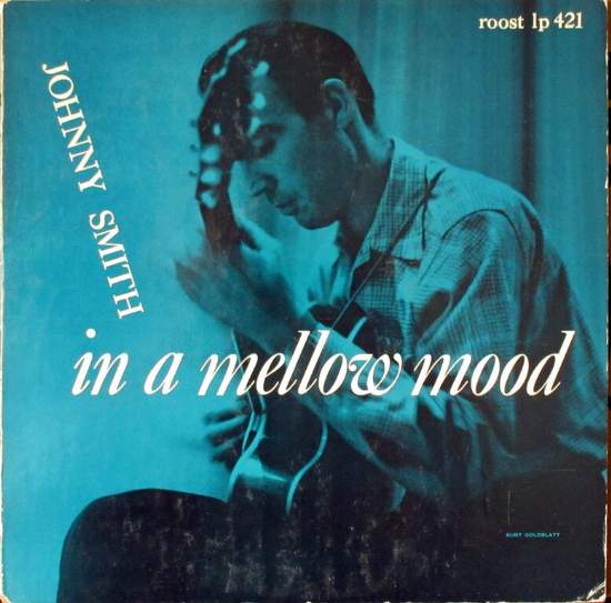
I felt lucky the day I found this 10-inch Roost LP from 1954. The designer and photographer was Bert Goldblatt, on whom I’ll concentrate one of these days. The theme of this release was a common one: Johnny Smith is a jazz musician, but this one is mellow and beautiful, not weird.
__________
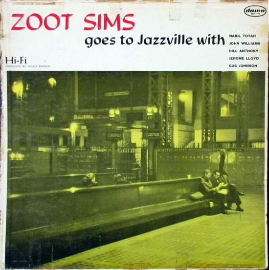
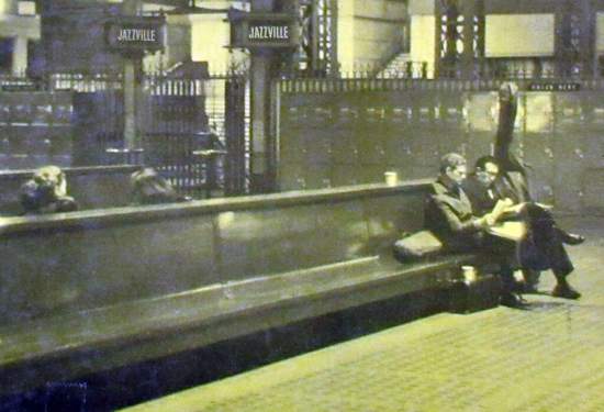
To conclude this small selection of jazz photos I have a 1957 album from the small Dawn label. The musicians are almost lost in this shot of a train station dubbed “Jazzville.” The photographer was Fran Scott (later Fran Attaway), who was art director for Impulse Records and created the orange and black format used by this jazz label for years. Zoot Sims is nearest us; next to him is John Williams in his jazz piano days, before he composed for the movies.
*
Next time…The Art of London Records
__________
In Volume 1 of “Cover Stories,” Paul shared his collection of covers by Alex Steinweiss, known as the father of the record album cover, and for many years in charge of Columbia Records’ art department.
Volume 2 focused on Columbia covers
Volume 3 featured jazz illustrations from the early years of the record album
Volume 4 revisited the 1950’s with images of fans holding and enjoying their albums
Volume 5 explored the work of Alex Steinweiss when he used the pseudonym “Piedra Blanca”
Volume 6 featured teenagers of the 1950’s enjoying their music
Volume 7 featured Steinweiss album covers from his prime period — the late 1940’s and early 1950’s
Volume 8 featured a “disturbing” and fascinating trend in 1950’s album art — Records on the Floor!
Volume 9 featured a selection of RCA Victor album covers from Paul’s collection
Volume 10 featured a selection of covers by Curt John Witt, the prolific illustrator for mid-century budget record labels
Volume 11 featured a selection of “glamour girl” covers
Volume 12 featured the “late Columbia” era of master designer Alex Steinweiss
Volume 13 focused on Everest Records, the last of several new labels that Alex Steinweiss helped launch














I love the subtlety of these old album covers …
I love the subtlety of these old album covers …
Another great entry by P. Morris. Interesting, the photos aren’t as daring as film noir could’ve led them to be.
Another great entry by P. Morris. Interesting, the photos aren’t as daring as film noir could’ve led them to be.