Paul Morris is a graphic designer and writer who collects album art of the 1940’s and 1950’s. He finds his examples of influential mid-century design in the used record stores of Portland, Oregon.
This edition features a selection of RCA Victor album covers from Paul’s collection
__________
I’ve pulled out a selection of RCA Victor covers from my collection, mixed in style but all released between 1940 and 1960. RCA was one of the big three companies in the 1940s, along with Columbia and Decca. Its roots were in the Victor Talking Machine Company, home of the dog Nipper and manufacturer of the Victrola. In the period at hand, though they were a large company, their cover art didn’t have an overall style that has endured.
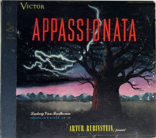
A book by Steve Jones and Martin Sorger refers to “the painterly covers made by RCA. Using traditional imagery on their classical releases, RCA tried to promote a conservative, quality-oriented corporate image. The company incorporated various genres of painting on its covers, alternating from Surreal or Cubist to Romantic. Frank Decker, one of the more productive freelancers used by RCA, attempted to match his cover designs to the music historically.” (Covering Music: A Brief History and Analysis of Album Cover Design.)
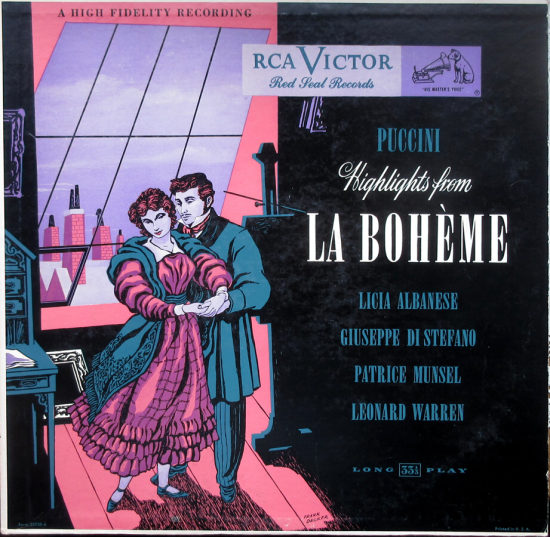
These two Frank Decker covers illustrate two of his styles.

__________
But often the RCAs are romantic and dated paintings commissioned to have blank spaces where type would be added. This Chopin cover is signed by Stahlbert.

__________
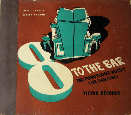
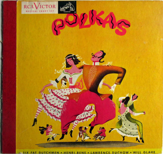
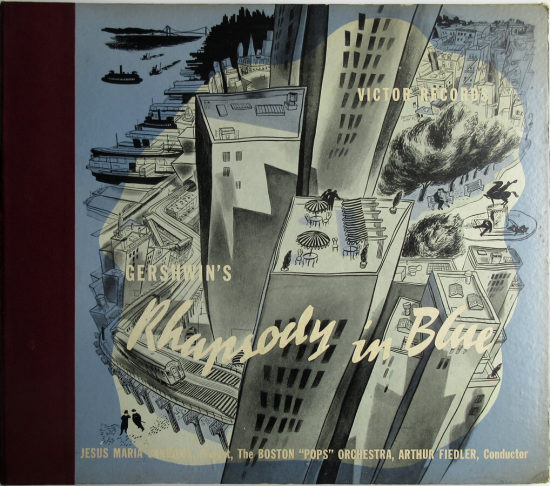
Many of the early RCA covers are the sort of stodgy things you associate with your grandparents’ house, and many of them use styles of illustration common in the busy graphics field. Before photography took over, there were legions of commercial illustrators working for magazines, newspapers, book publishers, and ad agencies. From 1945 is this jazz cover that still looks great, and a polka album with a distinctive painting, both unsigned. RCA was stingy with credit for its artists, something that makes their covers less interesting to collect.
__________
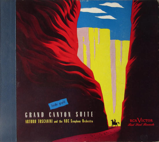
Three old-style covers from the 1940s. These were custom designs. The Rhapsody in Blue illustration of Manhattan reminds me of a New Yorker cartoonist.
__________
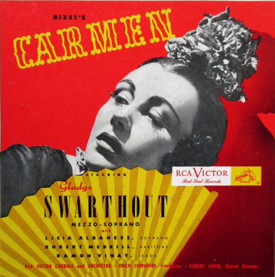
And here are two covers in a snappier style. Images like the Carmen were printed in a smaller size, 7×7, on the album covers. I don’t know why they didn’t use the entire 10 or 12 inches as other companies did. The result is art that you have to squint at, like a CD cover.

__________
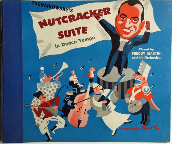
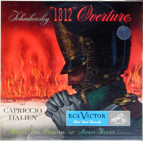
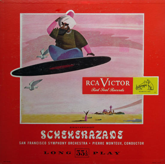
I have no names for the styles of the Scheherezade, Freddy Martin, or the Tchaikovsky, but they’re all of a high calibre. The Richard Strauss art is appropriately humorous, and on the album cover is stamped, “RCA Victor Red Seal De Luxe Edition, Non Breakable.” Above, Serge Koussevitzky’s signature is printed in gold on the binding strip.


__________
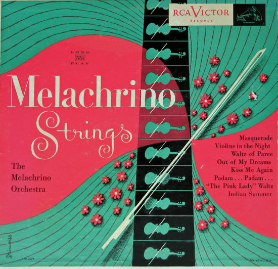
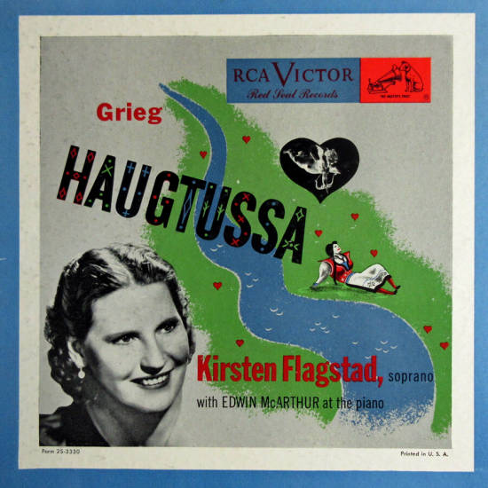
Though Alex Steinweiss is not known for his work for RCA, I have one credited example, the Melachrino Strings album (evidently he didn’t know where they were going to slap on the logo, or it wouldn’t be so awkwardly placed). Next is a 1950 Kirsten Flagstad album that’s uncredited but a dead ringer for Steinweiss. Then a Christmas album by a versatile designer named Joe Krush that uses the Steinweiss Scrawl for the composer’s name.

__________
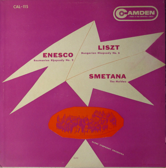
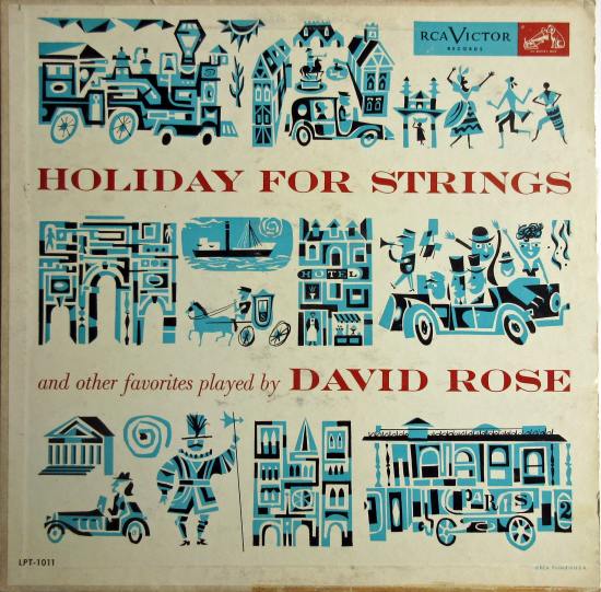
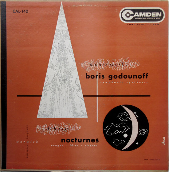
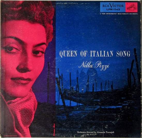
In this small sample of the large RCA catalog I have some modernist designs that stand out. This David Rose album is by Edward Sorel, early in his career. His work has included children’s books and social commentary. The purple abstract cover is credited to Beck. (It turns out to be hard to Google “Beck album art” and find anything about this artist from 60 years ago.) Below that is a spacey composition by an artist named Bunce. To finish, a goofy cover that RCA used repeatedly for different recordings. Vinyl lovers have to like this one. And last is a romantic evocation of Venice by John Ross and Clare Romano, noted illustrators and printmakers.
__________
Next time, the prolific designer for budget classical labels, Curt John Witt.
In Volume 1 of “Cover Stories,” Paul shared his collection of covers by Alex Steinweiss, known as the father of the record album cover, and for many years in charge of Columbia Records’ art department.
Volume 2 focused on Columbia covers
Volume 3 featured jazz illustrations from the early years of the record album
Volume 4 revisited the 1950’s with images of fans holding and enjoying their albums
Volume 5 explored the work of Alex Steinweiss when he used the pseudonym “Piedra Blanca”
Volume 6 featured teenagers of the 1950’s enjoying their music
Volume 7 featured Steinweiss album covers from his prime period — the late 1940’s and early 1950’s
Volume 8 featured a “disturbing” and fascinating trend in 1950?s album art — Records on the Floor!
















My mom used to own the Grand Canyon Suite album, I always thought the cover was cool and evocative. Thanks again Paul!
Hi Paul;
I enjoy your posts and research into the terrific illustrations for record albums. Do you know who the artist is for Grofe’s Grand Canyon Suite conducted by Toscanini? You mention that it was a custom job, and elsewhere that Steinweiss did some covers for RCA Victor. Did he do this one? It looks awfully Steinweissian. This is one of my favorite covers, and it’s frustrating not to know who designed it.
Thanks again for your interesting articles.
Regards, Peter Banks
I wish I knew the designer of the Grand Canyon Suite album. Though the style is like Steinweiss, I doubt it was him, because of the timing. It came out in 1945, before he left Columbia Records, when I doubt he was doing anything for RCA. Also Steinweiss did an illustration for the GC Suite as released by Columbia.
Hi, I found one source that identified Steinweiss as the artist for that Grofe cover. Not sure what he would have been doing outside his contract, but maybe Columbia started scaling back some?
https://www.bbc.co.uk/music/articles/65c2f244-e2e9-408f-a2e7-5e070de3d287
Thanks for this series, I’m really enjoying it and I expect I will be returning to it.