Paul Morris is a graphic designer and writer who collects album art of the 1940’s and 1950’s. He finds his examples of influential mid-century design in the used record stores of Portland, Oregon.
This edition features Alex Steinweiss album covers from his prime period — the late 1940’s and early 1950’s.
__________
I’ve gathered together some Alex Steinweiss covers from what I consider his prime period, the late 40’s and early 50’s. These illustrations share what I’ll call a modernist European style. There are influences of Surrealism and an overall tone of irony and wry humor. The musical works are all western European. For Russian and eastern European works he often featured dancing peasants and other rural subjects.
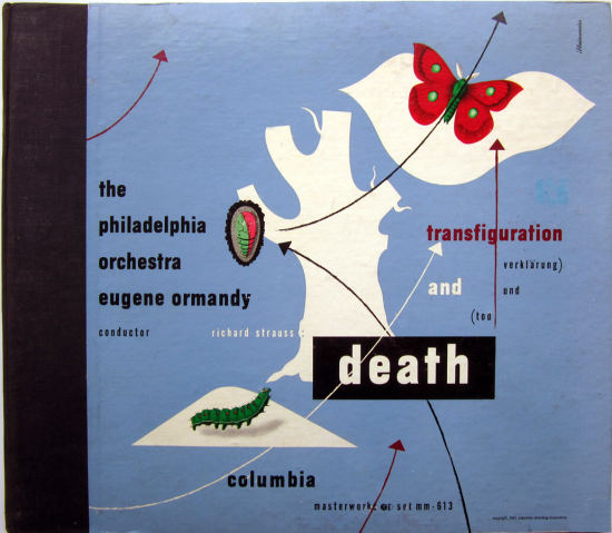
The first cover illustrates Strauss’s Transfiguration and Death, a good soundtrack for the Age of Anxiety. It dates from 1947. The moth is cheerful enough, but there is a starkness to the composition and the black box enclosing the word death darkens the mood.
__________
This Chopin cover from 1949 uses an old engraving of a piano, in negative. Other devices that recur in Steinweiss’s illustrations are the conductor’s hand with baton and the composer’s quill pen and manuscript paper.

__________
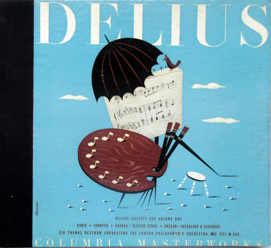
The Delius cover with a bird on it is one of my favorites. The references in a Steinweiss cover usually correspond to something in the music, but I haven’t found any themes about painting in these works. Probably he just liked the conceit of the painter choosing notes from his palette. Perhaps the music shown is from one of the pieces on the album, but probably not, as there’s a mistake in the middle staff, where two half-note D-flats are followed by a quarter-note D-flat. Too many beats for one measure.
__________
This 1947 cover for an album of 78-rpm records is striking, but I admit I don’t know what the cupid and the sword refer to. Possibly it’s the first aria on the record, one from Aida in which the heroine sings of her beloved, Radamès, who is returning from battle.

__________
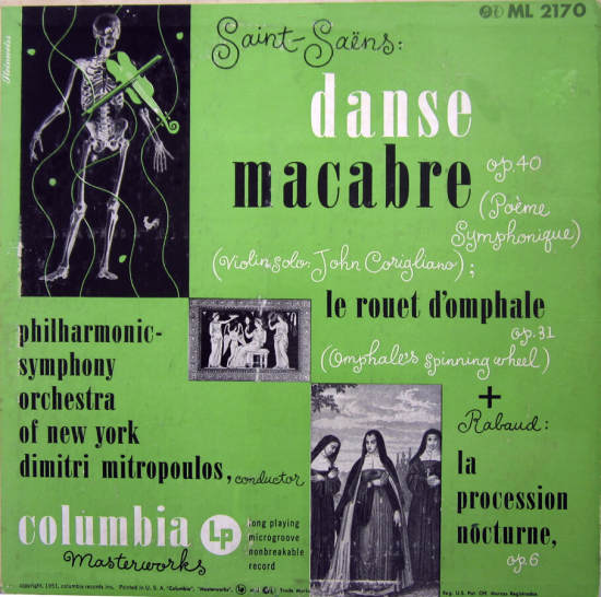
Moving to 1951, the LP has arrived, and Steinweiss often had to somehow illustrate two disparate works on the same cover — many compositions fit easily on one side of the record. These double-title covers surely were harder to pull off successfully, and this one doesn’t really hang together, but I think it is a lot of fun. First, the Danse Macabre is given prominence. Second, there’s the negative image of the skeleton with the green violin. And there’s a lot of the Steinweiss Scrawl. If anyone can explain the rooster near the skeleton’s knee, please write in.
__________
This illustration for La Traviata features a French scene and a delicious purple background. The man’s hand is drawn in a familiar fashion-in numerous covers it is a conductor’s hand holding a baton, as on the Chopin cover above.

__________
Another hand, another piano engraving, and a big red composer’s quill pen-combined in a very lively composition. Most likely this was from the early 1950’s, though it was not printed with the more modern four-color process. This uses four ink colors-red, yellow/chartreuse, blue-gray, and black.

__________
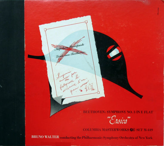
Beethoven evidently struck a chord with Steinweiss; his illustrations are memorable. This relatively simple illustration refers to the possibly mythical story in which Beethoven dedicated his symphony to Napoleon, then changed his mind when the French ruler named himself emperor. The inscription “Sinfonia Eroica per festeggiare il sovvenire di un Grand Uomo” means “Heroic symphony, [composed] to celebrate the memory of a great man.”
The second cover for the Third Symphony again uses the Napoleonic hat, along with the emperor’s crown.

__________
The Beethoven Fifth cover is from 1950. The composer’s face is shown in positive and negative; these images are flanked by a lady holding out a flower and a skeleton, again in reverse. I have noticed that many album designers who tackle a fifth symphony make use of a large numeral “5.” I think this is because the 5 fills the square space of an album cover in a balanced, satisfying way. Much nicer than a large 2 or 7.
Why the skeleton and the lady with the parasol? My best guess is that Beethoven’s music encompasses the extremes of human emotion and experience.

__________
Also from 1950 is this somewhat less successful cover for Finlandia and some works by Rachmaninoff. The background is a photo of driftwood and a fishing net. To my eye, the colors are a bit overripe.

__________
The illustration here is for the first piece on this record, the ballet Les Sylphides, based on music by Chopin. Here Steinweiss chose a soft, tender mood to depict the dancers. The Villa-Lobos piece doesn’t get its own picture.

__________
Tchaikovsky in a mask? This delightful and odd cover shows how logical it is to arrange things in a diagonal composition, from upper left to lower right. It was released in 1950. I believe the mask refers to the composer’s statement that his symphony had a programme, or narrative, but that he would not reveal it. At this time Tchaikovsky’s sexuality was not commonly discussed in liner notes, but today it’s hard not to read the image as a closeted gay man. The notes describe the Pathétique as “a masterpiece of strong emotions, of magnificent colors which are sometimes somber, sometimes flaming.”

__________
The last example of the European Steinweiss is Wagner, who brings out our artist’s dark side. The color is an ominous red, and the background bristles with knives, swords, and spears. The picture at the upper right is Wotan saying farewell to Brünnhilde in Die Walküre. The opera Rienzi, on the other side of the record, does involve war and coups in medieval Italy, but such a profusion of arms is hard to explain. He must have found a trove of old engravings of weapons and decided he couldn’t resist them.

__________
Next time: I confess my fascination with records on the floor.
In Volume 1 of “Cover Stories,” Paul shared his collection of covers by Alex Steinweiss, known as the father of the record album cover, and for many years in charge of Columbia Records’ art department.
Volume 2 focused on Columbia covers
Volume 3 featured jazz illustrations from the early years of the record album
Volume 4 revisited the 1950’s with images of fans holding and enjoying their albums
Volume 5 explored the work of Alex Steinweiss when he used the pseudonym “Piedra Blanca”
Volume 6 featured teenagers of the 1950’s enjoying their music










Fascinating. Love this very fine collection.
I’m not sure if this blog is still active, but it’s giving me a lot of pleasure. Thanks so much for posting all this. I love Steinweiss, and album covers from those days are a lot of fun to look at!
A couple of corrections: As indicated by the arrows on the cover (clever!), the title of the work on the first album photo is “Death and Transfiguration” by Strauss. Also the middle system on the cover of the Delius is actually correct, there are only 4 beats. In typical piano-reduction notation, the two quarter notes would be played during the time of the second half note.
The Beethoven “Eroica” covers are two of my favorites. The first was from a 1941 recording and the second was a 1949 recording on tape (as opposed to shellac in 1941) and is a clear riff on the earlier cover – now with bullet holes through both the crown of royalty and the Napoleonic hat!
As an aside, Steinweiss also designed a cover to the 5th Symphony from 1941 (Bruno Walter, Philharmonic-Symphony Orchestra of New York), which appears stylistically to be a partner for the photo you have posted. That cover had the Morse code for “V” [for victory] which is dot-dot-dot-dash, mimicking the famous rhythm in the opening of the symphony. For that reason, and the obvious musical trajectory of the work, it was played very often during WWII to bolster morale. I’m not entirely sure but I expect the Morse code association with the work preceded Steinweiss’s use on this cover.