Paul Morris is a graphic designer and writer who collects album art of the 1940’s and 1950’s. He finds his examples of influential mid-century design in the used record stores of Portland, Oregon.
In this edition, Paul features jazz illustrations from the early years of the record album
__________
Jazz is what’s on my turntable most often, and for this edition I’ve brought some jazz album covers from the early years of the record album. The art created for jazz tended to be more informal and bright than the work for classical music.
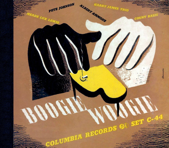
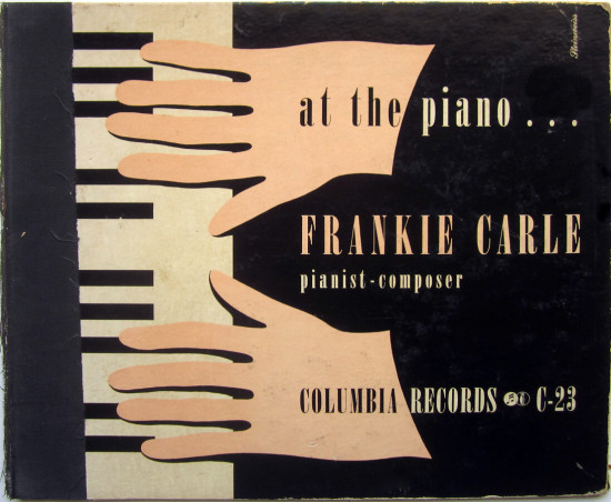
In the early 1940s at Columbia, Alex Steinweiss was doing both. The 1942 anthology of boogie woogie music featured both black and white artists, and the illustration reflects that. “Frankie Carle at the Piano” is from 1940.
_____
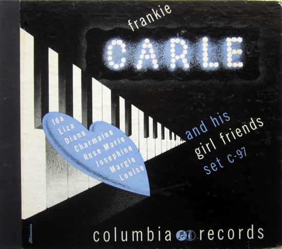
This Frankie Carle cover by Steinweiss uses the theme of songs with girls’ names, a scheme to be used many more times. Frankie Carle (born Carlone) is rightly classified as easy listening, rather than jazz. The typeface is a condensed version of Trade Gothic, very popular in these decades.
_____
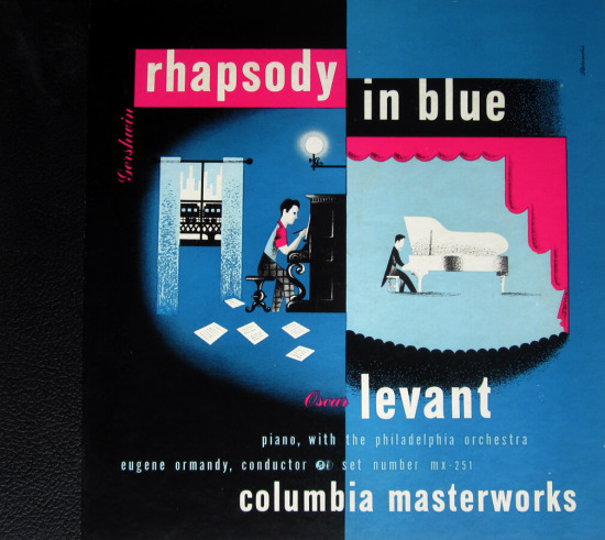
This last Steinweiss is also from the periphery of jazz. The origin of “Rhapsody in Blue” in the composer’s New York apartment is juxtaposed with the performance in the symphony hall. More Trade Gothic, I believe. I like to try to recreate Steinweiss’s type using contemporary digital versions of these 1940s typefaces.
_____
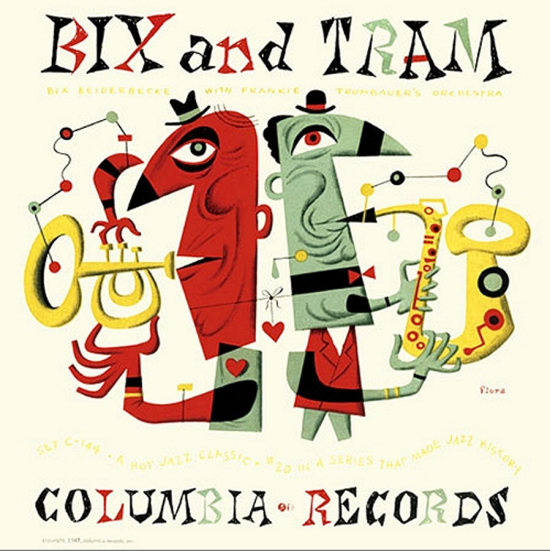
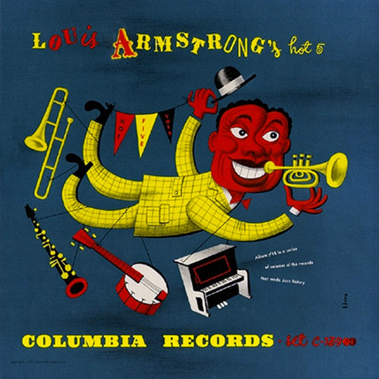
Jim Flora became the jazz specialist at Columbia in the 1940s, and his early creations are knockouts. They’re also hard to find for us collectors, so these first two covers are images found online. Columbia had an excellent reissue program for jazz classics that had been out of print for years. These Bix Beiderbecke and Louis Armstrong sides have rarely been out of print since they reappeared on 78-rpm albums in 1942.
_____
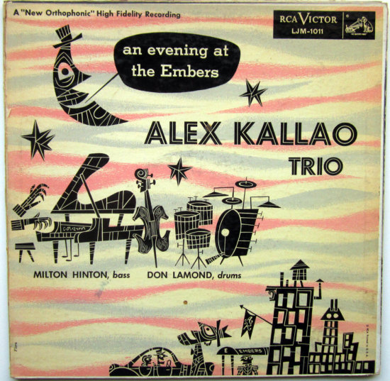
This Flora cover is from the 1950s, when he moved to RCA. Numerous live albums came out of the Embers nightclub in this decade. This and the other Flora covers made jazz seem like a lot of fun.
_____
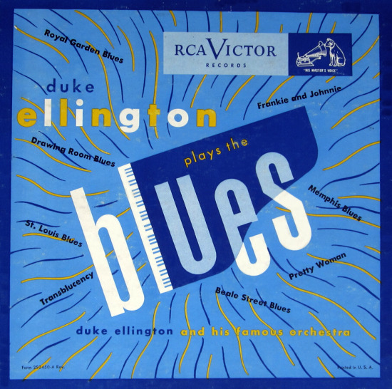
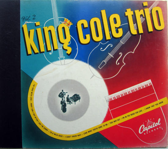
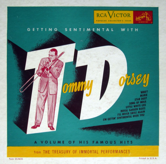
The covers below are nice but not spectacular, all uncredited, from about 1950. All of these are recordings released on 78 rpm originally, then repackaged in the new LP format. The Nat Cole cover is the most inventive.
_____
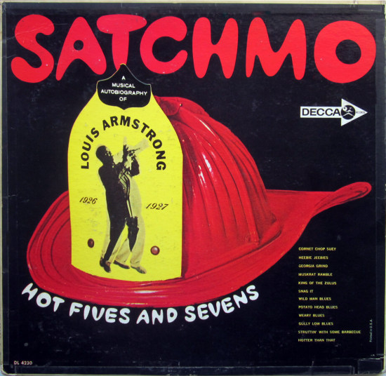
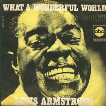
This Armstrong image is a bit clumsy by today’s standards, but I like the spirit. In what they called a musical autobiography, Louis rerecorded his early hits, interspersing commentary about his life.
_____
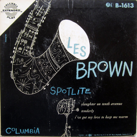
An unnamed artist at the Monogram studio produced this cover for Columbia. The informal pen-and-ink sketch has the feel of a small studio rather than the corporate ad agency.
_____
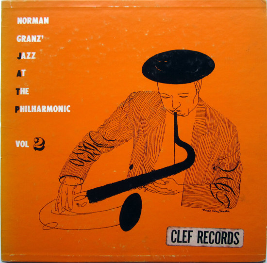
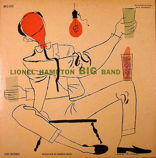
In the 1950s, small labels began to proliferate, and as Eric Kohler wrote in his excellent In the Groove: Vintage Record Graphics 1940-1960, the jazz labels came up with some of the most interesting illustrations. David Stone Martin worked extensively for the Norman Granz labels, Verve and Clef. His style ranged widely. I like the quickly sketched look of the Lester Young and Dizzy Gillespie covers. The Young album is from my collection; it has to be said that the draftsmanship wasn’t the best on this one, whereas the Lionel Hampton cover is deftly drawn and very funny.

_____
This David Stone Martin drawing of clarinets is a favorite. The hanging light bulbs are an unexpected but very effective touch. Buddy DeFranco was the definitive bebop clarinet player, and is still with us at the age of 90.

_____
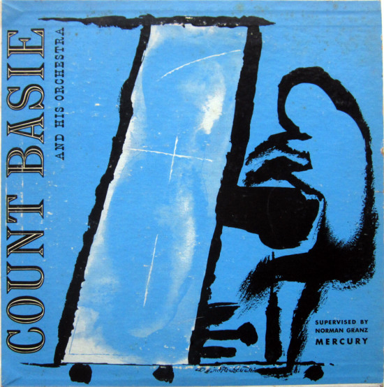
Another prominent jazz illustrator was Burt Goldblatt. Here he makes the most of the square format all the artists had to deal with. Goldblatt also made a name as a photographer and designer.

_____
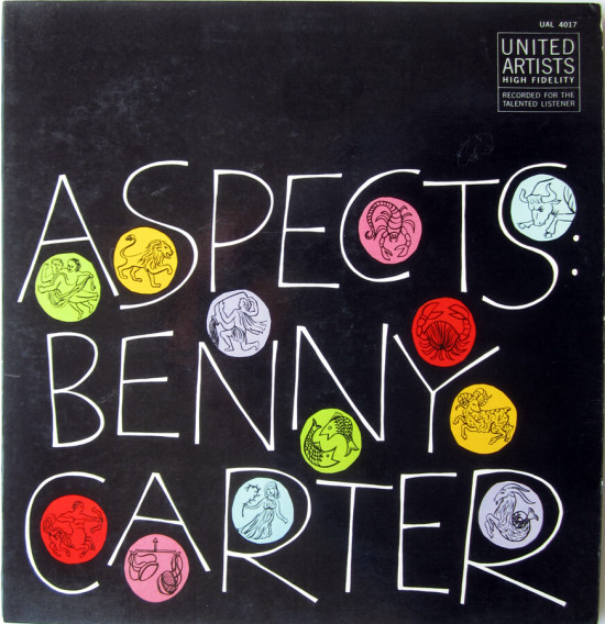
This last cover is from 1959, designed by Paul Bacon, who became a prominent book-cover designer. He also was a jazz fan, creating covers for Thelonious Monk and others. The theme of this Benny Carter album was the months of the year (“September Song,” “I’ll Remember April.”). Bacon used the signs of the zodiac along with his hand lettering. I’d highly recommend this recording, which featured top L.A. studio players and the superior drumming of Shelly Manne. Benny Carter is a special favorite of mine. I like him so much, my daughter’s middle name is Carter.
___________________________________________
In Volume 1 of “Cover Stories,” Paul shared his collection of covers by Alex Steinweiss, known as the father of the record album cover, and for many years in charge of Columbia Records’ art department.
Volume 2 focused on Columbia covers

















Really enjoyed these latest insights, Paul. Have a Merry Christmas.
Nice covers. Jazz covers are the best. Jim Flora’s covers remind me of the style of Cliff Roberts who illustrated a book I grew up with, The First Book of Jazz, with text by Langston Hughes, 1951.
Paul, enjoyed the covers some of which I can remember from my own early days of buying albums. Interesting commentary. This is a whole new area I know nothing about.
A few of my poems will be on this site sometime fairly soon. Thanks for turning me on to it.
regards, Lou
Thanks for some fascinating insights into designers of these early covers. I love Steinweiss’ early designs (as you show in Vol 1). He had excellent taste in employing the likes of Daryll Connelly, Jim Flora and Andy Warhol to do cover art for Columbia. Many of Steinweiss’ Decca covers are fabulous, too.
I think Columbia Records set a standard for record cover art. I even love many of John Berg’s covers from the 70s and 80s.
Great posts. I hope to read more!