Paul Morris is a graphic designer and writer who collects album art of the 1940’s and 1950’s. He finds his examples of influential mid-century design in the used record stores of Portland, Oregon.
In this edition, Paul features album covers of his favorite pop singers of the 1950’s
__________
This time I’ve pulled out a stack of albums by some of my favorite pop singers of the 1950s. I favor the jazz-inflected interpreters of the Great American Songbook such as Sinatra, Tony Bennett, Nat Cole, and Peggy Lee. They and other more middle-of-the-road singers showcased their star qualities on their album covers with carefully crafted photo portraits. Some of these covers look very corny now—Nat Cole rarely had an interesting cover—but some remain fresh.
_____
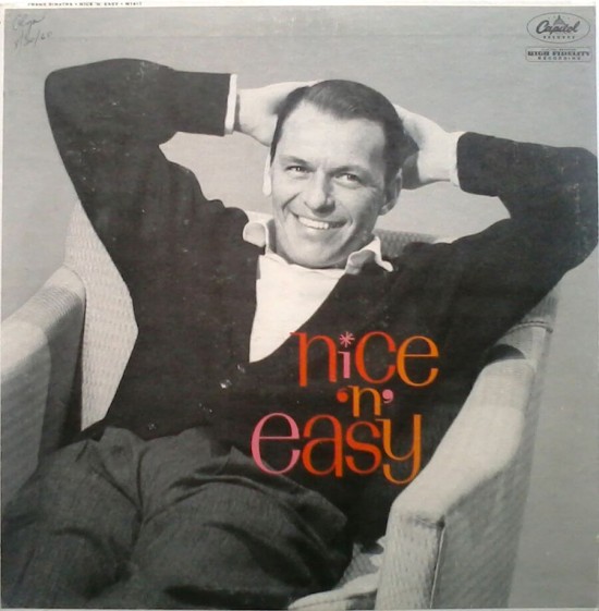
A cardigan never looked as cool as it did on Frank Sinatra on this 1960 Capitol cover. The theme of the album is a common one of the time—the music’s not exciting, the songs are all ballads, it’s relaxing. In fact the songs are beautifully arranged by Nelson Riddle and sung superbly by Sinatra, making the music fascinating and exciting to me, though in slow tempos. The photo is uncredited.
__________
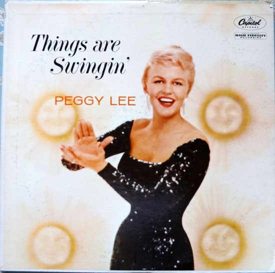
I am the number one Peggy Lee fan on my block, partly because she produced superior album covers like the two below. For Things Are Swingin’ (1958) she is pictured singing, in front of a wall decorated with yellow images of a smiling sun. This was Lee in her prime, with superior material and the best of the L.A. studio musicians, such as Shelly Manne, Pete Candoli, Milt Bernhardt and Barney Kessel.
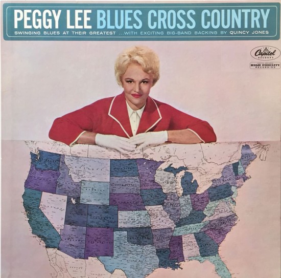
John Engstead created the “concept” photo for the 1962 Blues Cross Country, which featured arrangements by Quincy Jones and a good studio band. The concept required blues songs from different cities, and to make up 12, Lee and others came up with some forgettable titles such as “The Grain Belt Blues.”
__________
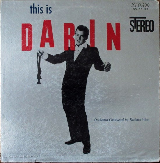
These covers by Bobby Darin and Polly Bergen take a simple approach. From 1959, This Is Darin represents the singer’s best, most swinging period. If you associate Bobby Darin only with “Splish Splash” and “If I Were a Carpenter,” you should sample this record, or That’s All or Darin at the Copa. He had the chops to step up and compete for Sinatra’s audience. Picture and design by Hollywood photographers Murray Garrett and Gene Howard.
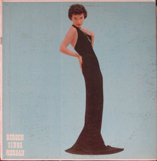
This photo of Polly Bergen is by Tony Vaccaro, a New York commercial photographer who also distinguished himself as a photojournalist in World War II. I haven’t yet listened to this album of the songs of Helen Morgan. I remember Polly Bergen as a panel member on I’ve Got a Secret.
__________
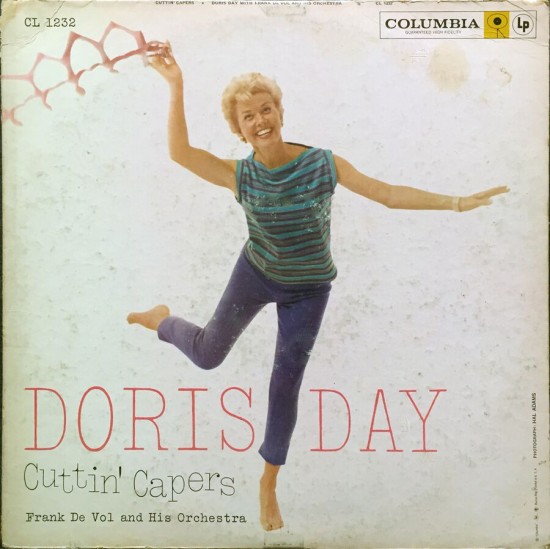
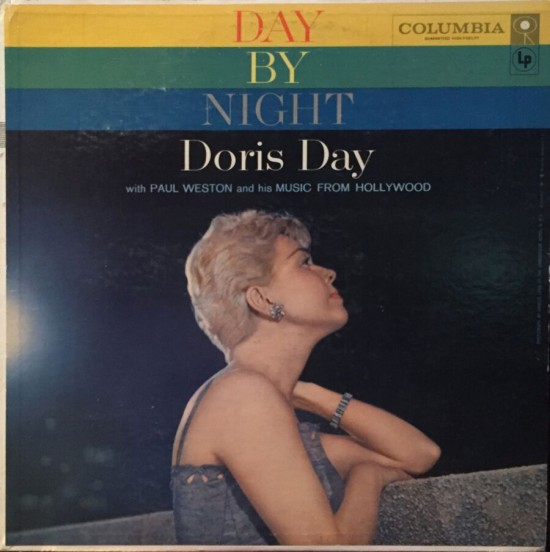
It wasn’t until a few years ago that I discovered that Doris Day, mainstay of the mainstream TV and radio of my youth, was a sure-footed interpreter of standards. Two of her better covers are, first, a photo by Hal Adams for Cuttin’ Capers (1959). For Day by Night, “a program ideal for night-time listening,” the singer was photographed by Harold Lang at the Hotel Ambassador, New York City.
__________
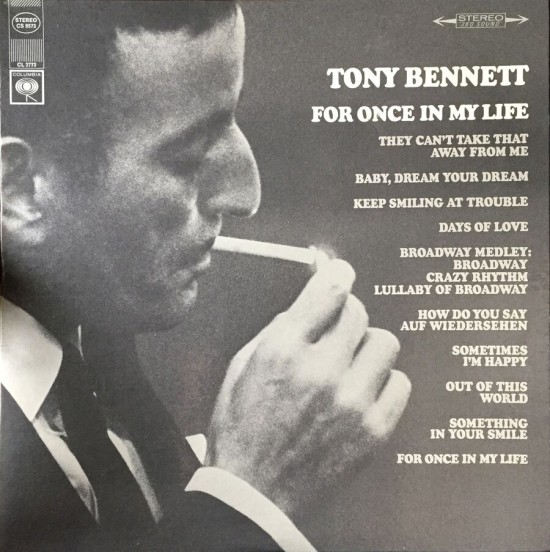
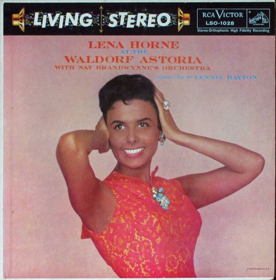
One of Tony Bennett’s cooler covers for an excellent album from his prime years was For Once in My Life. The 1967 black-and-white photo was by Larry Richman. The great Lena Horne photo is from 1958, when she was performing at the Waldorf Astoria. This is an example of a cover design being defaced by a garish Living Stereo banner on the stereo version.
__________
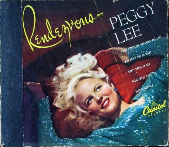
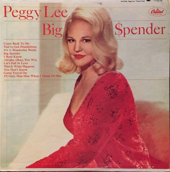
Peggy Lee was perennially photogenic, as shown in the 1949 Capitol album Rendezvous with Peggy Lee (uncredited) and on the cover of Big $pender (1966), photo by John Engstead.
__________
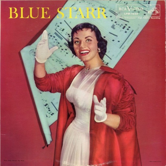
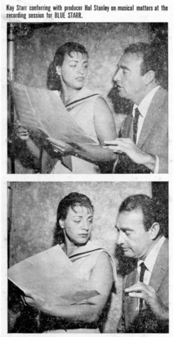
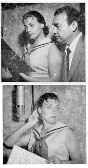
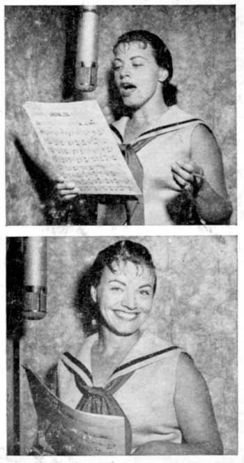
In 1985 the jazz writer Gary Giddins wrote an appreciation of Kay Starr that led me to her forgotten RCA and Capitol albums of the 1950s. Her bluesy interpretations of standards were miles away, artistically, from her jukebox hits. Will Friedwald has written that Starr’s albums from 1955 to 1962 “are among the essential treasures of American pop and jazz.” Blue Starr, a gem from 1957 is hard to find even now. The cover photo by Wally Seawell shows that you can sing the blues in white gloves. On the back of the album are a series of semicandid studio shots. Producer Hal Stanley, who must be blamed for adding a cheesy vocal chorus to half the songs, is shown conferring with the singer. Kay Starr seems to feel he’s invading her personal space.
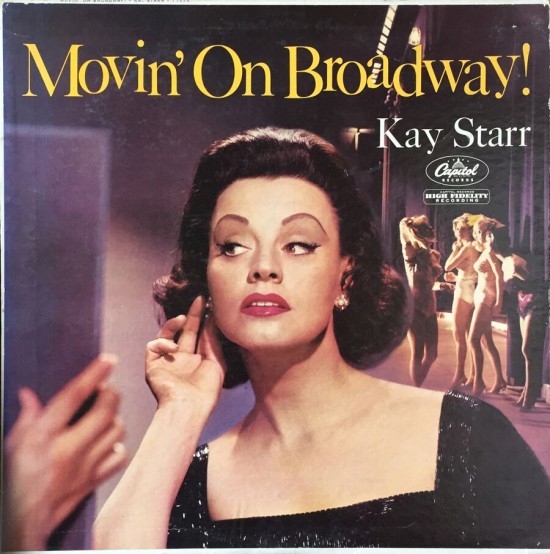
For the very swinging Movin’ on Broadway, 1960, the uncredited photo shows Starr offstage at a show that included chorus girls. This is curious if you know that she had no career on the stage; she was merely singing show tunes.
__________
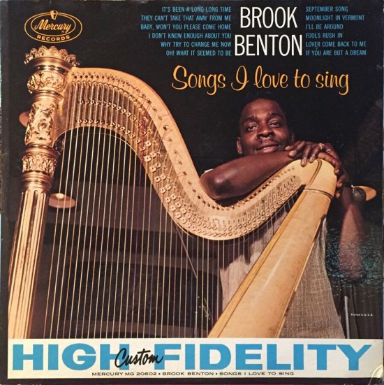
Brook Benton made this album in 1960 and there was a harp in the orchestra. It was decided to use it in the photo, I’m guessing. How do you pose with a harp and not look silly? Larry Adler was a well-known harmonica player with jazz pretentions.

__________
The last pop photo cover is The Piano Artistry of Jonathan Edwards, a humor “project” of arranger Paul Weston and his wife the prominent vocalist Jo Stafford. If you look twice at the pianist you’ll be clued that it’s a satire. The music within combines Weston’s pastiches of bad pop piano styles with Stafford impersonating a hack singer who frequently veers off key. I imagine that the people who appreciated Lenny Bruce might have gone for this humor; it can’t have been a large club.

__________
Next time: Westminister, a classical label with superior cover art.
__________
In Volume 1 of “Cover Stories,” Paul shared his collection of covers by Alex Steinweiss, known as the father of the record album cover, and for many years in charge of Columbia Records’ art department.
Volume 2 focused on Columbia covers
Volume 3 featured jazz illustrations from the early years of the record album
Volume 4 revisited the 1950’s with images of fans holding and enjoying their albums
Volume 5 explored the work of Alex Steinweiss when he used the pseudonym “Piedra Blanca”
Volume 6 featured teenagers of the 1950’s enjoying their music
Volume 7 featured Steinweiss album covers from his prime period — the late 1940’s and early 1950’s
Volume 8 featured a “disturbing” and fascinating trend in 1950?s album art — Records on the Floor!
Volume 9 featured a selection of RCA Victor album covers from Paul’s collection
Volume 10 featured a selection of covers by Curt John Witt, the prolific illustrator for mid-century budget record labels
Volume 11 featured a selection of “glamour girl” covers
Volume 12 featured the “late Columbia” era of master designer Alex Steinweiss
Volume 13 focused on Everest Records, the last of several new labels that Alex Steinweiss helped launch
Volume 14 Paul shares some of his personal jazz record collection, concentrating on the lesser known and sometimes quirky covers that emphasize photographs
Volume 15 took a look at the art of London Records
Volume 16 Paul shared some jazz covers from the 1950’s
Volume 17 looked at the album cover art of Erik Nitsche, a pioneer of modern design
Volume 18 featured album covers picturing designer furniture
Volume 19 showcased choice examples of Decca Records
Volume 20 featured examples of vintage kitsch on several themes
Volume 21 featured samples of Alex Steinweiss album covers, created during the early 1940’s, at the beginning of his career















back, back, back we go
Hey, Paul. I always enjoy your posts. LP art evolution during this era was really amazing…from the simple, urbane, minimalistic sleeve photos of the 50’s to the more personality driven covers of the early 60’s. A fun time. Thanks!
top notch, as always. –Al