Paul Morris is a graphic designer and writer who collects album art of the 1940’s and 1950’s. He finds his examples of influential mid-century design in the used record stores of Portland, Oregon.
In this edition, Paul features samples of Alex Steinweiss album covers, created during the early 1940’s, at the beginning of his career
__________
I’m back after a hiatus with scans of Alex Steinweiss album covers from the early forties. If you have recently stumbled on this column, I can tell you the focus is on LP cover art from 1940 to 1960, when top illustrators and graphic designers worked for record companies.
A pioneer in the field was Steinweiss at Columbia Records. The current selection shows a sample of his work at the beginning of his career, 1940 to 1942. He was hired at the age of 23 as art director of the company recently taken over by William Paley.
_____
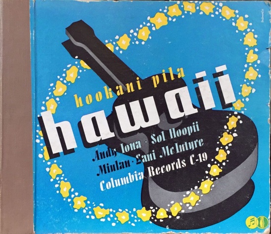
These covers, only one with a photo, were part of a productive period when it seemed he illustrated every classical release. For Larry Adler’s collection he used just blue to enhance a soulful photo of the harmonica virtuoso. The Hawaiian music set from 1940 uses one more color for the lei. For those who haven’t seen a 78-rpm album, the bands of fabric on the left side are the binding of the album, which would have 3 to 6 sleeves for the records.

.
__________
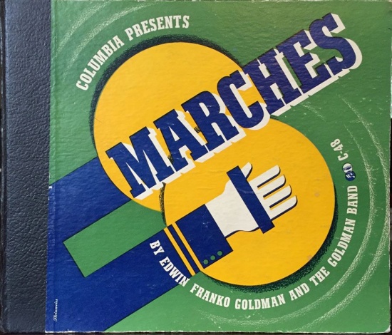
The covers for the Kern show tunes and Edwin Franko Goldman’s marches are in a simple and bold poster style that characterized Steinweiss’s early 1940s work. In a book on Steinweiss Steven Heller wrote about Columbia Presents Marches, “Steinweiss’ goal with every cover was to express the feeling of the music. For this book-bound album of marching music, he used shapes as rigid, simple, and regular, with colors as loud, shallow, and uncomplicated, as a marching tune.” My high school band teacher Truman Youngberg used to heap praise on Goldman’s band; I really should listen to this some day.

__________
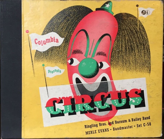
The following three illustrations show the artist’s attempts to capture the spirit of rhumba, polka, and circus music. The first one is the most successful. The bandleader Xavier Cougat was a talented cartoonist, and his funny self-portrait fits perfectly in the square frame of the album cover. The dual byline perhaps is one of a kind for Steinweiss.


__________
Cante Flamenco from 1941 is notable for its simplicity, the boldness of the lines, and the lilt of the curving arms. This is one of several in this group that were included in the 2011 Steinweiss book by Kevin Reagan.

__________
This early illustration for chamber music by Alec Wilder is charming in spite of the trite symbolism and the bad condition of my copy. The octet was an attempt at classical-jazz fusion that included Mitch Miller on oboe. It may have been an integrated group, explaining the hands of different hues, and presumably the lyre and drum represent classical and jazz.

__________
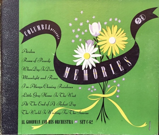
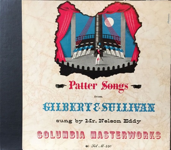
These 78 album covers from about 1941 are more routine efforts. His output was very high—at least 50 a year, probably more.
__________
For Stephen Foster Steinweiss used just green and pink on his drawing of the Southern couple and the miniature image of the mansion. This one also was in the Reagan book, on which the artist collaborated.
__________
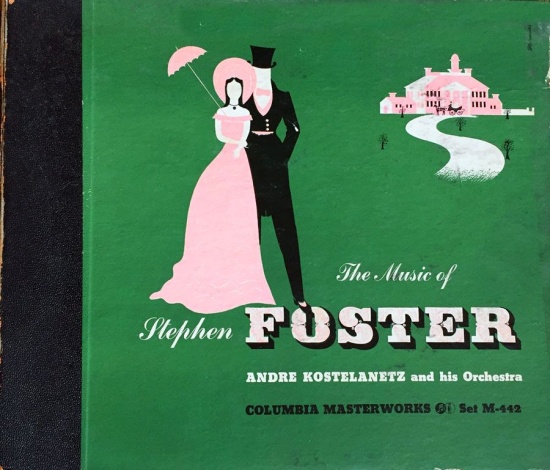
The arresting and boldly colored 1942 cover for the Grand Canyon Suite is a classic, much anthologized. It apparently inspired a very similar, uncredited illustration for an RCA album of the 1940s. Kevin Reagan wrote, “Particularly charmed by the donkeys portrayed in the Grand Canyon Suite’s best-known movement, “On the Trail,” Steinweiss used them as a motif to illustrate this cover.”

__________
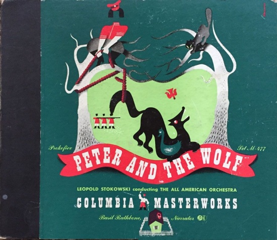
Also in several surveys of graphic art is this witty and fun cover for Peter and the Wolf in 1941. Classical music interested and moved Steinweiss the most, and here the various figures illustrate incidents in the work most aptly. Again there are several large figures in the foreground and a miniaturized house below.
__________
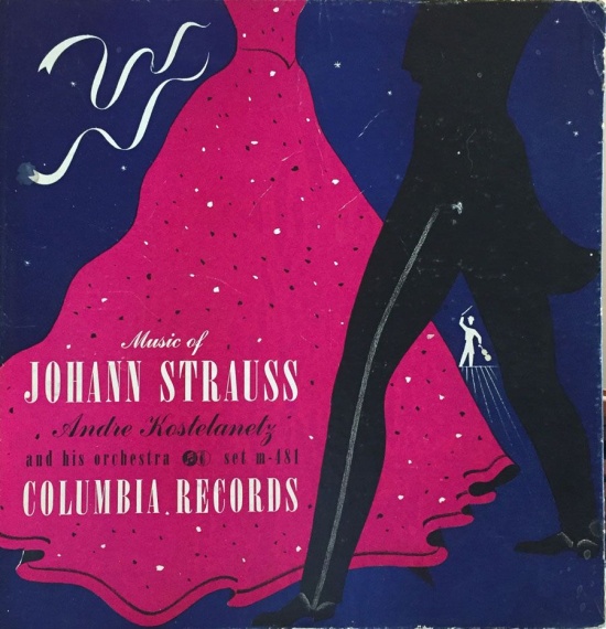
On this illustration of a waltzing couple, probably from the early 1940s, there are two solid colors—nothing screened—in addition to the solid black. The blue of the background turned out rather dark. The figure of the conductor will pop up on numerous other covers.
__________
The last example of the day-to-day work of Alex Steinweiss is a richly hued view from a window for Debussy’s take on Spanish music. The stick pin is similar to the ones in Alec Wilder cover above. A technical note about this product of the 1940s when four-color printing was prohibitively expensive: the red and blue plates here contain screens, i.e. patterns of dots that can show gradations of colors, as in the sky. The yellow for the church is a solid color.
These poster-like covers show what Steinweiss the commercial artist, in his mid-twenties, could produce on what must have been a grinding schedule. They strongly influenced other creators, particularly in this first decade of record album art. In a few years Steinweiss would add layers of irony and reference, done in more overtly Modernist styles . (My column in July 2014 has examples of the “European” style.)

*
Next time: Pop singers of the 1950s, in which I will explain how much I’m into Doris Day.
__________
In Volume 1 of “Cover Stories,” Paul shared his collection of covers by Alex Steinweiss, known as the father of the record album cover, and for many years in charge of Columbia Records’ art department.
Volume 2 focused on Columbia covers
Volume 3 featured jazz illustrations from the early years of the record album
Volume 4 revisited the 1950’s with images of fans holding and enjoying their albums
Volume 5 explored the work of Alex Steinweiss when he used the pseudonym “Piedra Blanca”
Volume 6 featured teenagers of the 1950’s enjoying their music
Volume 7 featured Steinweiss album covers from his prime period — the late 1940’s and early 1950’s
Volume 8 featured a “disturbing” and fascinating trend in 1950?s album art — Records on the Floor!
Volume 9 featured a selection of RCA Victor album covers from Paul’s collection
Volume 10 featured a selection of covers by Curt John Witt, the prolific illustrator for mid-century budget record labels
Volume 11 featured a selection of “glamour girl” covers
Volume 12 featured the “late Columbia” era of master designer Alex Steinweiss
Volume 13 focused on Everest Records, the last of several new labels that Alex Steinweiss helped launch
Volume 14 Paul shares some of his personal jazz record collection, concentrating on the lesser known and sometimes quirky covers that emphasize photographs
Volume 15 took a look at the art of London Records
Volume 16 Paul shared some jazz covers from the 1950’s
Volume 17 looked at the album cover art of Erik Nitsche, a pioneer of modern design
Volume 18 featured album covers picturing designer furniture
Volume 19 showcased choice examples of Decca Records
Volume 20 featured examples of vintage kitsch on several themes













it’s fun to go back in time; polkas, Stephen Foster, Flamencos …
A very distinctive collection of covers!