Paul Morris is a graphic designer and writer who collects album art of the 1940’s and 1950’s. He finds his examples of influential mid-century design in the used record stores of Portland, Oregon.
In this edition, Paul focuses on the art of Columbia
__________
Alex Steinweiss, the subject of my last column, started his career as head of the art department at Columbia Records, one of the three largest companies at the time (RCA and Decca were the others). Columbia continued its success throughout the period I’m looking at. Their covers vary in style, but they usually shared a feel of quality, an uptown New York esthetic. In varying degrees they show the influence of the boss. The later Columbia look had a similarly classy look. As photographers replaced the artists in the 50’s, Columbia could afford to use the top fashion photographers from Madison Avenue.
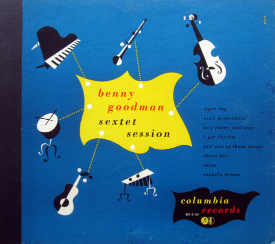
The first example is a 1946 work by George Maas, a native of Kansas who worked later in designing book jackets and album covers for Mercury. The drawings of the instruments in Benny Goodman’s sextet are delightfully off-kilter. If you haven’t heard these recordings, you’re in for a treat. They include the early, groundbreaking work on electric guitar by Charlie Christian.
_____
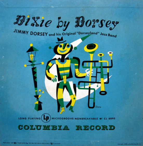
The brightly colored, whimsical paintings of Jim Flora first appeared on Columbia releases in 1942. A jazz fan who admired Diego Rivera and the surrealist painters, Flora took over the jazz covers while Steinweiss concentrated on classical. Later in the 50’s Flora created jazz covers for RCA. I’d like to include more Flora work, but his albums are hard to find. I’m guessing that in the 40’s classical music outsold jazz.
_____
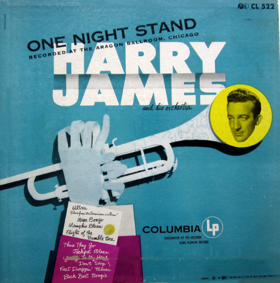
One Night Stand by Harry James is from about 1952, and is credited to “Becker-Horowitz/Monogram.” Apparently Monogram was a design studio that frequently did work for Columbia. The hands and trumpet are painted to look like a paper sculpture. By this time photographs of the artists were becoming dominant in album cover design, and they saw fit to drop in James’s picture. Steinweiss would have said no to that photo.
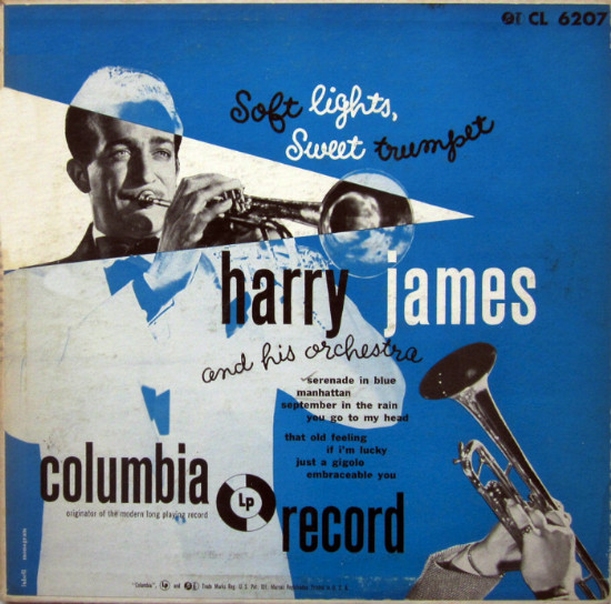
The other Harry James cover makes more effective use of photographs. It’s credited to a designer named Lubell, about whom I know nothing. The script lettering is not the Steinweiss Scrawl, but you can tell designers liked the informal note struck by the combination of hand lettering and type.
Soft Lights, Sweet Trumpet is a 10-inch LP. For about five years, from 1948 to 1953, there were dueling record formats. Some recordings were released in 78, 45 and 33 rpm versions. There were both 10-inch and 12-inch LPs, and there were albums made up of several 45’s. This reminds me of today when musicians advertise recordings as available as download, CD, and vinyl.
_____
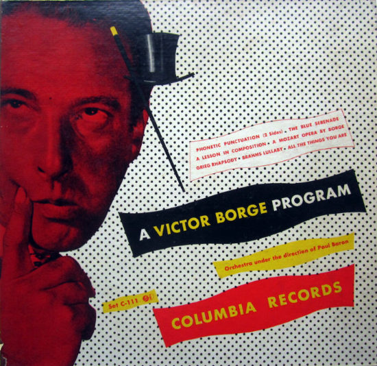
This Victor Borge cover gets points for strangeness. I wonder if the color of the pianist’s face is what the designer intended. I’m not familiar with Borge’s playing, but I know he combined comedy and classical music, like Peter Schickle, so fans wouldn’t be surprised by a goofy design. I remember as a child that my mother especially liked it when Borge was a guest on the Jack Parr show. She liked his jokes but impressed upon me that he was a legitimately good pianist.
_____
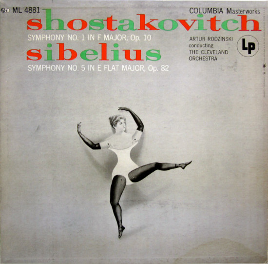
The Shostakovich and Sibelius cover makes me wonder about the meeting when the graphic artist presented his idea to the art director. Neither symphony is about dancing. An ocean of empty space surrounds the image. The title uses Christmas colors. However the uncredited artist got it through, I love it. I think I know how it was done: a photo of a dancer was cut out and the portions we see were connected with pins. This was photographed and a shadow was airbrushed in. Questions: In what ballet does the dancer wear gloves like that? And is it just me, or does her leotard look a lot like an undergarment?
_____
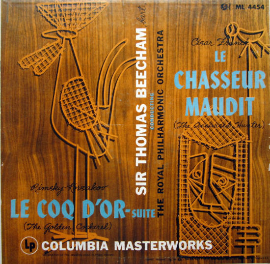
An album that combined two classical works was a challenge for the designer. Often the musical works had no similarity, and an awkwardly joined pair of images resulted. The rather elaborate composition on this Royal Philharmonic recording uses photographs of wicker sculptures set against a woody background that is a bit distracting. The artist, credited as Stanley/Monogram, chose a bird theme to unify the pictures. “The Golden Cockerel” does feature a magical rooster, and here “The Accursed Hunter” of César Franck’s symphonic poem has speared a songbird. The hunter is supposed to look troubled.
_____
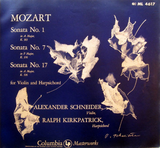
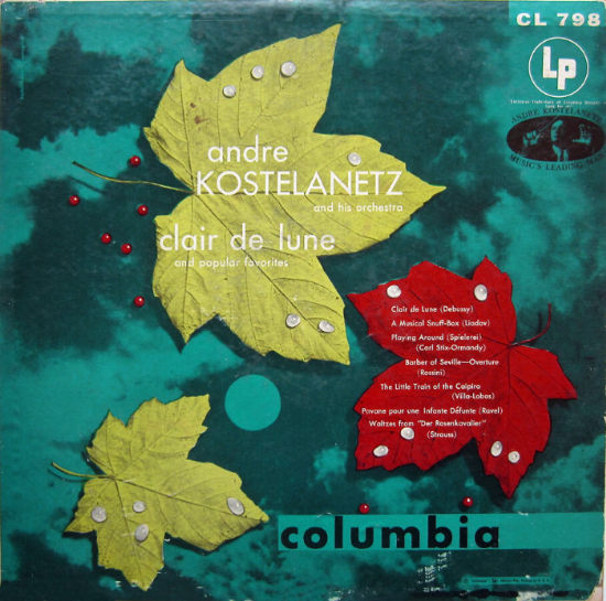
These two Columbia covers make use of photographs cleverly manipulated in the darkroom. The designer of the Mozart sonatas cover has sketched over negative images of leaves. His signature is hard to read, but a little Googling led me to Pavel Tchelitchew, a fascinating artist born in Russia in 1898 who painted portraits of Gertrude Stein and Edith Sitwell. In the Andre Kostelanetz cover for Clair de Lune, which means “moonlight,” three leaves are placed on a night sky. I think the drops of water and the moon were painted in. Designed by “Becker-Horowitz/Monogram.”
_____
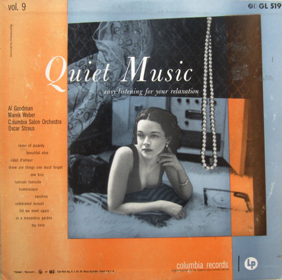
The “Quiet Music” cover is interesting in several ways. The credit reads “Camerage by Strimban-Willig,” the handle of Jack and Bob Strimban, and Sam Willig, who also did magazine covers in the 50’s. I have one other cover with a photo collage credited to them. The picture of the model lying on a shag rug in front of the hi-fi set has a 20’s look. I hope that’s an album cover at her right — records on the floor are one of my obsessions. Images of lace and a patterned curtain are overlain, and a string of pearls, synonymous with elegance at the time, is dropped on top. The cover uses three key marketing terms for easy listening music: quiet, easy, and relaxation. The liner notes add the terms pleasant, familiar, and soothing.
_____
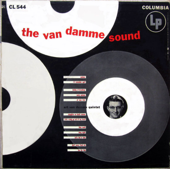
The last example, by Henry Wolf, is from the early 50’s. Pairing geometric, “modern” designs with modern jazz artists who were said to play abstractly was popular. Wolf was art director of Esquire magazine in the 50’s, and later worked at the ad agency McCann Erickson, the firm that bought out Sterling Cooper in Mad Men. Accordionist Van Damme looks out from what could be the center hole of a 45. The song titles are set in ten-point condensed type — extremely hard to read. Records by Art Van Damme appear frequently in the used bins, so I assume he had some success, but the jazz accordion never caught on.
_____
This has been a very brief trip through the huge Columbia catalog. A final accolade to Columbia: they were very good about crediting their designers, something RCA and Decca rarely did. This makes the sleuthing work much easier, for one thing, and it gives much-deserved credit to the creators of these unique artworks.
*
__________
In Volume 1 of “Cover Stories,” Paul shared his collection of covers by Alex Steinweiss, known as the father of the record album cover, and for many years in charge of Columbia Records’ art department.


















I’m Jack Strimban’s daughter, very interesting! Do you have the 1952 cover of “The story of the Music Box.”?
Don’t have that album. The other Camerage cover I have is “Hi-Fireworks” from 1953, one of the first albums by Ferrente and Teicher. Your father’s work was fascinating!
Damn’t I’m also a graphic designer named Paul Morris. I’m way too generic and don’t even collect album covers.