Paul Morris is a graphic designer and writer who collects album art of the 1940’s and 1950’s. He finds his examples of influential mid-century design in the used record stores of Portland, Oregon.
This edition focuses on Everest Records, the last of several new labels that Alex Steinweiss helped launch
__________
Everest Records was the last of several new labels that Alex Steinweiss helped launch, beginning in 1958. This was late in his career, when he freelanced for several labels while also doing magazine work. He designed the logo, disc label, and other materials.
The Richard Strauss cover below is one of his best efforts, and reminiscent of his earlier work for Columbia. This collage used the composer’s portrait to allude to the autobiographical elements of the tone poem. One section is called “The Hero at Battle,” so armor is appropriate. The background was printed in a silver ink that doesn’t photograph quite right.
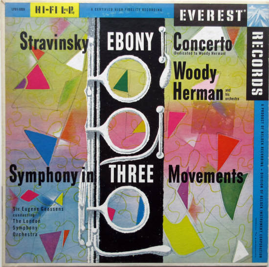
The Stravinsky Ebony Concerto, from 1958, also shares some design elements with earlier covers, but the colors are up to date. The large yellow and blue logo bars are intrusive on some of the Everests, but in this case Steinweiss took care to harmonize his color palette with the logo.

__________
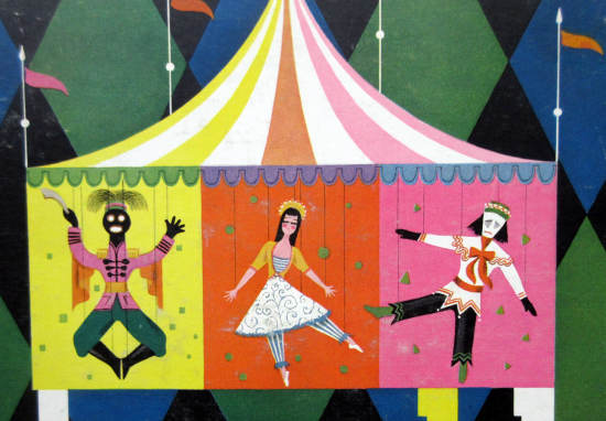
This label emphasized more modern classical works, and here Stravinsky’s Petrouchka is given a charming illustration. The ballet is meant to evoke a Russian country fair; Petrouchka was a marionette. Here the logo bars have shrunk to a more tasteful size.

__________
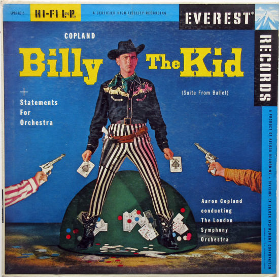
Many covers were based on photographs and Steinweiss’s role was that of art director for the shoot. The exciting Billy the Kid shows the protagonist caught cheating at cards (not one of the incidents portrayed in Copland’s ballet). The model wears striped pants never seen in cowboy country and holds oversized cards. The card table he stands on is curiously folded.
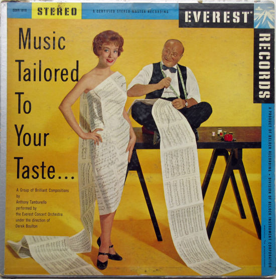
For Music Tailored to Your Taste he created a dress out of sheet music. This image shows on the edges the silver-coated paper that initially was used on the backs of the covers. The type looks old-fashioned for 1958; it’s like a condensed Trade Gothic but with a small x-height: the lowercase letters are much shorter than the capitals.
__________
The subtle and finely detailed illustration for Prokofiev’s 5th must have been highly esteemed by Steinweiss, as it is one of the few Everest covers he included in the first book about his work. The symphony had no particular program, so I’m unable to explain the figure in classical toga holding a lyre and a face mask. The literal meaning of the next cover, for Arthur Benjamin piano works, also is elusive. The bust on a column, the vertical piano keyboard, and the sail-like object appear to have been photographed through shower glass.
More about the label: this was one of many companies proclaiming their superior technology and sound. Everest’s claim to fame was the use of 35mm film rather than the narrower tape normally used. This was said to give the engineers three times the space normally available. Every album included several dense paragraphs extolling “the most advanced ideas in acoustics for recording.” The label was a division of an electronics company: “The parent company is considered one of the world’s finest precision electronic facilities and is engaged chiefly in the development and production of ultra-secret military devices.” The military-industrial-recording complex?


__________
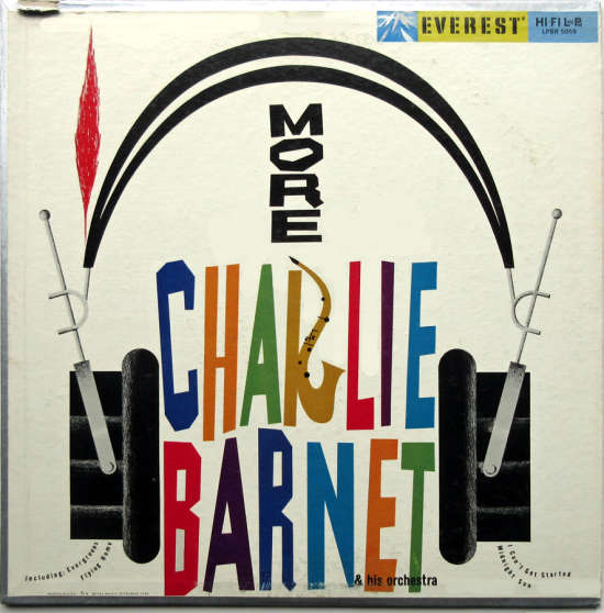
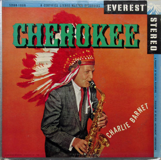
The label recorded a fair amount of jazz. Here are two Charlie Barnet covers, the first one very similar to the early Steinweiss style, except for the crazy type. The “R” is particularly witty. The silly Cherokee photo came out about a year after the equally silly Sonny Rollins cover for Way Out West.
__________
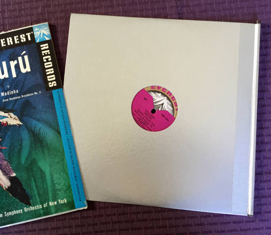
Besides the silver paper stock, Everest tried a unique packaging idea. The inner sleeve was made of sturdy silver-coated cardboard with a dowel handle attached to the edge. I don’t know how many records were produced with the dowel, but few survive today in the used-LP bins. They must have been expensive and did not last long; the label itself lived only three years.
The Villa-Lobos piece was based on a Brazilian folk tale about an enchanted bird. If you look closely, you’ll see that the bird appears to be a photograph, superimposed on the jungle scene. My theory is the designer took a stuffed bird and decorated it with multi-colored feathers.

__________
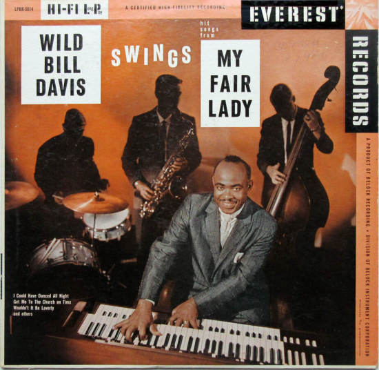
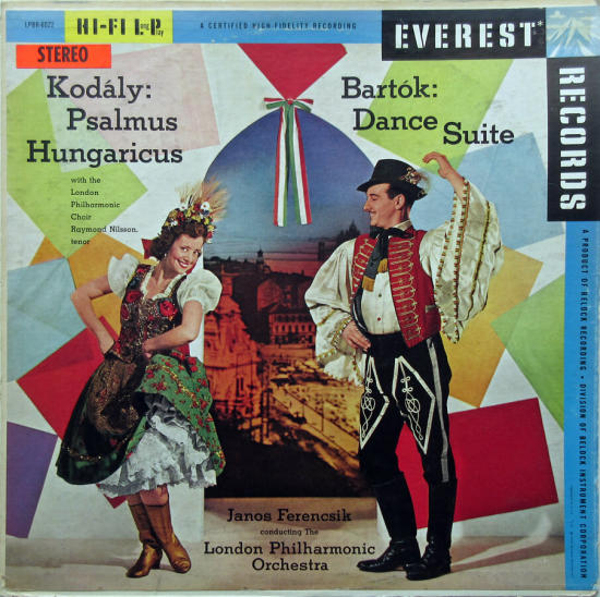
Two more photo-based covers from my collection. The Wild Bill Davis has liner notes by Nat Hentoff. The Kodály and Bartok works were both based on Hungarian folk music; the central photo must be Budapest.
__________
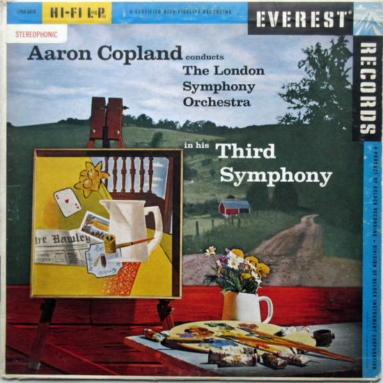
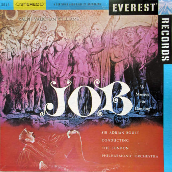
The Copland cover below is a still life within a still life; the painting on the easel evokes Braque and Gris. The Ralph Vaughan Williams record is a rare attempt to use William Blake as album art. The work was born in the 1920s when Williams was commissioned to create a ballet based on Blake’s illustrations for the Book of Job. That’s Satan reclining in the foreground. Above, Job and his family before their tribulations began, as painted by Blake.
For more Everest images by Steinweiss, click here. Ken Halperin believes the Everest art is second only to the late-forties Columbia work in the master’s career.
__________
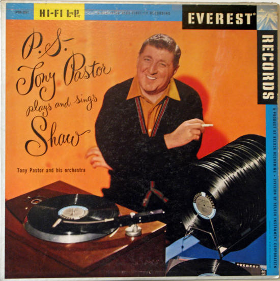
Last is Tony Pastor, aging big band leader paying tribute to Artie Shaw. Not from my collection, but the record rack intrigued me — I remember these from my younger days. It’s funny that an audiophile label would depict their records stored so carelessly. Tony has a fancy turntable, but his Everest disks are collecting dust, scratches, and possibly cigarette ash in that rack!
*
Next time, jazz and pop photo-based covers from the 1950s
__________
In Volume 1 of “Cover Stories,” Paul shared his collection of covers by Alex Steinweiss, known as the father of the record album cover, and for many years in charge of Columbia Records’ art department.
Volume 2 focused on Columbia covers
Volume 3 featured jazz illustrations from the early years of the record album
Volume 4 revisited the 1950’s with images of fans holding and enjoying their albums
Volume 5 explored the work of Alex Steinweiss when he used the pseudonym “Piedra Blanca”
Volume 6 featured teenagers of the 1950’s enjoying their music
Volume 7 featured Steinweiss album covers from his prime period — the late 1940’s and early 1950’s
Volume 8 featured a “disturbing” and fascinating trend in 1950’s album art — Records on the Floor!
Volume 9 featured a selection of RCA Victor album covers from Paul’s collection
Volume 10 featured a selection of covers by Curt John Witt, the prolific illustrator for mid-century budget record labels
Volume 11 featured a selection of “glamour girl” covers
Volume 12 featured the “late Columbia” era of master designer Alex Steinweiss












all very unique, what a wonderful collection
all very unique, what a wonderful collection