Paul Morris is a graphic designer and writer who collects album art of the 1940’s and 1950’s. He finds his examples of influential mid-century design in the used record stores of Portland, Oregon.
This edition features the “late Columbia” era of master designer Alex Steinweiss
__________
Alex Steinweiss, the master, is my focus this time. Imagine a period in the artist’s life in 1950 and 1951 when his time with Columbia Records was drawing to a close. He had started in 1939 and was to leave the company in 1953, after designing a thousand or more album covers. I’ve pulled out a sequence of records, most classical, in order of catalog number, which I presume makes them roughly chronological.
As month followed month, Steinweiss produced cover after cover, maintaining a high level of quality. Always square, always twelve inches, always making the important information visible in the top third. Surely he must have asked himself, “What can I do for yet another Beethoven piano concerto?” But he didn’t often falter, and this “late Columbia” period produced some memorable gems.
In general look for more complexity in the compositions when comparing these with the 1940s work. Instead of a bold, poster-like simplicity for 78 albums, designed to catch the shopper’s eye on a shelf, these long-playing records were displayed in bins where customers could flip through them and pick them up.
In the first two examples below the artist faced up to the Beethoven piano concertos. Both designs use a grand piano placed diagonally.
On the second one the whole composition balances on the corner of the piano. The Steinweiss Scrawl does most of the type work; he had to pay the typesetter for only nine characters of Bodoni. This cover was chosen for inclusion in the definitive book on Steinweiss by Kevin Reagan, so the artist must have remained pleased with it. I can never read the pianist’s name without recalling a poem by Marianne Moore in which she wrote that “The mind is an enchanting thing … like Gieseking playing Scarlatti.”


__________
This cover for Swan Lake also was included in the book I referred to. It’s notable for the hand ornamentation added to the large display type. The dancer is Nora Kaye, an original principal of the American Ballet Theater.

__________
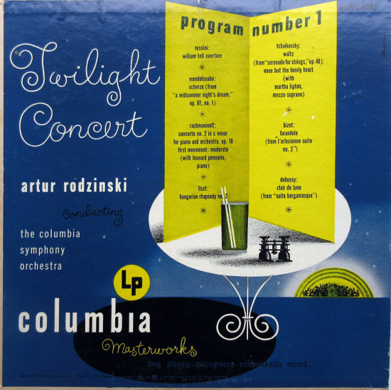
Continuing in catalog order, Twilight Concert depicts a scene from an outdoor concert, with the artist’s distinctive shadows on the table. All the condensed type, possibly a News Gothic, is lowercase, something many designers tried at one time. There’s what I believe is a typo on the program. In the right column, the quote mark before l’arlesienne suite no. 2 is placed too high—it looks like it was pasted in at the last minute.
__________
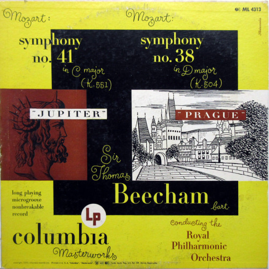
This cover for two different symphonies required two images; I’d bet the designers dreaded getting assigned a two-in-one. Here Steinweiss combines his own drawing of Prague’s Charles Bridge with an image of Jupiter from his cache of old engravings. It hangs together nicely. Bodoni is the only typeface used.
__________
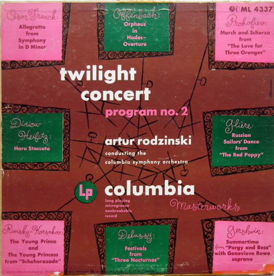
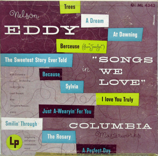
A second Twilight Concert called for multiple titles by multiple composers, so each one got a music stand. Not his best cover, but a balanced, well-wrought composition. All the type is Futura. Following this he was assigned the uninspiring Nelson Eddy. The composition places a bunch of rectangles over a net of playful Steinweiss tendrils. That color palette would have seemed bright and up-to-date in 1950.
__________
The Prades Festival was founded by Pablo Casals in the town in the French Pyrenees where he had taken up residence. A Gothic tympanum, probably an engraving, dominates this design. The upper photo shows Prades. This recording came from the first year of the festival, now known as the Pablo Casals Festival. Program note: Isaac Stern, violin star of this record, was married for a time to Nora Kaye, the ballerina pictured above.
In this work, as in others in the late Columbia years, we have come a long way from the simpler, poster-like compositions of the early 1940s. This art wouldn’t grab your eye from across the store; it requires a closer look and assumes you want to read the credits in some detail. On the back were liner notes by experienced critics.

__________
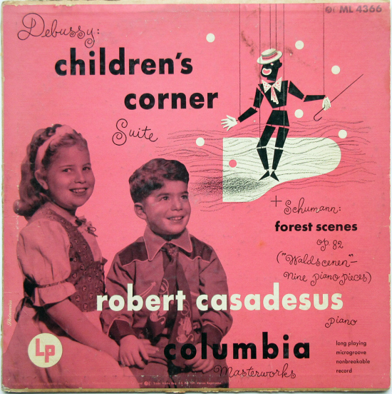
This album is the third of this series to be chosen for the Steinweiss coffee table book, likely not because of the outstanding design but because the designer used his children as models. The image of the marionette in blackface sent me on a research quest, in which I read about “Golliwog’s Cakewalk,” one of the Debussy pieces in the Children’s Corner Suite. A golliwog was a black character in 19th century children’s books, reminiscent of American minstrel characters. Steinweiss gives him a cane and straw hat for his ragtime-influenced cakewalk.
__________
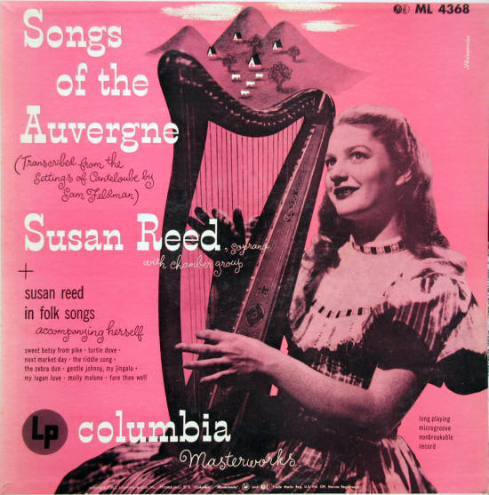
French folk songs apparently didn’t prompt the best design here, on a cover using a pink background that makes me queasy. The drawing of the pastoral scene from the Auvergne, placed atop the harp, is quite unnecessary. This is from 1951, when he designed dozens, perhaps more, of album covers for Columbia. He had administrative duties as well, so I fully sympathize when I see a competent but not exciting work like this.
__________
Perhaps it was the next week in 1951 that he turned to the Beethoven violin concerto, and was inspired to create a stunner. The large Clarendon type gives a poster appeal to the violinist’s name. In other compositions Steinweiss has used the form of the scroll and the tuning pegs; here he gives us a close-up of the bridge. Within this frame is a woodsy scene with a strolling gentleman.


__________
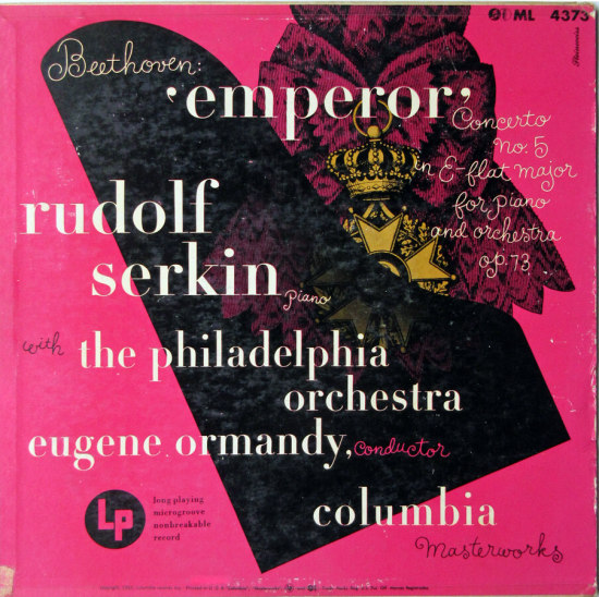
The cover below for the Emperor Concerto combines the oft-used crown picture with the also familiar piano balanced on a diagonal. It’s skillfully put together, but the piano image was supposed to allow some of the crown to show through, and the printers didn’t pull that off.
__________
Two of Tchaikovsky’s well known works receive literal treatments in the small boxes. The sketches show Romeo at Juliet’s window and Dante conversing with Francesca in the second circle of hell, where she was being punished for carnal sins. A large tree effectively ties together the pink boxes.
This is Columbia ML 4381, from 1951. I began this unselective series with Claudio Arrau playing Beethoven, ML 4302. Besides these from my collection, Steinweiss would have designed many other covers of the numerical series represented here. They demonstrate the creative heights this artist could climb while adhering to a crushing production schedule at a large record company.

*
Next time, Paul explores some of the covers of Evererst Records, the short-lived jazz and classical label that Steinweiss helped to launch
__________
In Volume 1 of “Cover Stories,” Paul shared his collection of covers by Alex Steinweiss, known as the father of the record album cover, and for many years in charge of Columbia Records’ art department.
Volume 2 focused on Columbia covers
Volume 3 featured jazz illustrations from the early years of the record album
Volume 4 revisited the 1950’s with images of fans holding and enjoying their albums
Volume 5 explored the work of Alex Steinweiss when he used the pseudonym “Piedra Blanca”
Volume 6 featured teenagers of the 1950’s enjoying their music
Volume 7 featured Steinweiss album covers from his prime period — the late 1940’s and early 1950’s
Volume 8 featured a “disturbing” and fascinating trend in 1950’s album art — Records on the Floor!
Volume 9 featured a selection of RCA Victor album covers from Paul’s collection
Volume 10 featured a selection of covers by Curt John Witt, the prolific illustrator for mid-century budget record labels
Volume 11 featured a selection of “glamour girl” covers















I fell in love with Steinweiss’ covers for Columbia Records, too. My personal favourite (though it’s difficult to choose from the aweinspiring number he was responsible for) is his cover for “The Firebird” (ML 4046) from – I think – 1949. Then he went on to do another Firebird cover for Decca in 1954 (DL 79978), which possibly surpassed the 1949 design and was included as an art print in the magnificent Steinweiss tribute book by Steven Heller.
I fell in love with Steinweiss’ covers for Columbia Records, too. My personal favourite (though it’s difficult to choose from the aweinspiring number he was responsible for) is his cover for “The Firebird” (ML 4046) from – I think – 1949. Then he went on to do another Firebird cover for Decca in 1954 (DL 79978), which possibly surpassed the 1949 design and was included as an art print in the magnificent Steinweiss tribute book by Steven Heller.
Very nice and so definitely 40’s and 50’s … they take me back awhile
Very nice and so definitely 40’s and 50’s … they take me back awhile