Paul Morris is a graphic designer and writer who collects album art of the 1940’s and 1950’s. He finds his examples of influential mid-century design in the used record stores of Portland, Oregon.
This edition features a selection of “glamour girl” covers !
__________
We return to the photo studies of the 1950s again with albums I file under “Glamour.” I’ve collected a bunch in which the photographer gathered a multitude of models, or where the same model is pictured multiple times.
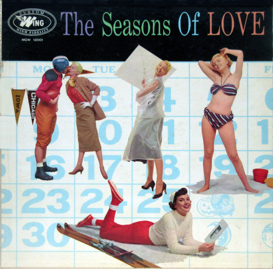
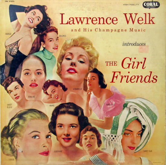
The theme may be the seasons, as in this Mercury collection; the square white umbrella is nice. Or it may be the much-done collection of songs with women’s names, like Lawrence Welk’s “The Girl Friend,” photographs by Tony Guyther. There’s quite a variety in this one, from Sweet Sue with the curious towel on the head to Dolores with the turtleneck and Margie with the racy evening gown.
__________
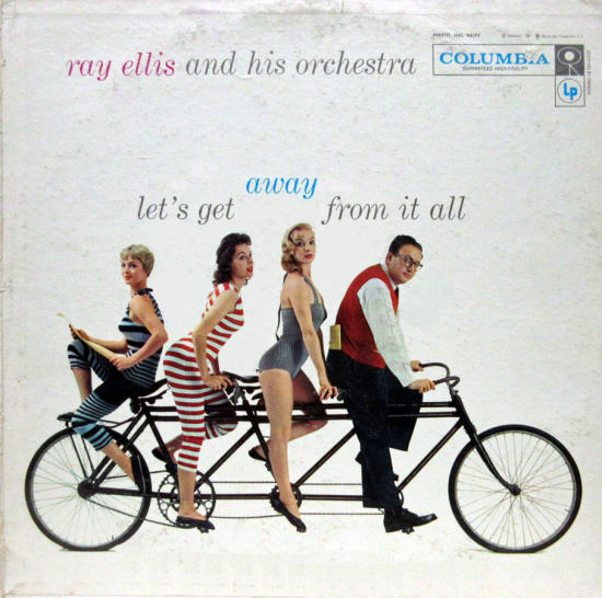
This is a 1957 example of dressing up the frumpy jazzman with hip models. Ray Ellis, an arranger and bandleader with a jazz background, is known for adding the orchestral backgrounds to Billie Holiday’s Lady in Satin album. Here he presents pop tunes with the theme of travel.
__________
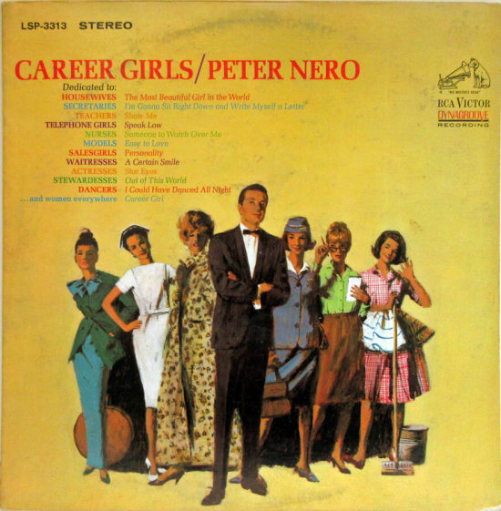
The Peter Nero album below is from 1965, a bit beyond the normal cutoff for this column, but it’s a real winner. Career Girls is dedicated to “housewives, secretaries, teachers, telephone girls, nurses, models, salesgirls, waitresses, actresses, stewardesses, dancers…and women everywhere.” Some wretch was compelled to write liner notes explaining which song went with which career: “One is certain that waitresses will be stirred by the appeal implicit in ‘A Certain Smile,’ as one hopes that stewardesses will not take too literally the flight suggested by ‘Out of This World.’” In the illustration, four careers are easy to identify; for the woman on the left with a hatbox I’ll guess model, and for the tall woman next to the nurse, I’ll say actress.
__________
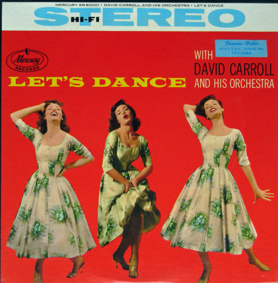
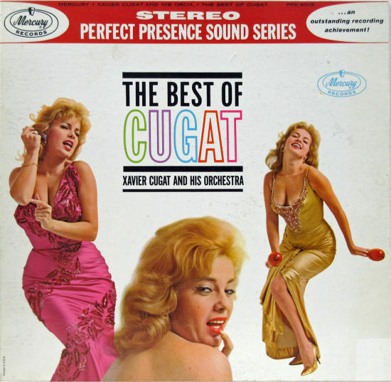
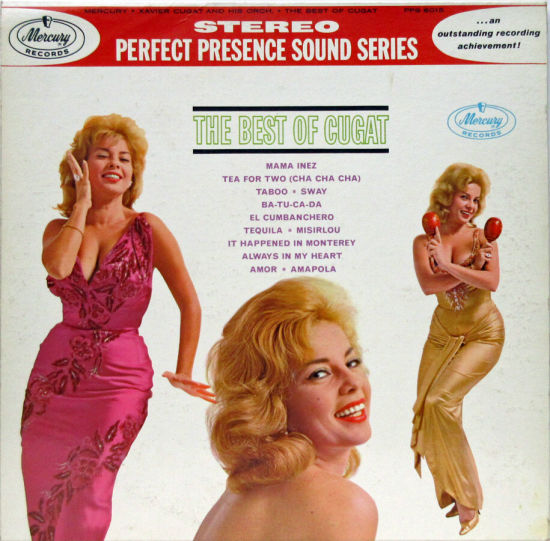
During this period someone at Mercury had a thing for staging numerous models, such as this David Carroll album with a triple portrait. Following that is a 1961 Xavier Cugat record with the dancer pictured on both front and back of the album in two different dresses. Photos were by George Pickow and the model was Abbe Lane, who sang with the band and was also Mrs. Cugat until 1964. She attracted attention for her suggestive comments, such as, “Jayne Mansfield may turn boys into men, but I take them from there.”
__________
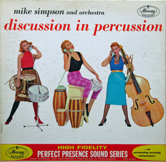
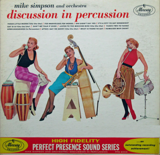
For the front and back of Discussion in Percussion the photographer assembled one model, three outfits, a telephone, and some musical instruments. The color palette takes us back to 1961, when stockings of contrasting colors were a thing, it seems. Notice how the base unit of the phone disappears on some of the pics. The songs relate to talk: “Too Marvelous for Words,” “After I Say I’m Sorry,” etc.
__________
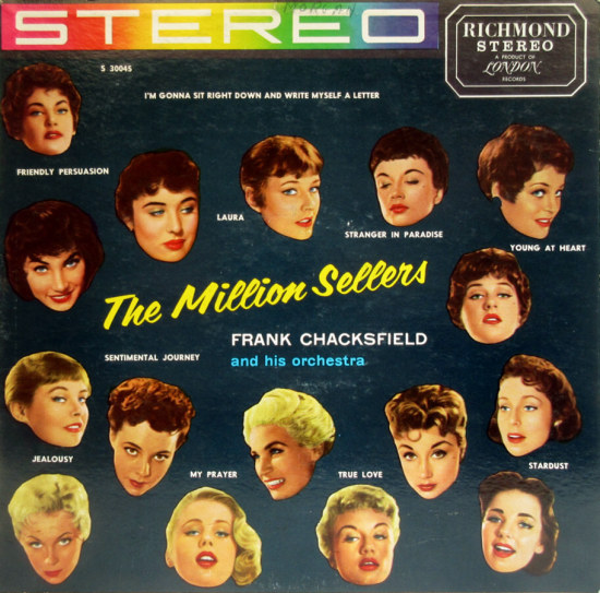
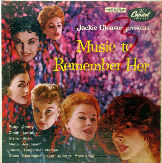
Here are two more with ladies’ heads floating in album space. The Million Sellers is an example of how tricky it was to paste up a layout like this. Each photo had to be cut out by hand, and tracing the outline of hair is especially difficult. These days, masking, the name for this technique, is much easier to accomplish digitally.
__________
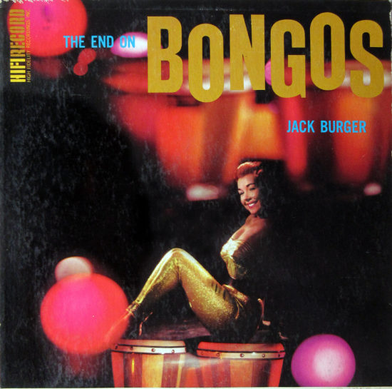
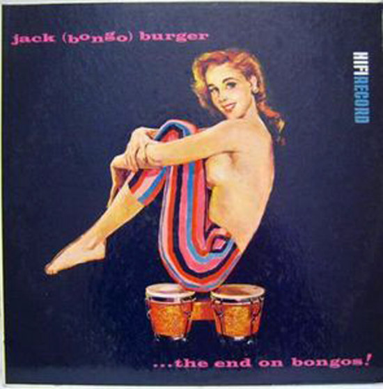
Sometimes I find an album that has a certain interest, but then I find another similar item, and I have a category. These could be called “Babes and Bongos.” (They’re filed near “Babes and Brass.”) The first album, The End on Bongos, credits the bandleader Jack Burger with the photograph of model Joyce Moore and notes that Neil Boyle designed the cover. Following this is the Canadian version of the cover, which is more explicit in its placement of the glamour girl’s bottom on the bongos.
__________
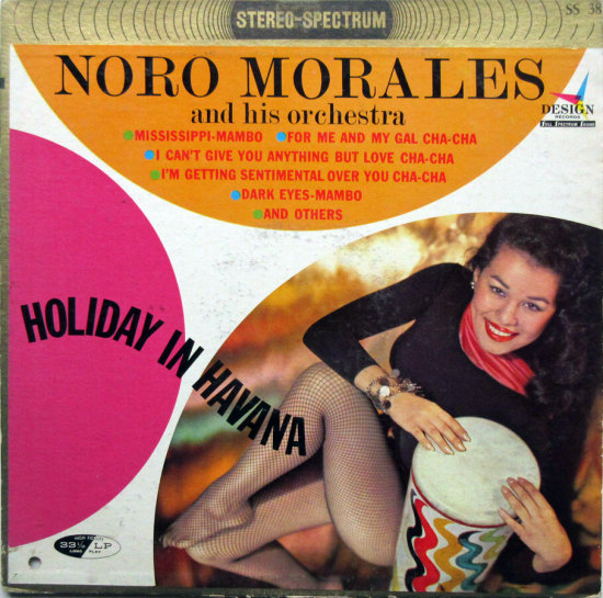
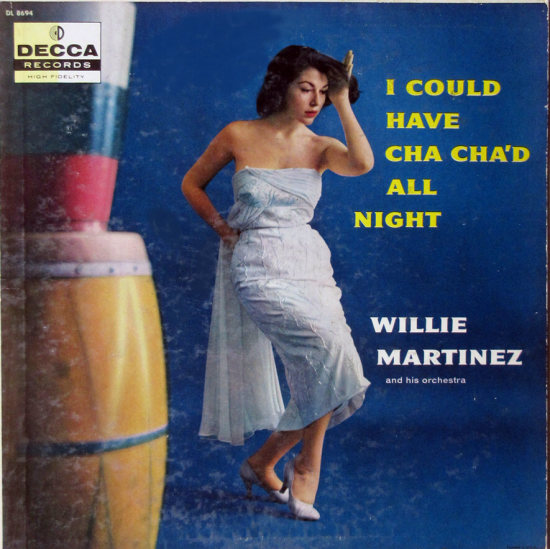
More congas and cuties. From the Noro Morales liner notes by Abbot Lutz: “Here’s fun when your friends drop in. Dance music that’s as modern as the Sputnik and accepted at the Debs Ball … The College Prom … The Country Club …and your own living room or den. Even the youngsters have to admit these Latin tempos have something that can make them turn away from ‘rock and roll.’” The writer of these notes was a photographer whose life was twisted and fascinating.

__________
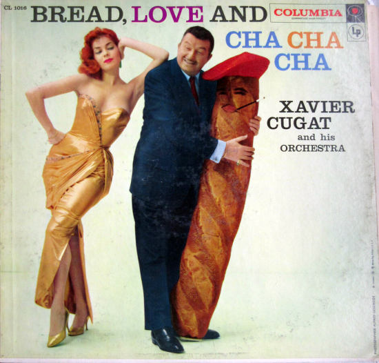
Sometimes I look at these ageing albums and despair that I cannot understand the forgotten cultural context; the chasm is too great. I do happen to know that it’s the lamé-loving Abbe Lane leaning on the bandleader, but why on earth is he caressing a giant beret-wearing baguette? The liner notes reveal that the title is a play on Bread, Love and Dreams, an Italian movie of the day. Also, “the extraordinary loaf of bread on which Señor Cugat is leaning was especially designed and baked for that purpose; its transportation to the photographer’s studio was covered by national news magazines.” Why the loaf is Frenchified and male remains a mystery.
__________
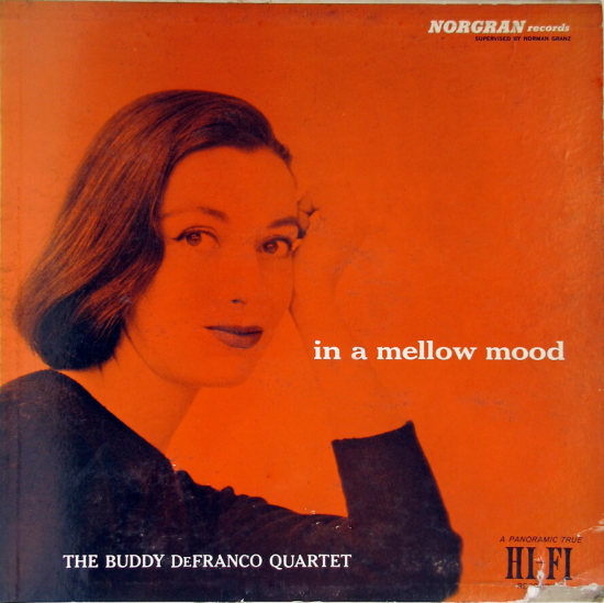
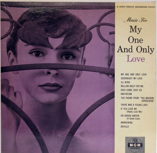
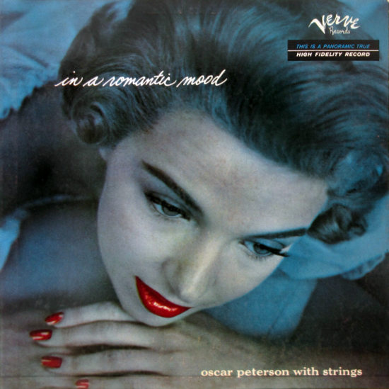
A few of my glamour albums hold up as photographs, especially those produced by Verve, the jazz label. The striking models in the first two have appeared on several covers; I wish I knew their names. Paul March is the photographer of the Buddy Defranco image. The Oscar Peterson photo is more dated. It also qualifies for another category, Black Artists and White Models.
__________
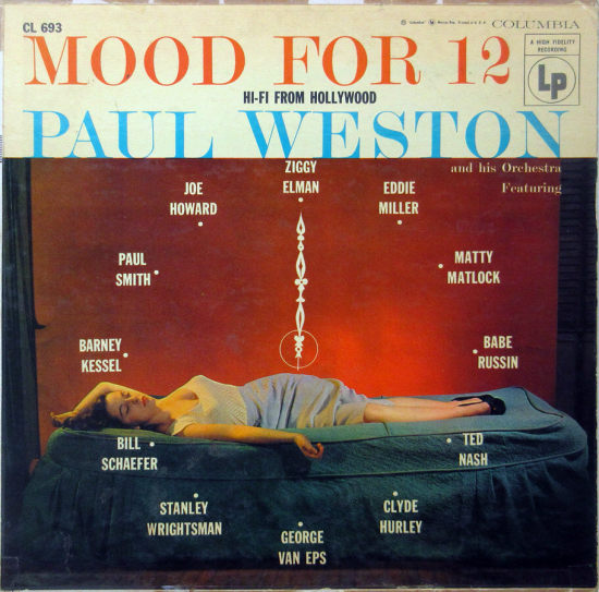
In Mood for 12 Paul Weston featured a dozen soloists performing mood music. How this turned into a photo of a clothed, sleeping woman and a clock dial is a puzzle. Is she asleep because it’s midnight? Did the mood music put her to sleep? She didn’t even remove her high heels! An example of album art that you probably shouldn’t overthink.
__________
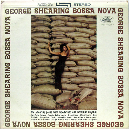
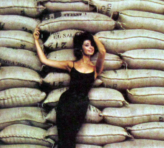
To close I’ll share a small category featuring pretty girls. The George Shearing album (photo by Jerry White) wouldn’t get a second glance from me, even with the detail that those are El Salvador coffee beans on a Brazilian album, except…
__________
…I have another album with a babe and beans! On this one the coffee is from Brazil. The uncredited photo came out in 1967, and was evidently inspired by Whipped Cream and Other Delights, a cover known to all devotees of glamorous album art.

__________
Next time — Alex Steinweiss at Columbia: the later years
*
In Volume 1 of “Cover Stories,” Paul shared his collection of covers by Alex Steinweiss, known as the father of the record album cover, and for many years in charge of Columbia Records’ art department.
Volume 2 focused on Columbia covers
Volume 3 featured jazz illustrations from the early years of the record album
Volume 4 revisited the 1950’s with images of fans holding and enjoying their albums
Volume 5 explored the work of Alex Steinweiss when he used the pseudonym “Piedra Blanca”
Volume 6 featured teenagers of the 1950’s enjoying their music
Volume 7 featured Steinweiss album covers from his prime period — the late 1940’s and early 1950’s
Volume 8 featured a “disturbing” and fascinating trend in 1950’s album art — Records on the Floor!
Volume 9 featured a selection of RCA Victor album covers from Paul’s collection
Volume 10 featured a selection of covers by Curt John Witt, the prolific illustrator for mid-century budget record labels















Cugat’s loaf is obviously a giant phallus. Could be interpreted a couple of very different ways . . . I’m enjoying the “Babes and” theme. Babes and bread? Nice work as always.
Great covers here. Mercury Wing was apparently very frugal with cover art. On Wing stereo SRW 12508,”Contrasts” by David Carroll, the same girl appears in the two-piece bathing suit as on the cover of the “Seasons of Love” LP you show. The image has been reversed, but it is the same photo.
When I saw the topic for this installment, my mind went back to the covers of many Julie London albums from the early 60’s, which loomed large in my imagination after browsing the record aisle in Woolworth’s. And this was even before I was able to appreciate Julie London’s real gifts as a singer. Or do those covers belong in another installment, because she was the artist and not just the photographer’s model?
When I saw the topic for this installment, my mind went back to the covers of many Julie London albums from the early 60’s, which loomed large in my imagination after browsing the record aisle in Woolworth’s. And this was even before I was able to appreciate Julie London’s real gifts as a singer. Or do those covers belong in another installment, because she was the artist and not just the photographer’s model?
One of my favorite glamour girl covers is for the album, “Let Yourself Go.” It depicts jazz singer Mark Murphy reclining on a piano, with his arm outstretched, flanked by a couple of slinky babes close by, to his left.
One of my favorite glamour girl covers is for the album, “Let Yourself Go.” It depicts jazz singer Mark Murphy reclining on a piano, with his arm outstretched, flanked by a couple of slinky babes close by, to his left.