Paul Morris is a graphic designer and writer who collects album art of the 1940’s and 1950’s. He finds his examples of influential mid-century design in the used record stores of Portland, Oregon.
This edition features a selection of covers by Curt John Witt, the prolific illustrator for mid-century budget record labels
__________
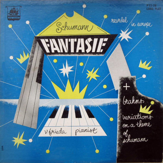
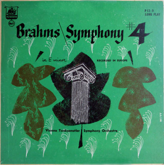
For this edition I’ve photographed a selection of covers by Curt John Witt, the prolific illustrator for mid-century budget record labels. This designer, whose life is not well documented, provided art for the classical labels Plymouth and Royale, and later for Remington.
These first two covers show some features of his work: a cursive handwriting style quite similar to the Steinweiss Scrawl, skilled use of a broad-nibbed pen (as in the Brahms title lettering), a mix of peaceful pastoral images and modern abstraction. Mainly the designs did not have specific references to the musical work or composer.
__________
In the Grieg cover below is more of the pen lettering. The blue cover for the Mozart piano concerto uses, as above, a classical column and piano images. I have to assume Witt was paid less than Steinweiss or other designers working for major labels, and therefore I admire these creations for what they are: art produced on deadline.


__________
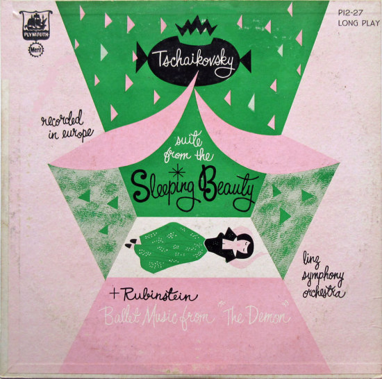
These two covers show a more sentimental side. On these Plymouth releases, the orchestra usually isn’t listed on the cover. They were less-well-known Eastern European groups recording familiar repertoire, and now there are modern successors who fill out the racks of classical CDs.

__________
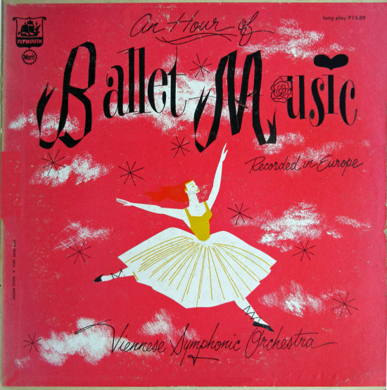
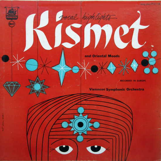
“An Hour of Ballet Music” is a fluently drawn image of a dancer amid clouds. In his original design she has a mane of red hair trailing behind her, but the difference between the red hair and the red background has faded over the years. This label used cheaper paper stock and the colors sometimes seem off, to my eye. The “Kismet” cover is less similar to his other work, and more dated.
__________
This Blue Danube cover shows off his draftsmanship in a charming Vienna scene. I want to believe the colors were added after it left Witt’s studio. The bridge in purple just looks wrong, and I don’t get the blue used on the trees, either.

__________
The purple Concert Hall Society cover shows a much different side of Witt, with the antique crest contrasting with the geometric lines and broad brushstrokes at the top. The drawing of the zephyrs mounted on serpents and the crowned crest is the kind of fancy pen-and-ink work found in 19th-century calligraphy sample books.

__________
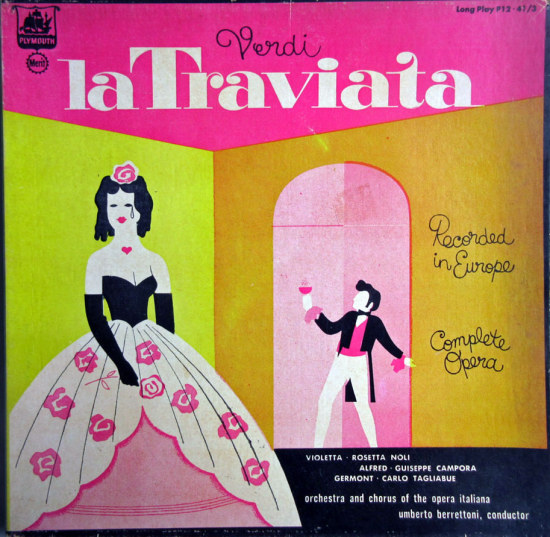
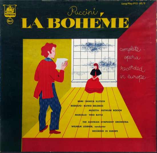
These covers for opera box sets apparently were done at the same time, and I found them in the same used bin. Plymouth gave him a better print job on these colorful paintings. (They are uncredited but almost certainly by Witt.)
__________
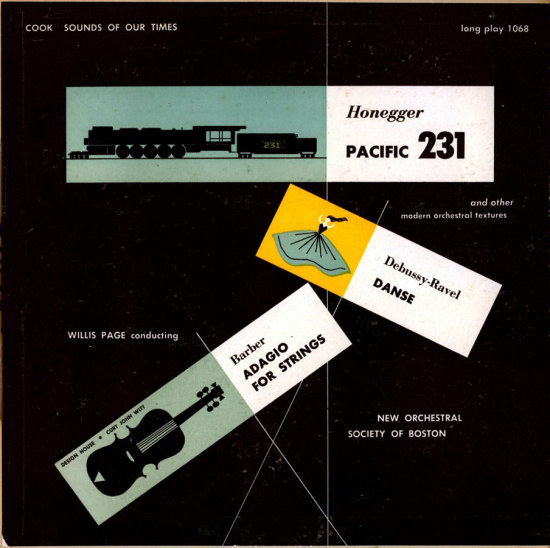
Here, the last of the Plymouths for this time and a cover for Cook demonstrate Witt’s skill with a more geometric style.

__________
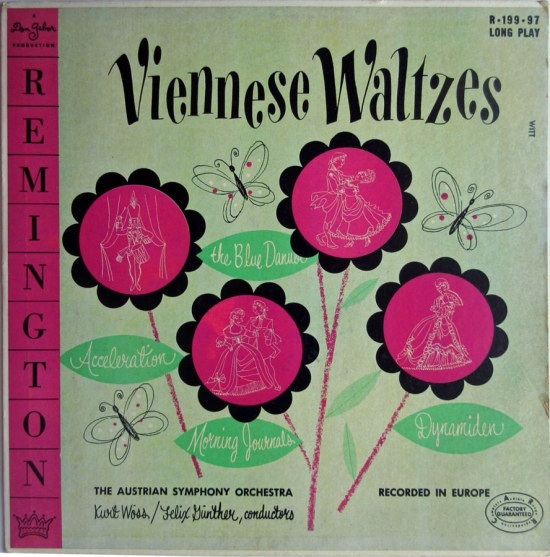
Here are two covers for the Remington label, begun by Don Gabor in 1950. Perhaps they paid a bit more, for the Witts I’ve acquired show more polish in execution. The Vienna Waltzes cover, with its sunflowers and butterflies, is a very nice piece of work with the beautiful lettering style Witt used most often. The purple and green combo wouldn’t be my choice, however. The Tchaikovsky cover skillfully uses the space provided by the prominent Remington logos. The dancing peasants and connecting lines are quite reminiscent of Steinweiss.
The basic “identity package” for labels and logos for Remington was the work of Alex Steinweiss, who also designed many of the early covers. They all included the large colored bar at the left, which is so big it wars with any other image and color block. I would have thought that Steinweiss, who came up with this scheme, would have made the corporate logo less obtrusive. They must have had a conversation about branding. When stereo came, they added the banner across the lower corner, “Musirama 3 Dimensional Sound.” All vinyl lovers know the record companies came up with a million tags like this to tout their superior stereo processes.

__________
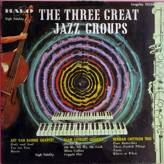
My last example is a rare jazz cover, also known as “When Curt John Witt Dropped Acid.” The last part probably was unlikely in 1953, but this certainly is a departure. I would like to know how he created the image of the circles using non-digital tools. The jazz geek in me is compelled to point out that the images of the bass, keyboard, and flute may seem to go with the three groups, but they’re not the right instruments. Herman Chittison was a pianist, Slam Stewart played bass, but Art Van Damme played accordion. I’m still trying to mentally revise this cover to replace the flute on the right with a trippy accordion!
__________
Next time — the glamour girls of the 1950’s!
*
In Volume 1 of “Cover Stories,” Paul shared his collection of covers by Alex Steinweiss, known as the father of the record album cover, and for many years in charge of Columbia Records’ art department.
Volume 2 focused on Columbia covers
Volume 3 featured jazz illustrations from the early years of the record album
Volume 4 revisited the 1950’s with images of fans holding and enjoying their albums
Volume 5 explored the work of Alex Steinweiss when he used the pseudonym “Piedra Blanca”
Volume 6 featured teenagers of the 1950’s enjoying their music
Volume 7 featured Steinweiss album covers from his prime period — the late 1940’s and early 1950’s
Volume 8 featured a “disturbing” and fascinating trend in 1950?s album art — Records on the Floor!
Volume 9 featured a selection of RCA Victor album covers from Paul’s collection







thanks, Paul for taking the time to show us this fascinating but subtle album covers. There was a time when subtle was understood and appreciated.
thanks, Paul for taking the time to show us this fascinating but subtle album covers. There was a time when subtle was understood and appreciated.
It’s interesting and fun to see one person’s style by having the covers lined up next to each other, Thanks Paul.
It’s interesting and fun to see one person’s style by having the covers lined up next to each other, Thanks Paul.
Another great episode in the series. Makes me sad to think that all this album art is passing, even CDs are in the process of vanishing. Makes this stuff more precious.
Another great episode in the series. Makes me sad to think that all this album art is passing, even CDs are in the process of vanishing. Makes this stuff more precious.