Paul Morris is a graphic designer and writer who collects album art of the 1940’s and 1950’s. He finds his examples of influential mid-century design in the used record stores of Portland, Oregon.
In this edition, Paul writes about the album cover art of Erik Nitsche, a pioneer of modern design
__________
The designer of this month’s selection of art is Erik Nitsche (1908–1998), a pioneer of modern design in whose career album covers were a minor chapter. He rose to prominence in the 1950s with a series of striking posters and advertising for the General Dynamics military-industrial corporation. In the 1960s he designed several series of educational books as well as children’s books that added to his renown as a master of page composition and book design.
You can find abundant information about Nitsche online. A feature from some years back by Steven Heller is a good place to start. You can read it by clicking here.
_____
Nitsche had been based in New York since the 1930s, when he was art director for Saks Fifth Avenue and other businesses. In the early 1950s for his client Decca Records he showed what he could do with the twelve-inch square format. Below are two examples of a style that combined a classic serif typeface like Didot with a reproduction of a historical engraving that referenced the music at hand.
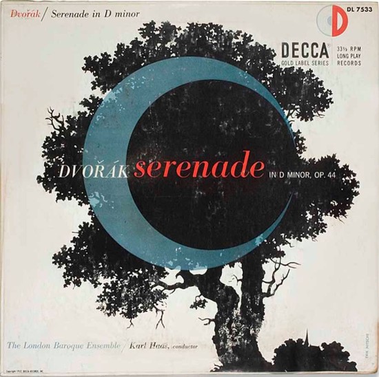

__________
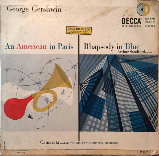
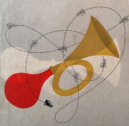
This 1950 design for a Richard Tauber record shows a restrained use of a single typeface, set large, with a small painting of a stage below an expressive white space. The next cover is for Gershwin and shows a snazzier side of Nitsche, who normally was assigned the classical records. The car horn references the horns featured in the score of An American in Paris.

__________
The grim cover for a Shakespeare recording, from 1951, is one of my most recent Nitsche finds. There is an old engraving of Romeo and Juliet, but the skull and dagger of Hamlet dominate the composition. The calmer design for the two clarinet trios on the next cover combines a lacelike pattern with a balanced grouping of triangles that evokes Nitsche’s Swiss Modern background.


__________
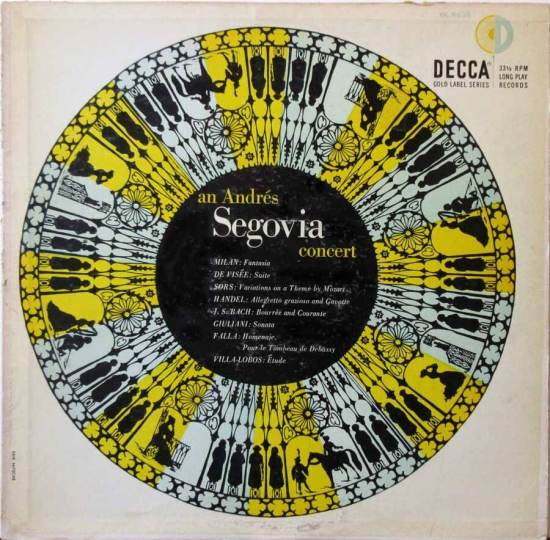
This Music of Mexico design is something entirely different, perhaps using found images. The illustration for the Segovia concert is also bold and poster-like.

__________
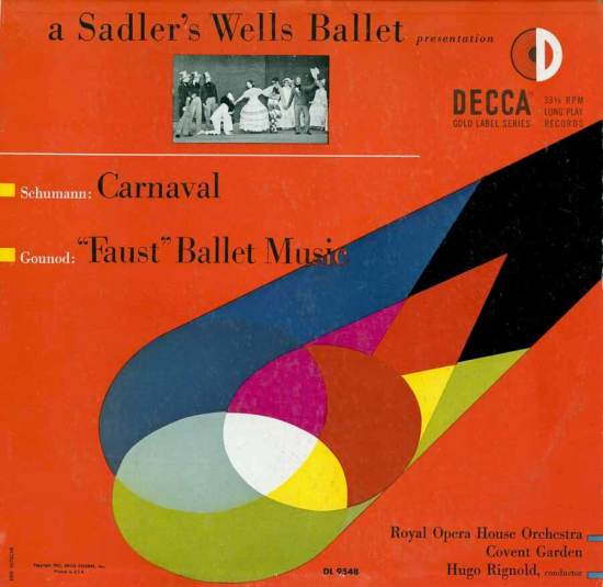
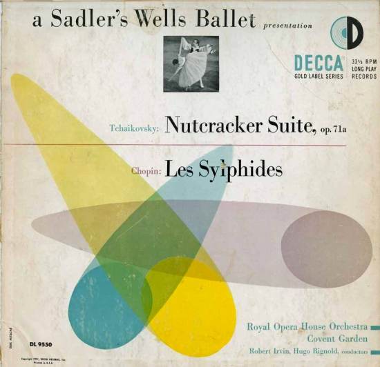
These two covers from 1951 are for recordings of ballet music by a London orchestra. Using the same basic elements, Nitsche deftly shows how they can be varied in placement, sizing, and color, to create two complementary but quite different effects. Comparing them is like watching the artist’s process of revision.
__________
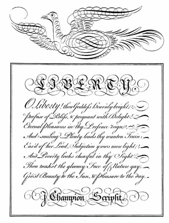
For Handel’s Water Music we have a ship done in a technique called calligraphic illustration. There is a long tradition in Europe of elaborate drawings done with a pen. Books of engravings demonstrating the roundhand style such as The Universal Penman published by George Bickham in the 17th century, showed drawings such as the one below. I don’t know if Nitsche found this image and added color, or if he had mastered the technique.

__________
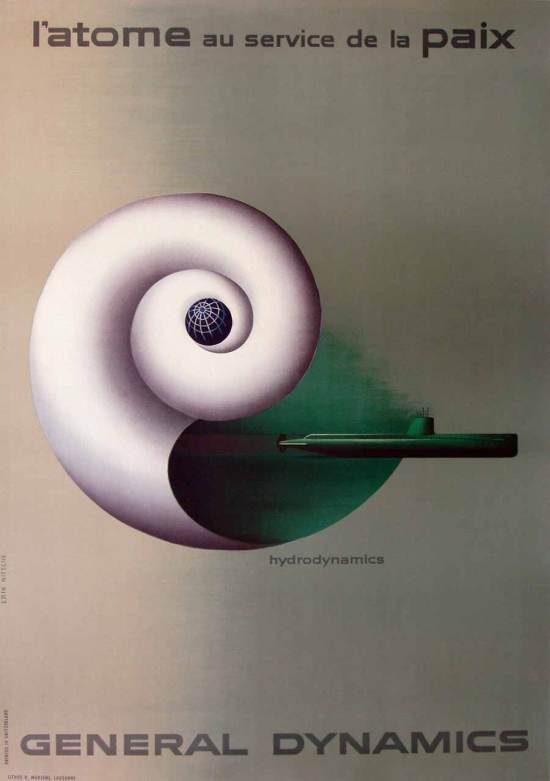
The cover for Schlusnus Sings shows the artist’s hard-edged illustration style with some acorn-like shapes paired with some singular modern type. This image brings to mind his posters for General Dynamics on the theme of atoms for peace. The poster shown here achieved the goal of portraying the corporation as futuristic and progressive while not being too explicit about the product, a nuclear submarine. The details of this Cold War military project had to be kept under wraps, even as the company tried to enhance its public image. Steven Heller wrote about this and a whole series of illustrations for this client, “Nitsche’s brand of artful futurism was copied by many others at the time and might be seen today as representative of the so-called ‘Atomic Style’ that emerged in the mid- to late-1950s.”

__________
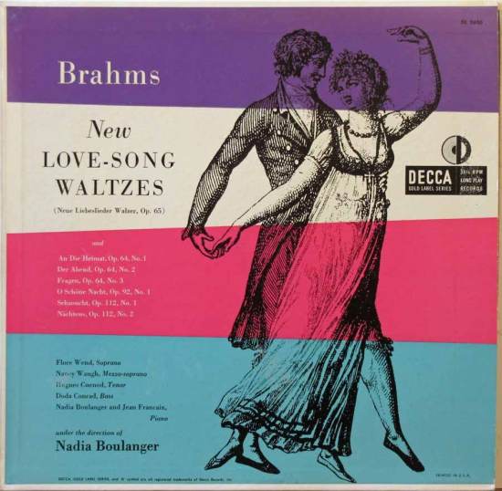
Two examples of Nitsche’s skill in riffing on found images from the 19th century. In the Trapp Family cover, there is an uncharacteristic droll humor. The bell-ringing contraption is shown with emphasis on the mechanisms. The artist had a lifelong interest in engineering—he art-directed an aeronautics magazine and dove into illustrating all kinds of large craft for General Dynamics. A dancing couple, the woman wearing an empire-waist dress, illustrates a collection of lieder by Brahms.

_________
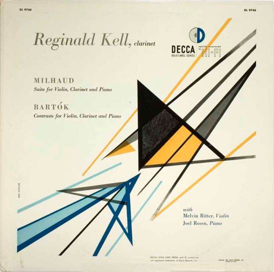
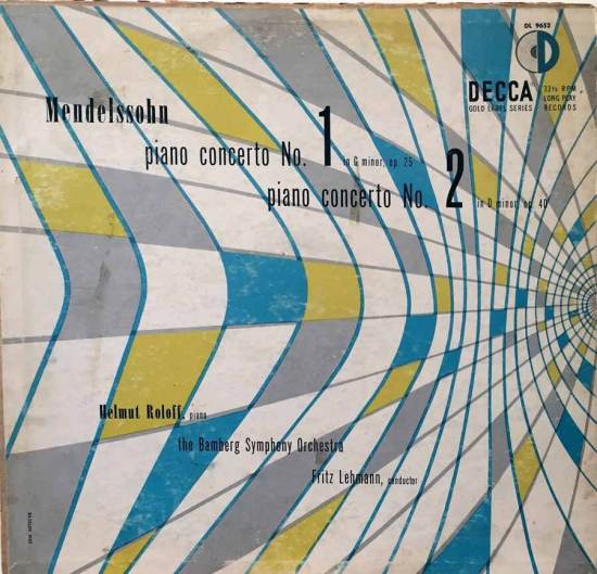
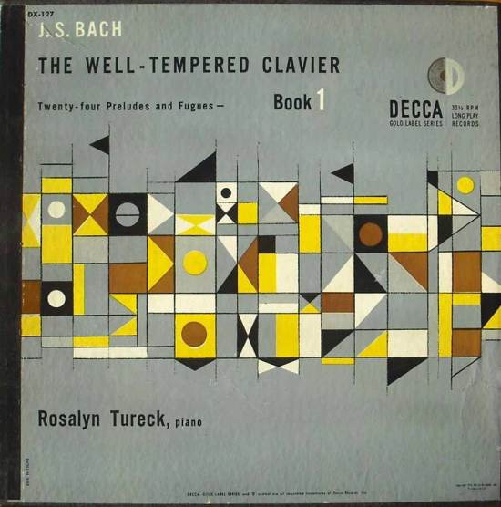
Nitsche was born and educated in Switzerland, and was fully fluent in abstract design. These two covers from 1954 and 1953 still look fresh, with sophisticated color choices.
__________
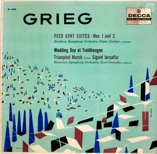
He grew up in Lausanne, the son of a portrait photographer. Nitsche got to know and was influenced by Paul Klee, who was a family friend. Perhaps these designs show some of that influence. The Grieg illustration is of a forested mountain, I assume. The Bach preludes are represented by what seems to be a misaligned keyboard. Whatever it is, the colors are well tempered.
__________
This last cover by Erik Nitsche combines a fanciful old engraving of a hot-air balloon with a trio of pastel prisms. The text is again in the stately Didot, with the intriguing figure waving a flag from the gondola basket that is only noticeable on a close second look.
If you read more about this giant of design, you’ll find, for example, how a corporate annual report made a splash in the design world of the 1960s, or what he did for the New York Transit Authority.

*
Next time… album covers with designer chairs.
__________
In Volume 1 of “Cover Stories,” Paul shared his collection of covers by Alex Steinweiss, known as the father of the record album cover, and for many years in charge of Columbia Records’ art department.
Volume 2 focused on Columbia covers
Volume 3 featured jazz illustrations from the early years of the record album
Volume 4 revisited the 1950’s with images of fans holding and enjoying their albums
Volume 5 explored the work of Alex Steinweiss when he used the pseudonym “Piedra Blanca”
Volume 6 featured teenagers of the 1950’s enjoying their music
Volume 7 featured Steinweiss album covers from his prime period — the late 1940’s and early 1950’s
Volume 8 featured a “disturbing” and fascinating trend in 1950?s album art — Records on the Floor!
Volume 9 featured a selection of RCA Victor album covers from Paul’s collection
Volume 10 featured a selection of covers by Curt John Witt, the prolific illustrator for mid-century budget record labels
Volume 11 featured a selection of “glamour girl” covers
Volume 12 featured the “late Columbia” era of master designer Alex Steinweiss
Volume 13 focused on Everest Records, the last of several new labels that Alex Steinweiss helped launch
Volume 14 Paul shares some of his personal jazz record collection, concentrating on the lesser known and sometimes quirky covers that emphasize photographs
Volume 15 took a look at the art of London Records
Volume 16 Paul shared some jazz covers from the 1950’s
















Wow, what a wild collection – quite beautiful! In the big someday I bet you’ll have a bazillion musicians and cover artists waiting in line to thank you for not forgetting them, Paul!
Wow, what a wild collection – quite beautiful! In the big someday I bet you’ll have a bazillion musicians and cover artists waiting in line to thank you for not forgetting them, Paul!